
Trend Inflation in Advanced Economies *
Abstract
We derive estimates of trend inflation for fourteen advanced economies from a framework in which trend shocks exhibit stochastic volatility. The estimated specification captures time-variation in the degree to which longer-term inflation expectations are well anchored in each economy. Our results bring out the effect of changes in monetary regime (such as the adoption of inflation targeting in several countries) on the behavior of trend inflation.
Our estimates expand on the previous literature in several dimensions: For each country, we employ a multivariate approach that pools different inflation series. Our inflation gap estimates--defined as the difference between trend and observed inflation--are allowed to exhibit considerable persistence. Consequently, the fluctuations in estimates of trend inflation are much lower than those reported in studies that use stochastic volatility models in which inflation gaps are serially uncorrelated. This specification also makes our estimates less sensitive than trend estimates in the literature to the effect of distortions to inflation arising from non-market influences on prices, such as tax changes.
Introduction
Measures of trend inflation play an important role for the study of inflation in many countries. In the context of policy analysis, the level and variability of trend inflation can be viewed as yardsticks of the degree to which inflation expectations in a particular country remain anchored over time. In addition, trend inflation can serve as a useful centering point in the construction of inflation forecasts at different horizons. Previous studies have also found that an important amount of the observed persistence of international inflation data are accounted for by variations in trend inflation, often related to changes in monetary regimes; see, for example, Levin and Piger (2002), Cecchetti, Hooper, Kasman, Schoenholtz, and Watson (2007) and Wright (2011).
In this paper we present estimates of the level and time-varying uncertainty of trend inflation for fourteen advanced economies. The estimates are derived from a multivariate model that pools information from different inflation series for each country. The model is applied on a country-by-country basis, in contrast to an approach of pooling information across countries (such as in Ciccarelli and Mojon, 2010). Our motivation for this choice is twofold: First, the country-by-country approach allows comparing different trend models across different samples of data. Second, while there are clearly some cross-country comovements in overall inflation, such common factors do not directly correspond to the components of a trend-cycle decomposition, as reported for example by Ciccarelli and Mojon (2010). In particular, as will be shown below, there are also considerable differences in each country's trend estimates, reflecting country-specific developments in monetary regimes and other forces.
Formally, we adopt the definition of trend inflation as the infinite horizon forecast of inflation. This trend definition corresponds to the Beveridge-Nelson (1981) concept, which has been applied to inflation data in a number of studies, including Stock and Watson (2007, 2010), Cecchetti et al (2007) and Cogley, Sargent and Surico (2013), as well as in some variation also by Cogley and Sargent (2005), Cogley, Primiceri, and Sargent (2010) and Kozicki and Tinsley (2012).1
Our multivariate model builds in the assumption that, for a given country, different inflation measures share the same common trend. Specifically, we consider changes in core and headline CPI as well as changes in the GDP deflator, assuming that the deviations that these inflation series exhibit from the common trend are stationary.
Our multivariate model nests the popular unobserved components model with stochastic volatility, simply known as "UCSV" model, of Stock and Watson (2007, 2010) that has been applied to G7 inflation data by Cecchetti, Hooper, Kasman, Schoenholtz, and Watson (2007). Our model extends the UCSV approach in two dimensions. First, as in Mertens (2011), the model extracts its trend estimates from multiple inflation series, instead of conditioning on a single inflation measure. Second, while deviations from trend are assumed to be serially uncorrelated in the UCSV model, inflation gaps can be, and typically are, persistent in our model, but are constrained to be stationary.
As in the UCSV model, we track two measures of stochastic volatility; one for trend shocks and the second one capturing changes in gap volatility. What makes the model tractable is the assumption that a single stochastic volatility measure drives changes in the volatility of all three gaps in our model.2 A more general approach, embedding separate stochastic volatilities for each gap, would not only be more costly to compute but even much less sensible to implement in our data sample, when there is missing data.3 In the same vein, we have also chosen to limit time-variation in model parameters to stochastic volatility, keeping inflation gap persistence constant.4
Since our estimation relies on state-space methods, with a limited number of time-varying parameters, we can well handle cases in which observations are missing for particular inflation series. Throughout, our estimation uses data since 1960, as far as available.
The remainder of this paper is structured as follows: Section 2 describes our data set for 14 industrialized countries. Section 3 lays out the empirical models used throughout the paper. Section 4 presents estimates for level and variability of trend inflation derived from univariate and multivariate models. Section 5 reviews periods in which price shifts occurred and their influence on the estimates. Section 6 concludes the paper.
2. International Inflation Data
Our dataset consists of quarterly inflation data for 14 developed countries from 1960:Q1 through 2012:Q3. To the extent that data availability permits, we use three different inflation measures for each country: headline CPI, core CPI and the GDP deflator. Details on the available data for each country are provided in Table 1. All CPI data are obtained from the Main Economic Indicators (database) produced by the OECD.5 All GDP deflator data are obtained from the International Financial Statistics (database) maintained by the IMF with the exception of the deflator series for Sweden that is from the Main Economic Indicators.6 All GDP deflators from the IFS are seasonally adjusted except for Belgium, Ireland and Sweden. A simple filter was applied to these series to remove seasonal patterns over the entire period to keep consistent with the other series.7 All inflation measures are computed as annualized quarterly log-differences.
[Table 1 about here]
For many countries, our sample encompasses periods over which recorded prices levels were likely distorted by nonmarket forces, like government price controls and major changes in indirect taxes.8 Section 3 will discuss these episodes, and their effects on our estimates, in more detail. An overview of these dates is given in Table 2.
[Table 2 about here]
3. Model Description
Our paper uses two different models to estimate measures of trend levels and variability and to construct inflation forecasts. Both models are time-series models that use the same trend concept. The models mainly differ in the data on which their estimates are conditioned. The first model is the univariate UCSV model of Stock and Watson (2007, 2010), which is applied to data for each country's CPI inflation (headline). The second model is the multivariate common-trend model of Mertens (2011), which we estimate using data on three inflation series for each country (employing headline and core CPI as well as changes in the GDP deflator). As will be detailed below, both models use the trend concept of Beveridge and Nelson (1981), and both allow for time-varying volatility in trend shocks. The UCSV model embeds the assumption that deviations between actual inflation and trend have no persistence, whereas the multivariate model uses a (time-invariant) VAR to describe the dynamics of deviations between data and trend. While the UCSV model has two separate sources of stochastic volatility--one for trend shocks, the other for transitory shocks to inflation--only the trend shocks have stochastic volatility in the common-trend model.
Throughout this paper, we employ a Beveridge-Nelson decomposition of inflation into a trend level ![]() and inflation gap
and inflation gap
![]() As described below, the two models used in this paper differ in their implied dynamics for the inflation gap,. In both models, the Beveridge-Nelson trend measures
each model's long-run forecast of inflation:
As described below, the two models used in this paper differ in their implied dynamics for the inflation gap,. In both models, the Beveridge-Nelson trend measures
each model's long-run forecast of inflation:
Univariate UCSV Model
The UCSV model of Stock and Watson (2007) takes inflation as exhibiting no persistence and that it is also affected by a separate process for stochastic volatility
Multivariate Model (MVSV)
As an alternative to the univariate UCSV model, we also study trend estimates derived from a multivariate model with stochastic volatility (MVSV), which jointly conditions on three inflation measures for each country; a variant of the model has been applied by Mertens (2011) and this study
extends this work to international data. Moreover, our model incorporates time-varying volatility in both the trend and the gap component of inflation. The model thus nests the UCSV case. In our application, the model uses observations on inflation in headline CPI, core CPI, and the GDP deflator,
stacked into a vector ![]() , and applies a Beveridge-Nelson decomposition, similar to the UCSV model above:
, and applies a Beveridge-Nelson decomposition, similar to the UCSV model above:
By contrast with the UCSV model, inflation gaps can be persistent in the multivariate model, provided they remain stationary. Specifically, the inflation gaps follow a stationary VAR with constant parameters and constant correlations and a common volatility factor:
The time-varying scale factor of the gap shocks is assumed to follow the same process as in the UCSV model; a random walk without drift in the log of
![]() . This approach has been proposed by Carriero et al (2012), in the context of VARs applied to observable data instead of our inflation gaps. These authors report
considerable gains--not only in computational efficiency but also model fit and forecast accuracy--from restricting the number of time-varying volatility factors this way, as opposed to assuming separate sources of stochastic volatility for each variable. In our application, such a more general
specification even proved hard to implement, with at times hardly plausible results, likely due to the VAR being applied to the latent gap factors (as opposed to observable data), and the presence of missing data for several inflation series in many countries.
. This approach has been proposed by Carriero et al (2012), in the context of VARs applied to observable data instead of our inflation gaps. These authors report
considerable gains--not only in computational efficiency but also model fit and forecast accuracy--from restricting the number of time-varying volatility factors this way, as opposed to assuming separate sources of stochastic volatility for each variable. In our application, such a more general
specification even proved hard to implement, with at times hardly plausible results, likely due to the VAR being applied to the latent gap factors (as opposed to observable data), and the presence of missing data for several inflation series in many countries.
The roots of the VAR polynomial ![]() are required to lie outside the unit circle, to ensure that the gaps are stationary. Shocks to gaps and trend are assumed to be mutually
uncorrelated.10 Apart from requiring the volatility of gap shocks to be constant, the multivariate thus nests the UCSV model, while extending it to multiple
input series and persistent gap dynamics. Choosing to model gap dynamics as being time-invariant enables the model to better handle our data set where data for some inflation measures is partly missing, than what would be possible when gap dynamics were time-varying.
are required to lie outside the unit circle, to ensure that the gaps are stationary. Shocks to gaps and trend are assumed to be mutually
uncorrelated.10 Apart from requiring the volatility of gap shocks to be constant, the multivariate thus nests the UCSV model, while extending it to multiple
input series and persistent gap dynamics. Choosing to model gap dynamics as being time-invariant enables the model to better handle our data set where data for some inflation measures is partly missing, than what would be possible when gap dynamics were time-varying.
Missing observations in ![]() are easily handled, by casting the model in state space form with (deterministic) time-variation in measurement loadings. In the case of missing observations,
the appropriate elements of
are easily handled, by casting the model in state space form with (deterministic) time-variation in measurement loadings. In the case of missing observations,
the appropriate elements of ![]() are encoded as zeros and so are their loadings on the model's states; see for example Mertens (2011) for details.
are encoded as zeros and so are their loadings on the model's states; see for example Mertens (2011) for details.
Estimation methods
The models are estimated with Markov-Chain Monte Carlo methods, as described in Mertens (2011). The algorithm yields not only estimates of the latent factors The sampling algorithm recovers the posterior distribution of missing data entries, conditional on the model and all observed data values. Convergence is assessed with scale reduction tests, applied to the output of multiple chains that started from dispersed initial conditions.
4. Inflation Trends: Levels and Uncertainty
This section reports country-by-country estimates of inflation trends and gaps as well as their time-varying variability, generated from the UCSV model of Stock and Watson (2007) and our MVSV model. The UCSV estimates complement and extend the results reported by Cecchetti, Hooper, Kasman, Schoenholtz, and Watson (2007), whose estimates are conditioned on the GDP deflators for the G7 countries. The UCSV estimates reported below are conditioned on CPI inflation (headline). For ease of comparison, we also report only the gap estimates of CPI (headline) inflation for the MVSV model.11 The estimates reported below are conditioned on all available data since 1960, except for the removal of certain dates, listed in Table 2, when price shifts occurred. The nature of these price shifts and their effect on our estimates are discussed in Section 5.
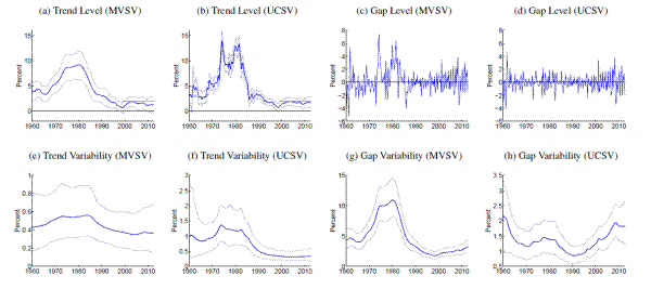
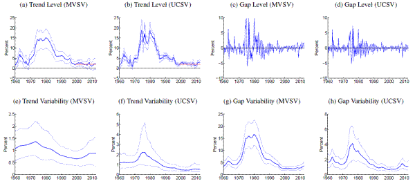
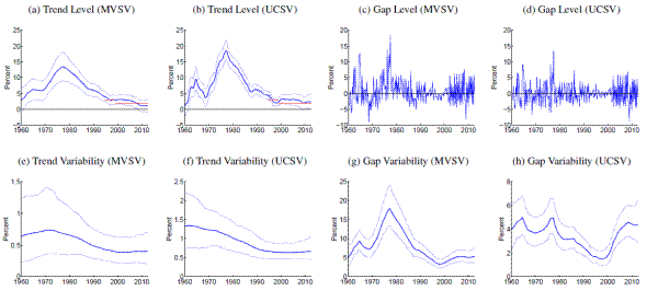
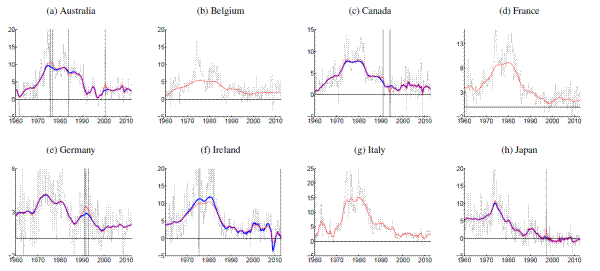
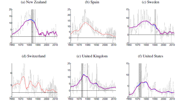
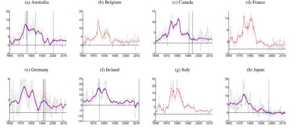
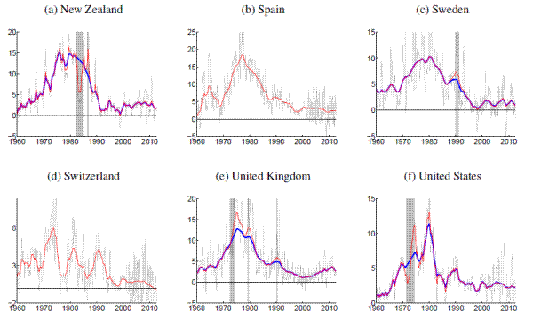
[Figures 1-14 about here]
Comparing estimates from the UCSV model and the MVSV for each country, there are some broad similarities, but also notable differences. Estimates from both models capture very similar low-frequency movements. But, typically, the trend estimates from the UCSV model are more variable, and comove more strongly with the actual data, while the gap estimates of the UCSV model are much less persistent. Compared with the MVSV estimates, the UCSV trend estimates appear to overstate changes in trend inflation by several percentage points. Similarly, there are marked differences in the stochastic volatility estimates from both models. While estimates from both models typically find a decline in trend volatility over the postwar sample, the UCSV estimates typically suggest a much larger degree of unanchored inflation expectations in the 1970s, while MVSV estimates of trend volatility display a much milder hump shape, if not a mere gradual decline in most countries. Strikingly, much of the time variation in UCSV estimates of trend volatility seems to be captured by time-variation in the MVSV estimates of gap volatility.
Several countries, listed in the lower panel of Table 1, have introduced formal inflation goals during the sample period. In most cases, estimated trend levels from both models tend to hover around these goals. Interestingly, our measure of anchored inflation expectations--the stochastic volatility of trend shocks--tends to decrease only within about five to ten years in most cases.
We defer a detailed description of our country-by-country results for the next revision of this draft. However, a few country-specific observations are worth mentioning already: Amidst the countries with explicit inflation goals, the trend estimates for Sweden, shown in Panels (a) and (b) of Figure 11, stand out by almost permanently hovering about half a percentage point below the Riksbank's inflation target of 2%; Svensson (2013) has noted the same phenomenon and discusses potential implications.
Not surprisingly either, the estimated trend levels for Japan, shown in Figure 8, are amongst the lowest in our cross-country sample. Both MVSV and UCSV estimates put Japanese trend inflation at levels below zero for the last decade and in particular the 90% credible sets of the MVSV model barely cover any positive values over that period. Concerns about rising deflation risks are also raised by our trend estimates for Switzerland, shown in Figure 12, which are clearly drifting down towards zero over the last few years, having remained stable near two percent for most of the last 15 years.
An interesting comparison between the MVSV and UCSV estimates is offered by the case of the UK, estimates for which are displayed in 13. Over recent years, U.K. inflation has been persistently running above the Bank of England's 2% target, and these overshoots have some influence on our estimates. In particular, the UCSV estimates are increasing over the last five years, up to levels near 4%. In contrast, the MVSV model generates a more cautious increase in trend inflation for the United Kingdom because of persistence embedded into the model specification of gap dynamics.
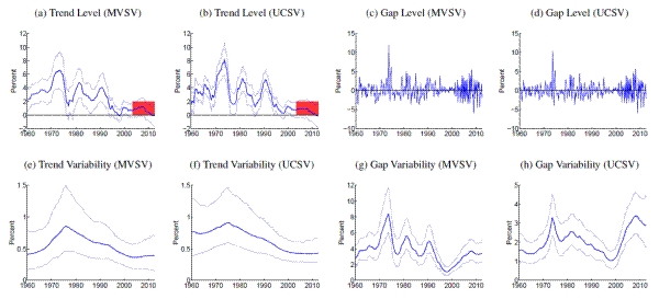
5. The Effects of Price Shift Dates on Trend Estimates
The estimates presented in the previous section are conditioned on all available data in our sample, except for the removal of country-specific dates on which price shifts occurred due to non-market factors.12 The results shown in Figures 1 to 14 were generated from inflation data for which periods of price shifts are treated as missing values in each model's estimation. The relevance of these episodes for our estimates, including a comparison with estimates conditional on all data, is the subject of this section.
All in all, we consider 15 price shift episodes affecting 7 out of the 14 countries in our sample; all are listed in Table 2. Most episodes are related to increases in taxes on goods and services and similar administrative surcharges, thus removing only a single quarterly observation from the data. The rationale for omitting these specific dates is that the price level shifted in the period in question not as a reflection of monetary policy or of private sector-initiated behavior, but because of a nonmonetary governmental measure whose effect was essentially to rescale the price level. Only three episodes were somewhat longer: The price controls in the U.S. (1971/74) and New Zealand (1982/84) as well as the transition period in the wake of German reunification (1991). Again, the shift in the price level in these dates corresponded either to a movement away from market determination of prices (in the case of the price control episodes) or a major redefinition of the area covered by the price index (as when the former East Germany was brought into the Federal Republic of Germany).13
[Figure 15 about here]
Reflecting their short duration, the price shift dates leave not much impact on trend estimates for many countries. But this is not invariably the case. Figure 15 presents trend estimates for four countries, German, Ireland, New Zealand and the U.S., for which the inclusion of price shift dates has nonnegligible effect on trend estimates, at least when using the UCSV model. The figure compares the trend estimates discussed in the previous section against estimates that condition on the entire data, including inflation data recorded during the price shift episodes. For each country, trend estimates from the MVSV around the price shift dates are not much affected whether the price shift data is included or excluded from the estimation. In the case of the UCSV estimates, there are however sizable differences. For example, the UCSV estimate of trend inflation in the U.S. peaks above 10% in the mid-1970s, when conditioned on the full data, whereas in the case where the price shifts are treated as missing data, the estimated inflation trend rises only gradually from about 5 to 8 percent during the same period.
Also, the estimated gap volatilities from the UCSV model prove to be more sensitive to the inclusion of price shift dates in the case of the U.S., and similarly so for New Zealand, see Panel (h) of Figures 9 and 14. In both cases, UCSV estimates of the gap levels right before and after the price shift periods are quite elevated, consistent with a rise in volatility. When the price shifts are treated as missing data, the Random Walk assumption then causes the estimated volatilities to remain elevated throughout the price shift period, whereas these patterns is somewhat mollified when all data are included (results not shown here).
Detailed results for each country, with and without price shift dates are provided in Figure 16 (for the MVSV model) and Figure 17 (for the UCSV model).
[Figures 16-17 about here]
6. Conclusion
Our paper compares estimates of trend inflation in fourteen advanced economies using two different models. Our preferred model is a multivariate extension to Stock and Watson's (2007) the unobserved components model with stochastic volatility (UCSV) that has been applied to the G7 countries by Cecchetti, Hooper, Kasman, Schoenholtz, and Watson (2007). Like the UCSV model, our multivariate stochastic volatility model (MVSV) tracks time-variation in the variability of shocks to trend inflation and inflation gap. But as in the model of Mertens (2011), gap estimates from our model display persistence, while the UCSV model embeds the assumption that gaps are serially uncorrelated. The MVSV trends are consequently smoother and less variable, since the underlying filtering procedure exhibits less leakage from persistent components of the data, which do not prove to be permanent. Thus, the MVSV estimates are less influenced by the occurrence of country-specific episodes in which price levels shifted because of non-market factors, like tax changes.
In addition, the MVSV model conditions on multiple inflation series, assuming they share a common trend. In contrast to Cogley and Sargent (2005) and Cogley, Primiceri, and Sargent (2010), our model restricts time-variation in its parameters only to stochastic volatility, and to have only two sources: drift in the log-variances of shocks to the common trend and a common scale factor to all gaps. Limiting the amount of time-varying parameters makes the model more tractable, and it also enables us to handle missing data in some of the inflation series for several countries. This approach also promises better forecast accuracy, which is a subject of our ongoing research.
While our estimates of trend inflation display quite some similarities across countries--notably the shared experiences of persistently elevated inflation rates in the 1970s and more stably-anchored inflation expectations over the last two decades--there are also clear differences in the trend estimates. For example, the extent to which trend inflation rose and fell over the postwar sample differs markedly. Also, for many countries, distinct, country-specific changes in monetary regime, like the adoption of a formal inflation target, are clearly visible in the trend estimates.
References
![Figure 1: Australia. Figure 1 contains eight panels. The x-axes on all panels are labeled, Year and range from 1960 to 2010. The y-axes on Panels (a) and (b) are labeled, Percent and range from -5 to 20. The y-axes on Panels (c) and (d) are labeled, Percent and range from -10 to 15. The y-axes on Panels (e) and (f) are labeled, Percent and range from 0 to 1.5. The y-axes on Panels (g) and (h) are labeled Percent and range from 0 to 15. In each panel, the solid, thick blue lines show posterior means, and thinner blue lines depict 90% confidence sets derived from the model's posterior distribution conditional on all data. All levels are measured in annualized percentage points. Uncertainty is measured by the standard deviation of a quarterly trend shock. Data sources as listed in Table 1, using all available data since 1960. Grey shading marks dates in which data was excluded from computation due to shifts in the price index at that time. Each panel has four grey shading marks (y-values: 1975,1976, 1985 and 2000, respectively). All country specific price shift dates for input measures are listed in Table 2. For those periods, estimated inflation gaps, shown in Panels (c) and (d), are marked green. In Panel (c), the green dots are clustered around [0,1975]. In Panel (d), the four green dots lie around [0,1975], [0, 1976], [0,1985], and [0, 2000]. When there are no price shift dates, the gap estimates are identical to the difference between actual inflation and the trend estimates, shown in Panels (a) and (b). In Panels (a) and (b), the solid red line marks the range of an officially stated inflation goal (range from 1995 to 2010). For the entire graphs (in panel (a), (b), (e), (f), (g) and (h)), the thick blue lines stay in the middle of two thin blue lines. Panel (a) is labeled, Trend Level (MVSV) . In the panel, all lines move together closely. All lines initially decrease by 2 percent in 1960, move upward together and then fall down steadily, oscillating around the y-values of 0-5. Panel (b)is labeled, Trend Level (UCVS). All lines move together closely and follow a similar pattern. The lines steadily rise to between 9 and 15 and then trend downward to about zero. From 1990, the lines fluctuate around the values of 0 and 5, sometimes dipping as low as -1, and sometimes rising to as high as 5. Panel (c) is labeled, Gap Level (MVSV). The line starts at around -3 percent and initially goes up, and then fluctuates between about -5 percent and 10 percent for the duration for the graph. Panel (d) is labeled, Gap Level (UCSV). The line starts at around -2 percent and initially shoots up to 3 percent and plummets to -5 and then fluctuates between about -5 percent and 8 percent for the entire graph. Panel (e)is labeled, Trend Variability (MVSV). Three lines are stacked atop one another. The top line (thin blue line) starts at around 1.2 percent and initially declines to 1 percent and then fluctuates up and down around the value of 1.3 percent for the last third of the graph (except for the part of the line which reaches the minimum value of 0.9 percent in 2000). The middle line (thick blue line) starts at 0.7 percent and stays between roughly 0.5 and 0.7 for the whole graph. The bottom line (thin blue line) starts at around 0.3 percent, rises slowly to 0.5 percent (in 1970), falls to about 0.3 percent (in 1980), goes up again to 0.5 percent (1995), before dropping down to end the graph at 0.3 percent. Panel (f) is labeled, Gap Variability (MVSV). Three lines are stacked atop on another and follow a similar trend from 1965 to 2010. The top line starts at 1.6 percent and falls down to 1.4 percent. The middle line starts at around 0.9 percent and decreases to around 0.8 percent. The bottom line starts at 0.4 percent and increases slowly to 0.5 percent. Around 1970, all three lines move upward together and decline slowly until the end of the graph (with some fluctuations along the way). Panel (g) is labeled, Gap Variability (MVSV). All three lines initially drop sharply and then move upward together. After 1975, the lines begin to plummet to between 3 and 5 percent and then rise slowly to between 3 and 5 percent. Panel (h) is labeled, Gap Variability (UCSV). Similar to panel (g), the lines move together closely . The lines decrease to between 2 and 3 percent and then trend upward until 1975. From that point, the lines move downward together until the end of the graph (fluctuate around the values of 1 and 4 percent.](figure1.gif)

![Figure 3: Canada. Figure 3 contains eight panels. The x-axes on all panels are labeled, Year and range from 1960 to 2010. The y-axes on Panels (a) and (b) are labeled, Percent and range from -5 to 15. The y-axes on Panels (c) and (d) are labeled, Percent and range from 10 to 10. The y-axis on Panels (e) is labeled, Percent and ranges from 0 to 2. The y-axis on Panel (f) is labeled, Percent and ranges from 0 to 1.5. The y-axis on Panel (g) is labeled, Percent and ranges from 0 to 15. The y-axis on Panel (h) is labeled, Percent and ranges from 0 to 4. In each panel, the solid, thick blue lines show posterior means, and thinner blue lines depict 90% confidence sets derived from the model's posterior distribution conditional on all data. All levels are measured in annualized percentage points. Uncertainty is measured by the standard deviation of a quarterly trend shock. Data sources as listed in Table 1, using all available data since 1960. Grey shading marks dates in which data was excluded from computation due to shifts in the price index at that time. Each panel has two grey shading marks (one at 1990 and the other one at 1994 (y-values)). All country specific price shift dates for input measures are listed in Table 2. For those periods, estimated inflation gaps, shown in Panels (c) and (d), are marked green. In panel (c), the green dots are around [1990,-1], [1993, 0], and [1993,1]. In panel (d), the green dots are around [1990, 0] and [1993, 0]. When there are no price shift dates, the gap estimates are identical to the difference between actual inflation and the trend estimates, shown in Panels (a) and (b). In Panels (a) and (b), the solid red line marks the range of an officially stated inflation goal (range from 1990 to 2010). For the entire graphs (in panel (a), (b), (e), (f), (g) and (h)), the three lines are stacked on top of each other (the thick blue line is in the middle). Panel A is labeled, Trend Level (MVSV). All three lines trend upward (between 5 and 10 percent) and then drop down (between 0 and 5 percent). After 2000, they fluctuate around the values of 0-5 percent by the end of the graph. Panel (b) is labeled, Trend Level (UCSV). All three lines seem to follow a similar path. They start between -1 and 3 percent and move upward together (with some jumps and dips). From 1980, all the lines slope downward and ending between 0 and 5 percent (with fluctuation). Panel (c) is labeled, Gap Level (MVSV). The blue line starts at -1 and then oscillates around the value of -5 and 5 before ending on the value of -2 percent. Panel (d) is labeled, Gap Level (UCSV). The line starts out at about -1 percent and then shoots up to 4 percent before severely fluctuating in between -7 and 5 percent. The line seems to behave more volatile in the second half of the graph. Panel (e) is labeled, Trend Variability (MVSV). The panel is a stacked line graph with three lines. The top line starts out at about 0.7 percent and hovers around the y-value of 0.7 percent or so. Between 1990 and 2009 on the x-axis, there is a significant upward trend to reach a peak of 2.0 percent in 2008 and then falls briefly y to 1.7 percent. The middle line (the thick blue line)starts at around 0.5 percent and gradually increases (with some fluctuation) until it reaches a y value of 1 at around 2009, then falls shortly to about 0.8 percent. The bottom line starts at 0.2 percent, and then remains relatively flat before gradually rising to 0.3 percent (remains relatively flat. Panel (f) is labeled, Trend Variability (UCSV). The top line starts out at about 1.2 percent and falls to about 1 percent, then rises, then steadily decreases to 0.8 percent, then increases to 1 percent by the end of the graph. The middle line starts out at about 0.7 percent and rises to 0.9 percent before falling sharply to about 0.4 for the remainder of the graph. The bottom line starts out at about 0.4 percent and then rises to about 0.6 percent, then falls back to 0.6 percent at 1985 before decreasing again to 0.3 percent. Panel (g) is labeled, Gap Variability (MVSV). All three lines follow a similar path. The lines start between 1-3 percent and increase steeply before dropping down sharply. After 1992, the lines begin to rise steadily to between 2-4percent. Panel (h) is labeled, Gap Variability (UCSV). All the lines exhibit a similar movement. The lines move upward first and then rise before falling sharply and then rising steeply (with fluctuation along the way). They then fall again until the end of the graph.](figure3.gif)
![Figure 5: Germany. Figure 5 contains eight panels. The x-axes on all panels are labeled, ''Year'' and range from 1960 to 2010. The y-axes on Panels (a) and (b) are labeled, ''Percent'' and range from -2 to 8. The y-axes on Panels (c) and (d) are labeled,''Percent'' and range from -6 to 8. The y-axes on Panels (e) and (f) are labeled, ''Percent'' and range from 0 to 0.8. The y-axes on Panels (g) and (h) are labeled ''Percent'' and range from 0 to 8. In each panel, the solid, thick blue lines show posterior means, and thinner blue lines depict 90% confidence sets derived from the model's posterior distribution conditional on all data. All levels are measured in annualized percentage points. Uncertainty is measured by the standard deviation of a quarterly trend shock. Data sources as listed in Table 1, using all available data since 1960. Grey shading marks dates in which data was excluded from computation due to shifts in the price index at that time. Each panel has two grey shading marks (y-values: 1990 and 1991, respectively). All country specific price shift dates for input measures are listed in Table 2. For those periods, estimated inflation gaps, shown in Panels (c) and (d), are marked green. In panel (c), the green dots are around [1990,0], [1990,-0.8],[1990,1], [1990, 1.5] and [1991,1]. In panel (d), the green dots are around [1990, 0], [1990, 0] and [1991, 0]. When there are no price shift dates, the gap estimates are identical to the difference between actual inflation and the trend estimates, shown in Panels (a) and (b). In Panels (a) and (b), the solid red line marks the range of an officially stated inflation goal (range from 2000 to 2010). For the entire graphs (in panel (a), (b), (e), (f), (g) and (h)), the thick blue lines stay in the middle of two thin blue lines. Panel (a) is labeled, ''Trend Level (MVSV).'' All three line exhibit a similar movement. The top line starts at [1960, 4.1], the middle line at [1960, 2.2] and the bottom line at [1960, 1]. In the beginning, they increase slightly and then shoot up to reach their peaks until 1970 before coming down. Around 2000, the lines remain stable for the duration of the graph (with fluctuations along the way). Panel (b) is labeled, ''Trend Level (UCSV).'' The top line starts at [1960,3.6], the middle line at [1960, 2] and the bottom line at [1960,0]. All lines initially increase until 1965 and gently dip down, then quickly go up to reach. After 1970, the lines dip down (in 1978), rise quickly until 1980 before falling again (in 1985). The lines then fluctuate around the values of 0 and 3 percent for the last third of the graph. Panel (c) is labeled, ''Gap Level (MVSV).'' This panel displays only one line (the solid blue line). The line starts out at 0 percent and then fluctuates dramatically around the values of -4 and 6 percent. For the last half of the graph, the line behaves less volatile and end the graph at 0 percent. Panel (d) is labeled, ''Gap Level (UCSV).'' This panel also shows only one line (the solid blue line). The line starts out at 0 percent and then oscillates irregularly between the value of -4 and 6 percent. The line then fluctuates gently toward the second half of the graph and end the graph at 0 percent. Panel (e) is labeled, ''Trend Variability (MVSV).'' The top line starts at 0.7 percent and steadily declines from its high point and then rises slowly to 0.7 percent by the end of the graph. The middle line starts at 0.3 percent and slowly increase to 0.4 percent until 1981 and then declines to end the graph at 0.3 percent in 2010. The bottom line starts at 0.1 percent and slowly rises to 0.2 percent by 1981 and then decreases to 0.1 percent by the end of the graph. Panel (f) is labeled, ''Trend Variability (UCSV).'' The top line starts at around 0.8 percent and dips down to 0.7 percent by 1970 and then returns to 0.8 percent by 1980 before falling sharply to 0.5 percent by 2000 and rising again to 0.6 percent in 2010 (it is a gentle U-shape). The middle line starts at around 0.5 percent and initially increases to 0.5 percent and then drops down to 0.4 percent by the end of the graph. The bottom line starts at around 0.3 percent and increases slowly to 0.3 percent by 1980 and then goes back to 0.2 percent by the end of the graph. Panel (g) is labeled, ''Gap Variability (MVSV)''. All three lines move together closely. They start between 2 and 5 percent and then climb to thier peaks in 1973 before plummeting to between 2 and 3 percent by the end of the graph. Panel (h) is labeled, ''Gap Variability (UCSV).'' All lines exhibit a similar movement. The top line starts out at around 3.3 percent, the middle line at around 2.4 percent and the bottom line at 1.6 percent. All lines decline steadily for the entire graph (with some jumps and dips).](figure5.gif)
![Figure 6: Ireland. Figure 6 contains eight panels. The x-axes on all panels are labeled,''Year'' and range from 1970 to 2010. The y-axes on Panels (a), (b), (c) and (d) are labeled, ''Percent'' and range from -10 to 20. The y-axes on Panels (e),(f) and (g) are labeled, ''Percent'' and range from 0 to 3. The y-axes on Panels (g) and (h) are labeled ''Percent'' and range from 0 to 25. The y-axis on (h) is labeled, ''Percent'' and ranges from 0 to 12. In each panel, the solid, thick blue lines show posterior means, and thinner blue lines depict 90% confidence sets derived from the model's posterior distribution conditional on all data. All levels are measured in annualized percentage points. Uncertainty is measured by the standard deviation of a quarterly trend shock. Data sources as listed in Table 1, using all available data since 1960. Grey shading marks dates in which data was excluded from computation due to shifts in the price index at that time. Each panel has two grey shading marks (y-values: 1990 and 1991, respectively). All country specific price shift dates for input measures are listed in Table 2. For those periods, estimated inflation gaps, shown in Panels (c) and (d), are marked green. In panel (c), the green dots are around [1975,1], [2010,0] and [2010, -1]. In panel (d), the green dots are around [1975, 0] and [2010, 0]. When there are no price shift dates, the gap estimates are identical to the difference between actual inflation and the trend estimates, shown in Panels (a) and (b). In Panels (a) and (b), the solid red line marks the range of an officially stated inflation goal (range from 2000 to 2010). For the entire graphs (in panel (a), (b), (e), (f), (g) and (h)), the thick blue lines stay in the middle of two thin blue lines. Panel (a) is labeled, ''Trend Level (MVSV).'' All lines follow a similar trend. The top line starts at 9 percent, the middle line at 5 percent and the bottom line at 1 percent. The lines experience a steady increase to reach their peaks in 1975 and then a sharp drop until 1995 before fluctuating around the values of 0-8 percent (sometimes dipping as low as -8-0 percent). Panel (b) is labeled, ''Trend Level (UCSV).'' All three lines move together very closely. They exhibit a sharp increase until 1975 and a dip (in 1976), and then a jump (in 1980) before declining rapidly until 2010 (sometimes dipping as low as -8-1 percent at the start of 2010). Panel (c) is labeled, ''Gap Level (MVSV).'' The line starts out at around 0 percent and gently fluctuates between -4 and 5 percent for the first third of the graph. After 1974, the line fluctuates up and down severely between about -8 and 17 percent until 1985 and then slows down for the duration of the graph (fluctuating between about -5 and 5 percent). The line reaches a minimum of -9 percent in 2009. Panel (d) is labeled, ''Gap Level (UCSV).''The line starts out at around 2 percent and oscillates rapidly around 0 with increasing amplitude for the first half of the graph, dipping as low as -8 percent and rising to as high as 15 percent. From 1985, the line fluctuates between about -5 and 5 percent for the rest of the graph, except that it reaches a minimum value of -10 percent in 2009. Panel (e) is labeled, ''Trend Variability (MVSV).'' The top line starts out at 1.3 percent, the middle line at 0.6 percent and the bottom line at 0.2 percent. All lines move upward together until 1980 and then drop down before rising rapidly to diverge by the end of the graph. Panel (f) is labeled, ''Trend Variability (UCSV).''The top line starts at 2 percent, the middle line at 1 percent, and the bottom line at 0.5 percent. They initially go upward until 1975 and then plummet to reach their lowest points in 1990, and then shoot up to reach their peaks in 2009. Panel (g) is labeled, ''Gap Variability (MVSV).''All lines tend to move together closely throughout the graph. In the beginning, the lines show an increase and then reach their peaks in 1975. After 1975, they drop down briefly in 1976 and then rise again before falling rapidly to their lowest points in 1995. From there, the lines fluctuate between about 2 and 6 percent until 2010. Panel (h) is labeled, ''Gap Variability (UCSV).''The top line starts at 6 percent, the middle line at 4 percent and the bottom line at 2 percent. All lines jump up to reach their peaks in 1975 and slope downward and end the graph between 1 and 5 percent (with some jumps and dips)](figure6.gif)
![Figure 8: Japan. Figure 8 contains eight panels. The x-axes on all panels are labeled, ''Year'' and range from 1970 to 2010. The y-axes on all panels are labeled, ''Percent.'' The y-axes on Panel (a) and (b) range from -5 to 20. The y-axes on panel (c) and (d) ranges from -10 to 30. The y-axis on Panel (e) ranges from 0 to 2 percent. The y-axis on Panel (f) ranges from 0 to 1.5. The y-axis on Panel (g) ranges from 0 to 20. The y-axis on Panel (h) ranges from 0 to 10. In each panel, the solid, thick blue lines show posterior means, and thinner blue lines depict 90% confidence sets derived from the model's posterior distribution conditional on all data. All levels are measured in annualized percentage points. Uncertainty is measured by the standard deviation of a quarterly trend shock. Data sources as listed in Table 1, using all available data since 1960. Grey shading marks dates in which data was excluded from computation due to shifts in the price index at that time. Each panel has two grey shading marks (y-value: 1998). All country specific price shift dates for input measures are listed in Table 2. For those periods, estimated inflation gaps, shown in Panels (c) and (d), are marked green. In panel (c), the green dot is around [1998,0]. In panel (d), the green dot is around [1998, 0]. When there are no price shift dates, the gap estimates are identical to the difference between actual inflation and the trend estimates, shown in Panels (a) and (b). In Panels (a) and (b), the solid red line marks the range of an officially stated inflation goal (range from 2000 to 2010). For the entire graphs (in panel (a), (b), (e), (f), (g) and (h)), the thick blue lines stay in the middle of two thin blue lines. Panel (a) is labeled, ''Trend Level (MVSV).'' The lines start between 4 and 7 percent and remain stable until 1965 (with fluctuation) and then jump to reach their peaks in 1970 before declining sharply and ending between -1 and 1 percent (with some jumps and dips). Panel (b) is labeled, ''Trend Level (UCSV).'' The lines start between 2 and 7 percent and increase rapidly to reach their peaks in 1970 and then drop down sharply to between -4 and 2 percent for the remainder of the graph (with fluctuations along the way. Panel (c) is labeled, ''Gap Level (MVSV).'' The line starts at -1 percent and fluctuates moderately between -5 and 9 for the duration of the graph (except that reaching a maximum value of 25 in 1973). Panel (d) is labeled, ''Gap Level (UCSV). '' The line starts at -1 and then rapidly oscillating between around -5 and 10 percent for the entire graph (except that reaching a maximum value of 24 in 1974. Panel (e) is labeled, ''Trend Variability (MVSV).'' The top line starts out at 0.8 percent and initially shows a jump to 1.5 percent (in 1970) and then exhibits a steep drop from 1.5 percent to 1 percent. From there, the line increases to roughly 1.5 percent and then falls down to 1 percent (with fluctuation). The middle line starts at 0.4 percent and shows an initial increase to 0.7 percent (1970) and then a decline to 0.6 percent (in 1985). From 1985, the line shows an increase from 0.6 percent to 0.7 percent and then a steady decline to 0.5 percent until 2010. The bottom line starts at 0.2 percent and exhibits a steady increase to 0.3 percent before returning to 0.2 percent by the end of the graph. Panel (f) is labeled, ''Trend Variability (UCSV).'' The top line starts at 1.4 percent and rises to 1.4 percent before falling steeply to about 0.7 percent by the end of the graph. The middle line starts out at 0.7 percent and increases steadily to 0.8 percent (in 1970) and then falls considerably to 0.5 percent (in 2010). The bottom line starts at 0.4 percent and then hovers around the y-value of 0.4 percent before declining to roughly 0.4 percent in 2010. Panel (g) is labeled, ''Gap Variability (MVSV).'' The lines follow a similar trend. The lines rise steadily until 1970 and then shoot up to reach their peaks in 1970 before decreasing dramatically to between 2 and 3 percent. Panel (h) is labeled,''Gap Variability (UCSV).'' The lines follow an almost identical path. They gradually increase until 1960 and then climb to reach their peaks in 1970 and then plateau at 4 percent for the remainder of the graph, experiencing fluctuations along the way.](figure8.gif)
![Figure 9: New Zealand. Figure 9 contains eight panels. The x-axes on all panels are labeled, ''Year'' and range from 1960 to 2010. The y-axes on all panels are labeled, ''Percent.'' The y-axes on Panel (a) and (b) range from -5 to 20.The y-axes on panel (c) and (d) ranges from -5 to 10. The y-axis on Panel (e) ranges from 0 to 2 percent. The y-axis on Panel (f) ranges from 0 to 2.5. The y-axis on Panel (g) ranges from 0 to 20. The y-axis on Panel (h) ranges from 0 to 20. In each panel, the solid, thick blue lines show posterior means, and thinner blue lines depict 90% confidence sets derived from the model's posterior distribution conditional on all data. All levels are measured in annualized percentage points. Uncertainty is measured by the standard deviation of a quarterly trend shock. Data sources as listed in Table 1, using all available data since 1960. Grey shading marks dates in which data was excluded from computation due to shifts in the price index at that time. Each panel has two grey shading marks (y-value: 1998). All country specific price shift dates for input measures are listed in Table 2. For those periods, estimated inflation gaps, shown in Panels (c) and (d), are marked green. In panel (c), the green dots are clustered around [1982, 1]. In panel (d), the green dots are clustered around [1983, 1]. When there are no price shift dates, the gap estimates are identical to the difference between actual inflation and the trend estimates, shown in Panels (a) and (b). In Panels (a) and (b), the solid red line marks the range of an officially stated inflation goal (range from 1990 to 2010). For the entire graphs (in panel (a), (b), (e), (f), (g) and (h)), the thick blue lines stay in the middle of two thin blue lines. Panel (a) is labeled, ''Trend Level (MVSV).'' The lines start between 0 and 4 percent, respectively. They move upward together to reach their peaks in 1980 and then drop sharply to between 0 and 4. From there, the lines oscillate irregularly between 0 and 5 percent for the last third of the graph. Panel (b) is labeled, ''Trend Level (UCSV).'' All three lines follow a nearly identical path. They increase very rapidly to reach their peaks in 1980 (with some jumps and dips) and fall steeply to between 0-5 percent in 1990 and then remain steady until 2010 (with fluctuation). Panel (c) is labeled, ''Gap Level (MVSV).'' The line starts out fairly volatile, oscillating around the y-values of -4 - 8 percent. In the second half of the graph, it fluctuates more severely and the mean value shifts up to about 5 percent. After 1990, the line starts fluctuating around -4 and 2 percent until the end of the graph. Panel (d) is labeled, ''Gap Level (UCSV).'' The line starts at -1 and then fluctuates up and down over a mean value of about 2. In the second half of the graph, the line fluctuates drastically between -4 and 7 percent and then fluctuates between -2 and 2 percent for the duration of the graph. Panel (e) is labeled, ''Trend Variability (MVSV).'' All three lines seem to follow an almost identical path until 2000. The top line starts at 1.2 percent, the middle line at 0.5 percent and the bottom line at 0.3 percent. The lines gradually slope upward until 1990 and then fall slowly until 2000, and then they diverge. Panel (f) is labeled, ''Trend Variability (UCSV).'' The top line starts at 2.3 percent and dips down to 2 percent and then rises to about 2.4 percent before falling back to 1 percent before rising slowly to 1.1 percent by the end of the graph. The middle line starts at around 1 percent, then rises steadily to 1.3 percent, and then falls down to 0.6 percent by the end of the graph. The bottom line starts at 0.5 percent and then increase to 0.6 percent and then back down to 0.3 percent by the end of the graph. Panel (g) is labeled, ''Gap Variability (MVSV).'' All three lines follow a similar path. In the beginning, they start between 2 and 5 percent and then spike up to reach their peaks in (1975), then plummet to their lowest points and then rise before ending at between 4 and 7 percent. Panel (h) is labeled, ''Gap Variability (UCSV).'' All three lines track each other closely. They fluctuate gently around between 1 and 4 percent until 1980 then rise quickly to reach their peaks in 1985 and slump to between 0 and 3 percent for the remainder of the graph.](figure9.gif)
![Figure 11: Sweden. Figure 11 contains eight panels. The x-axes on all panels are labeled, ''Year'' and range from 1960 to 2010. The y-axes on all panels are labeled, ''Percent. ''The y-axes on Panel (a) and (b) range from -5 to 15.The y-axes on panel (c) and (d) ranges from -10 to 15. The y-axis on Panel (e) ranges from 0 to 1 percent. The y-axis on Panel (f) ranges from 0 to 1.5. The y-axis on Panel (g) ranges from 0 to 15. The y-axis on Panel (h) ranges from 1 to 6. In each panel, the solid, thick blue lines show posterior means, and thinner blue lines depict 90% confidence sets derived from the model's posterior distribution conditional on all data. All levels are measured in annualized percentage points. Uncertainty is measured by the standard deviation of a quarterly trend shock. Data sources as listed in Table 1, using all available data since 1960. Grey shading marks dates in which data was excluded from computation due to shifts in the price index at that time. Each panel has two grey shading marks between 1990 and 1991. All country specific price shift dates for input measures are listed in Table 2. For those periods, estimated inflation gaps, shown in Panels (c) and (d), are marked green. In panel (c), the green dots are clustered around [1990, 0]. In panel (d), the green dots are clustered around [1990, 0]. When there are no price shift dates, the gap estimates are identical to the difference between actual inflation and the trend estimates, shown in Panels (a) and (b). In Panels (a) and (b), the solid red line marks the range of an officially stated inflation goal (range from 1990 to 2010). For the entire graphs (in panel (a), (b), (e), (f), (g) and (h)), the thick blue lines stay in the middle of two thin blue lines. Panel (a) is labeled, ''Trend Level (MVSV).'' The lines start between 2 and 7 percent and then slope upward until 1980, before dropping down and remaining there for the rest of the graph. Panel (b) is labeled, ''Trend Level (UCSV).'' All three lines follow an almost identical path. They start between 2 and 6 percent and then climb slowly to reach their peaks in 1978, and then fall steeply to their lowest points, before oscillating around the values of 0 and 3 percent until 2010. Panel (c) is labeled, ''Gap Level (MVSV).'' The line starts at 0 percent and the fluctuates markedly around the values of -5 percent and 17 percent. The line seems to be behave less volatile in the second half of the graph. Panel (d) is labeled, ''Gap Level (UCSV).'' The line starts at 0 percent and then oscillates very rapidly around the values of -5 and 11 percent. In the second half of the graph, the line fluctuates less severely. Panel (e) is labeled, ''Trend Variability (MVSV).'' All three lines follow a similar trend. They start between 0.17 and 0.7 and show an initial increase until 1992 and then steady decline for the remainder of the graph. Panel (f) is labeled, ''Trend Variability (UCSV).''The top line starts at 1.3 percent and decline slowly to 1 percent. The middle line starts at 0.7 percent and remains steady until the end of the graph. The bottom line starts at 0.4 percent and hovers around the y-value of 0.4 percent for the entire graph. Panel (g) is labeled, ''Gap Variability (MVSV).'' All three lines move in the same direction. They start between 4 and 7 percent and then shoot up to reach their peaks in 1978, then drop down steeply until 2000 and then swing upward where they oscillate around 3-4 percent. Panel (h) is labeled, ''Gap Variability (UCSV).'' The top line starts at 5 percent, the middle line at 3.5 percent and the bottom line at 2.5 percent. All three lines fall shortly by 1964 and then rise rapidly to between 3 and 5 percent by 1976, before moving downward for the remainder of the graph (with random fluctuations along the way).](figure11.gif)
![Figure 14: United States.Figure 14 contains eight panels. The x-axes on all panels are labeled, ''Year'' and range from 1960 to 2010. The y-axes on all panels are labeled, ''Percent.''The y-axes on Panel (a) and (b) range from 0 to 15.The y-axes on panel (c) and (d) ranges from -15 to 10. The y-axis on Panel (e) ranges from 0 to 0.8 percent. The y-axis on Panel (f) ranges from 0 to 2. The y-axis on Panel (g) ranges from 0 to 15. The y-axis on Panel (h) ranges from 0 to 10. In each panel, the solid, thick blue lines show posterior means, and thinner blue lines depict 90% confidence sets derived from the model's posterior distribution conditional on all data. All levels are measured in annualized percentage points. Uncertainty is measured by the standard deviation of a quarterly trend shock. Data sources as listed in Table 1, using all available data since 1960. Grey shading marks dates in which data was excluded from computation due to shifts in the price index at that time. Each panel has one grey shading mark (y-value: 1971). All country specific price shift dates for input measures are listed in Table 2. For those periods, estimated inflation gaps, shown in Panels (c) and (d), are marked green. In panel (c), the green dots are clustered around [1971,0]. In panel (d), the green dots are clustered around [1971, 0]. When there are no price shift dates, the gap estimates are identical to the difference between actual inflation and the trend estimates, shown in Panels (a) and (b). For the entire graphs (in panel (a), (b), (e), (f), (g) and (h)), the thick blue lines stay in the middle of two thin blue lines. Panel (a) is labeled, ''Trend Level (MVSV).'' All three lines follow the nearly identical path. They start between 0 and 3 percent and increase rapidly to reach their peaks in 1980 and then decline steadily to between 1 and 4 percent by the end of the graph (with fluctuations). Panel (b) is labeled,''Trend Level (UCSV).'' All three lines also follow a similar path. They start between 0 and 3 percent and then spike up to reach their highest points in 1984 and then decrease to between 1 and 4 percent by the end of the graph (with some jumps and dips). Panel (c) is labeled, ''Gap Level (MVSV).'' The line starts at 0 percent and then fluctuates gently between -3 and 6 percent (except that it reaches a minimum value of -14 percent in 2009). The line tends to fluctuate more rapidly in the last third of the graph. Panel (d) is labeled, ''Gap Level (UCSV).'' The line starts at 0 percent and then fluctuates moderately around the values of -3 and 4 percent (except that it reaches a minimum value of -14 percent in 2009). The line behaves more volatile from period 2000 and 2010. Panel (e) is labeled, ''Trend Variability (MVSV).'' The line starts at 0.5 percent and then rise rapidly to 0.7 percent and then follows a U-shape until 2010. The middle line starts at 0.3 percent and increases steadily to 0.4 percent and then falls down to 0.2 percent by the end of the graph. The bottom line start at about 0.15 percent and goes up to about 0.2 percent and then drops down to 0.1 percent by the end of the graph. Panel (f) is labeled, ''Trend Variability (UCSV).'' The top line starts at 1 percent and spikes up to 1.5 percent until 1980 and then follows a concave (up) shape until 2010. The middle line starts at 0.5 percent and trends upward to reach 0.9 percent by 1980 and then falls slowly to 0.5 percent by 2010. The bottom line starts at 0.3 percent and rises to 0.4 percent by 1985 and then decreases to about 0.3 percent by 2010. Panel (g) is labeled, ''Gap Variability (MVSV).'' All three lines show a similar movement. They increase rapidly to their peaks in 1980 and then drops down for the remainder of the graph (with some jumps and dips). Panel (h) is labeled, ''Gap Variability (UCSV).'' All three lines follow a similar pattern. They start between 1 and 2 percent and climb to their peaks in 1970 and then plummet to their lowest points until 2000, before rising rapidly for the duration of the graph.](figure14.gif)
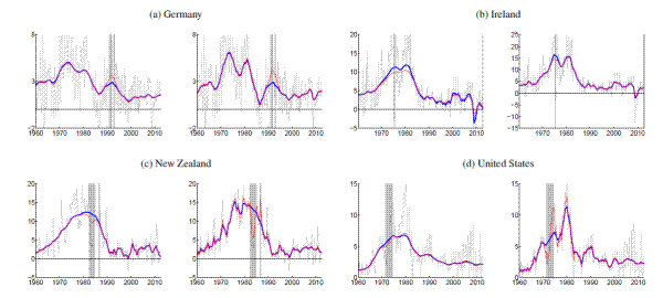
Figure 16a: Trend Estimates for MVSV Model
| Inflation Rates:Country | Inflation Rates:Headline CPI | Inflation Rates:Core CPI | Inflation Rates:GDP Deflator |
| AL: Australia | 1960Q1 | 1976Q3 | 1960Q1 |
| BE: Belgium | 1960Q1 | 1976Q1 | 1995Q1 |
| CA: Canada | 1960Q1 | 1961Q1 | 1961Q1 |
| FR: France | 1960Q1 | 1960Q1 | 1960Q1 |
| GE: Germany | 1960Q1 | 1962Q1 | 1970Q1 |
| IR: Ireland | 1960Q2 | 1976Q1 | 1997Q1 |
| IT: Italy | 1960Q1 | 1960Q1 | 1991Q1 |
| JA: Japan | 1960Q1 | 1970Q1 | 1994Q1 |
| NZ: New Zealand | 1960Q1 | 1969Q1 | 1988Q1 |
| SD: Sweden | 1960Q1 | 1970Q1 | 1993Q1 |
| SP: Spain | 1960Q1 | 1976Q1 | 2000Q1 |
| SZ: Switzerland | 1960Q1 | 1960Q1 | 1980Q1 |
| UK: United Kingdom | 1960Q1 | 1970Q1 | 1960Q1 |
| US: United States | 1960Q1 | 1960Q1 | 1960Q1 |
| Inflation Goals:Country | Inflation Goals:Inflation Goal | Inflation Goals:Dates |
| Australia | 2.0-3.0 | 1993Q2 :: Present |
| Canada | 2.0 | 1991Q1 :: Present |
| Eurozone* | 2.0 | 1998Q2 :: Present |
| New Zealand | 3.0-5.0 | 1990Q1 :: 1990Q4 |
| New Zealand | 1.5-3.5 | 1991Q1 :: 1991Q4 |
| New Zealand | 0.0-2.0 | 1992Q1 :: 1996Q4 |
| New Zealand | 0.0-3.0 | 1997Q1 :: 2001Q4 |
| New Zealand | 1.0-3.0 | 2002Q1 :: Present |
| Spain | 3.0 | 1994Q4 :: 1998Q4 |
| Sweden | 2.0 ±1 | 1993Q1 :: Present |
| Switzerland | 2003Q3 :: Present | |
| United Kingdom | 1.0 -4.0 | 1992Q4 :: 1995Q1 |
| United Kingdom | 2.5 | 1995Q2 ::2003Q3 |
| United Kingdom | 2.0 | 2003Q4 :: Present |
| Inflation Rates: Country | Inflation Rates: Date | Inflation Rates: Event |
| Australia | 1975Q3 | Universal health insurance |
| Australia | 1975Q4 | Sales tax increase |
| Australia | 1976Q4 | Universal health insurance |
| Australia | 1984Q1 | Medicare introduction |
| Australia | 2000Q3 | GST introduction |
| Canada | 1991Q1 | GST introduction |
| Canada | 1994Q1-1994Q2 | Cigarette tax change |
| Germany | 1991Q1-1991Q4 | Reunification |
| Germany | 1993Q1 | VAT increase |
| Ireland | 1975Q3 | Indirect tax cut |
| Japan | 1997Q2 | Consumption tax increase |
| New Zealand | 1982Q3-1984Q3 | Price controls |
| New Zealand | 1986Q4 | GST introduction |
| Sweden | 1990Q1 | VAT increase |
| Sweden | 1991Q1 | VAT increase |
| United Kingdom | 1972Q4-1974Q2 | Price Controls |
| United Kingdom | 1979Q3 | Indirect tax increase |
| United Kingdom | 1990Q2 | Poll tax Introduction |
| United States | 1971Q3-1974Q2 | Nixon price controls |