
Board of Governors of the Federal Reserve System
International Finance Discussion Papers
Number 1037, November 2011 --- Screen Reader
Version*
Are Recoveries from Banking and Financial Crises Really So Different?
NOTE: International Finance Discussion Papers are preliminary materials circulated to stimulate discussion and critical comment. References in publications to International Finance Discussion Papers (other than an acknowledgment that the writer has had access to unpublished material) should be cleared with the author or authors. Recent IFDPs are available on the Web at http://www.federalreserve.gov/pubs/ifdp/. This paper can be downloaded without charge from the Social Science Research Network electronic library at http://www.ssrn.com/.
Abstract:
This paper studies the behavior of recoveries from recessions across 59 advanced and emerging market economies over the past 40 years. Focusing specifically on the performance of output after the recession trough, we find little or no difference in the pace of output growth across types of recessions. In particular, banking and financial crisis do not affect the strength of the economic rebound, although these recessions are more severe, implying a sizable output loss. However, recovery does change with some characteristics of recession. Recoveries tend to be faster following deeper recessions, especially in emerging markets, and tend to be slower following long recessions. Most recessions are associated with a slowing, if not outright decline in house prices, but recessions with large declines in house prices also tend to have slower recoveries. Long recessions and those associated with poor housing-market outcomes can lead to sustained output losses relative to pre-crisis trends. Consistent with microeconomic studies showing permanent income loss to job-losing workers during recessions, we find that the sustained deviation in output from trend is associated with a reduction in labor input, especially linked to declines in employment and labor-force participation following recessions. On net, our results imply that the output/employment gap following a severe, long recessions is considerably smaller than is typically assumed by standard macro models, which in turn may have substantial implications for macroeconomic policy during recoveries.
Keywords: International, business cycles, recoveries, labor market, potential output, United States
JEL classification: E32 , E20, F44
More than two years after the date the NBER set for the end of the U.S. recession, U.S. employment growth remains sluggish, the housing market is moribund, and GDP has barely exceeded its pre-recession peak. Thus, attention is increasingly focusing on the determinants and characteristics of recoveries. Although research on the causes and types of recessions is legion, there has been surprisingly little academic work that concentrates on recoveries.1 That said, two stylized facts have been frequently cited in the current policy discussion. The first is that recoveries from banking and financial crises are typically slow, reflecting impaired financial intermediation and the need for structural adjustment (see Cerra and Saxena (2008) and Reinhart and Reinhart (2010)). The second is that the rate of growth following deep recessions is typically faster than average, given pent-up demand and large stocks of underutilized labor and capital. As the Great Recession was both a banking and financial crisis and associated with a deep decline in output, these stylized facts imply different trajectories for output growth in this recovery.
To address this uncertainty and to gain greater insight into the nature of recoveries, defined as output growth following recession troughs, we examine quarterly data on GDP over the past 40 years for almost 60 countries, split roughly evenly between the advanced and the emerging market economies, resulting in observations on 271 recessions. Classifying recessions according to whether or not they included a banking or financial (B&F) crisis we find, in contrast to earlier work, that there is little distinction in the pace of recovery across recession types. Although recessions associated with B&F crises are typically more severe, the subsequent recoveries are not particularly unusual. Earlier work, finding the opposite, does so because it characterizes the pace of recoveries by averaging growth starting from the pre-recession cyclical peak rather than the recession trough, thus confounding the strength of the recession with the behavior of the recovery.
We do, however, find that, independent of whether a recession is associated with a banking or financial crisis, the depth and duration of the recession do have some predictive power for the pace of recoveries. Deeper recessions are associated with slightly stronger growth during the first three years of recovery. Recessions of greater duration are linked to slower post-trough performance. Also, recessions with large house price declines--a common but not omnipresent feature of long recessions--tend to recover slower than other recessions.
Because banking and financial crises are often both deep and long, these effects on the pace of recovery balance out, leading post-trough growth to be about average and implying that output declines during such severe recessions are not made up quickly. We confirm and extend earlier work showing that severe recessions are associated with sustained negative gaps in the level of output from pre-crisis trend and show that these gaps are attributable to reductions in the utilization of labor - particularly through employment and labor force participation rates.
Until recently in the United States, GDP growth was about on pace with the average recovery in the advanced economies. However, recently the path of output has veered below the average recovery and is well below what would be predicted given the depth and duration of the Great Recession. However, once the impact of the severe decline in housing prices is accounted for, the recovery becomes less surprising. In addition, the composition of the recovery has been unusual.2 Exports and non-residential investment have outperformed the median recovery so far, but consumption, housing, and employment have languished. Looking more closely at these components, we find surprising strength in consumption of goods, in particular large durable goods such as cars and household furniture which one might think would be particularly restrained in this recovery. On the other hand, services consumption in almost every category is weaker than ever before in a post-war U.S. recovery. Likewise, even compared with other "jobless" recoveries, the weakness in employment is omnipresent and extreme.
Following this introduction, section II of the paper describes the dataset and recession classification system used. Section III presents our results, provides robustness checks, and contrasts our work with previous findings. Section IV focuses on characterizing and comparing the current U.S. recovery with past U.S. experience. Section V concludes.
II. Data and Methodology
For our cross-country comparisons, our database contains an unbalanced panel of quarterly GDP data for 59 countries - 26 advanced economies (AEs) and 33 emerging market economies (EMEs) - from 1970 (or whenever we begin to have quarterly GDP data) to present. Most data are from national sources, and a full list of countries can be found in appendix A. For comparability across countries, recessions are classified as two consecutive quarters of negative GDP growth. If a single quarter of positive growth occurs surrounded by a recession on either side, it is included in the recession. The pre-recession peak is defined as the last quarter before the beginning of a recession while the recession trough is the last quarter of the recession. As will be discussed further, we check the robustness of our results using a variety of other recession-dating methodologies found in the literature including the Bry-Boschen procedure for quarterly data (henceforth called the BBQ method) as described by Harding and Pagan (2002).3
Using our definition of recession, our sample contains 271 recessions; 137 occurring in the advanced economies and 134 in the emerging market economies (table 1). If the Great Recession is excluded, the sample of recessions is reduced to 224 episodes (116 AE and 108 EME). The greater number of AE recessions reflects the fact that quarterly GDP data are available for those countries earlier than for most of the EMEs. (See appendix B for data range for each country in our sample.)
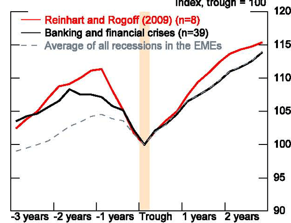
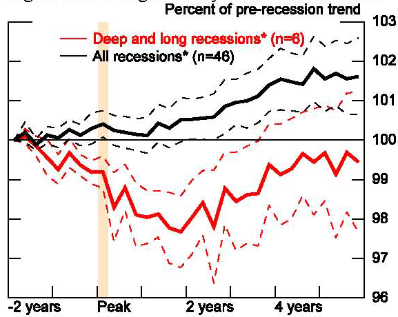
In our analysis, we divide our sample by the type of economy - emerging market or advanced - and by type of recession. For comparability with earlier work, we match up the list of banking and financial crises found in IMF work by Laeven and Valencia (2008) with the list of recessions from the above procedure to identify if the downturn coincides with a currency, banking, or debt crisis.4 Laeven and Valencia identify crises in the year of occurrence. For each recession, if a crisis occurred in a year during which the recession began or was ongoing, or if the recession began in the first or second quarter of a year immediately following a crisis, it was classified as being related to that crisis. Using this method, we identify 8 recessions in the advanced economies and 39 recessions in the emerging economies as being related to a crisis.
We also classify housing price slumps for a smaller sample of OECD countries for which we have a long time series of quarterly data on house prices. For these countries, we identify cycles in real house prices. Because the housing market is highly cyclical, most recessions are associated with periods of real house price decline. We identify periods of severe housing market stress as those associated with declines in real house prices above the median. We identify 35 recessions associated with severe housing slumps in the advanced economies. A list of countries, recession dates, and recession types is found in appendix A.
As with other work in this area, much of our analysis will be in the form of butterfly charts, allowing us to compare the behavior of output around cyclical downturns across numerous recessions and countries. In our case, however, instead of indexing the output series for each recession to be 100 at the pre-recession peak, we index the level of GDP to 100 at the date of the recession trough. This allows us to isolate the trajectory of the recovery, which is the key focus of our paper. We typically look at the 12 quarters before and after the trough. Because we have observations on so many recessions, it is not informative to chart individual recessions for most of our analysis. To summarize the cross-country experience, we calculate the mean value of output at each quarter across recession observations to construct the average path of GDP before and after the trough. Our results are not qualitatively different if medians are constructed. Using means allows us to create standard error bands around our average output paths.
III. Results
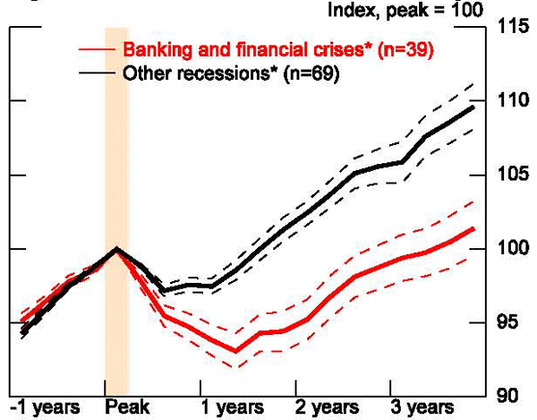
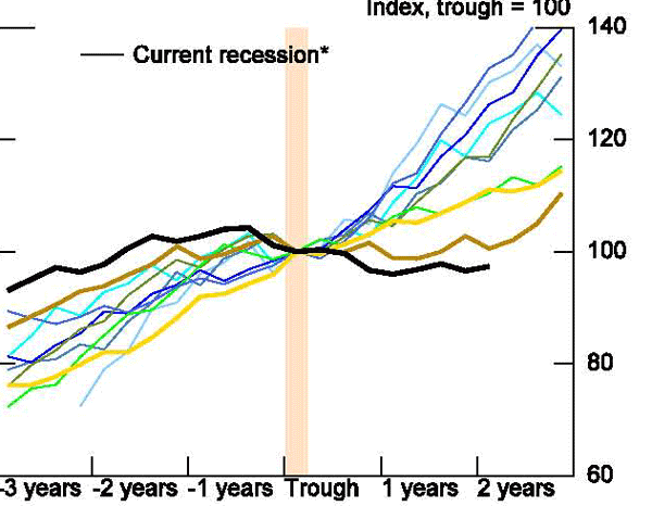
A. Banking and Financial Crises
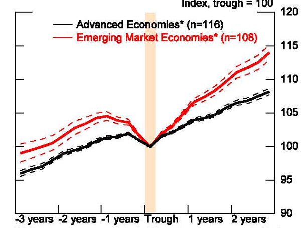
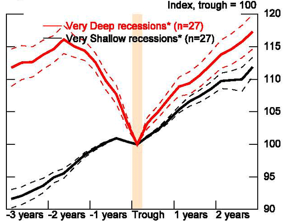
As a first look, we construct the average path of GDP around recession troughs for our entire sample, excluding the Great Recession (figure 1). On average in a recession in our sample, output falls 4½ percent from the pre-recession peak to the trough.5 GDP then rises at an average annual pace of 3¾ percent for the next three years, putting the level of output roughly 12 percent higher than at the trough. Splitting the sample between advanced economies and emerging market economies (figure 2), shows, not surprisingly, that the EMEs have more extreme cycles, both in terms of the severity of recessions and the rapidity of recoveries. For the average EME recession, output falls 6½ percent from peak to trough, compared to 2½ percent for the AEs. And the average annual pace of EME recovery is 5 percent over the three years following the trough, almost 2 percentage points faster than that in the AEs, leaving the level of output in the EMEs about 6 percentage points higher than that in the advanced economies.
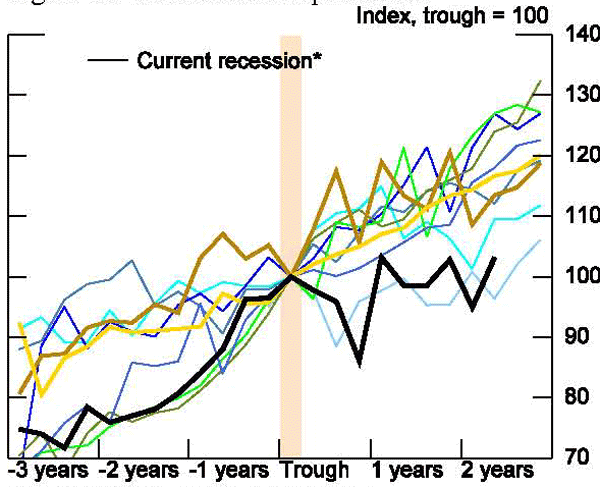
As mentioned earlier, we have classified recessions by type, depending on whether they were associated with banking and financial crises. Over our sample, excluding the current recession, 8 advanced economies have experienced B&F crises out of a sample of 116 - or roughly 6½ percent of all AE recessions.6 The frequency of banking and financial crises is a much higher 36 percent (or 39 out of 108) for the emerging market economies. Because of this, and the more pronounced behavior of output around EME recessions, we separate our sample into advanced and emerging market economies throughout the paper so country composition does not distort our conclusions.
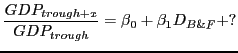
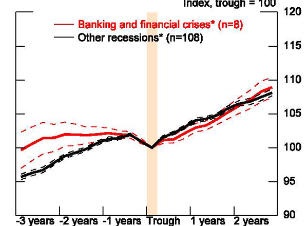
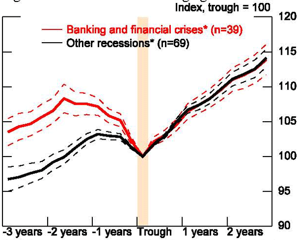
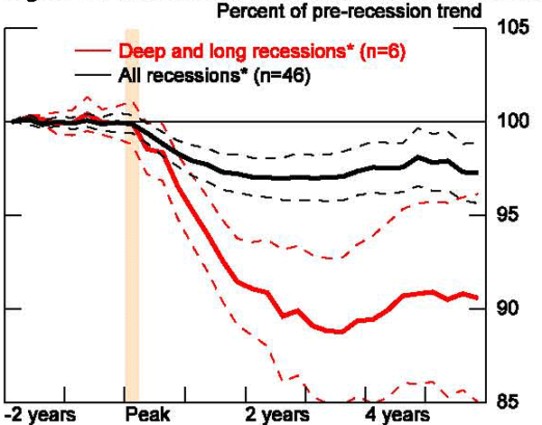
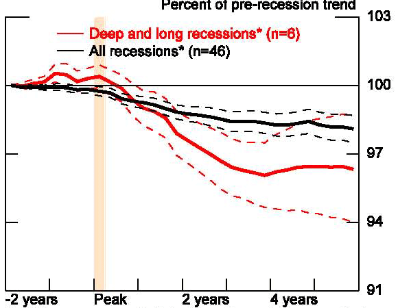
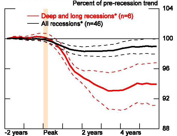
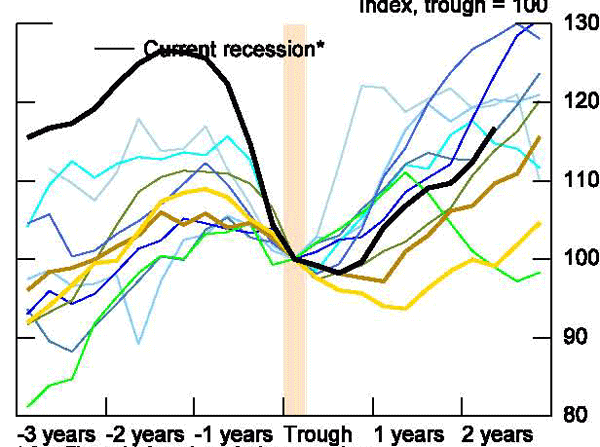
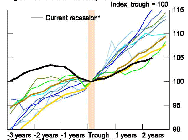
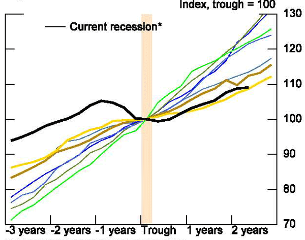
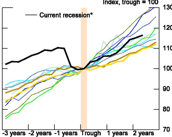
As seen in figures 3 and 4, the pace of output growth upon exiting a recession, shown in the region to the right of the recession trough, is remarkably similar for both the advanced and emerging economies. Recoveries from banking and financial crises appear identical in pace to recoveries from other types of recessions. Table 2 presents the results of regressions of the level of GDP one, two, and three years after the trough on a constant and a dummy for whether the crisis was associated with a banking and financial crisis. For both the advanced economies and the emerging markets, the coefficient on banking and financial crises comes in highly insignificant. There appears to be little evidence that the pace of output differs in recovery depending on whether the recession is related to a banking and financial crisis.
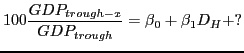
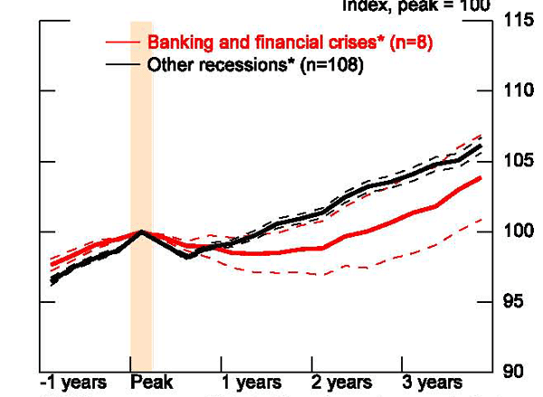
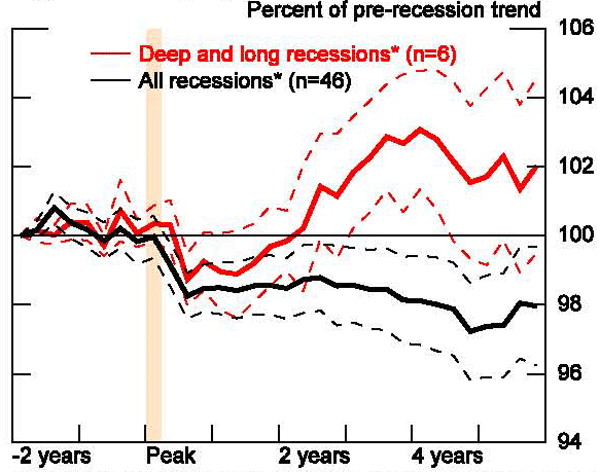
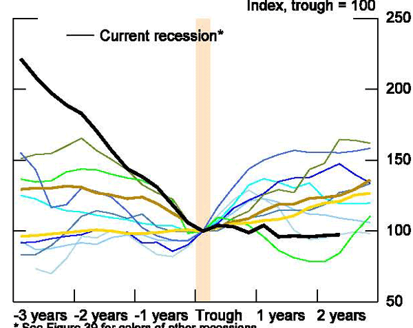
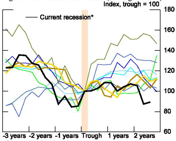
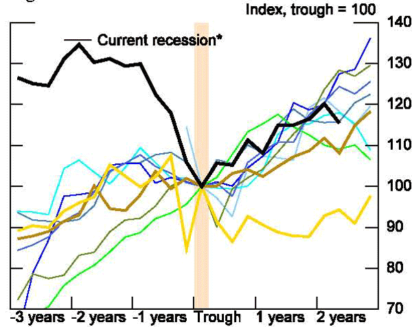
This result is surprising given the stylized fact and the standard interpretation of the previous empirical work (Reinhart and Reinhart, 2010; Reinhart and Rogoff, 2009; Claessens et al., 2008 and Terrones et al, IMF WEO, 2009) that finds that recoveries from banking crises are slow.7 A key reason for the divergence in results is that earlier analysis has indexed the level of GDP to the pre-recession peak, rather than the trough. As can be seen in figures 3 and 4, there are significant differences in the severity of recessions associated with B&F crises. The red lines in the region to the left of the trough are all higher and fall more sharply. Indeed, running similar regressions on the level of GDP one, two, and three years prior to the trough show that the coefficient on banking and financial crises is large and significantly positive in most cases - indicating a sharper decline during the recession for B&F crises (table 3). Indexing to the peak confounds the strength of the recession and the behavior of the recovery, as can be seen when we re-index our data to the pre-recession peak (figures 5 and 6). Our results are consistent with findings that banking and financial crises are associated with greater declines in output and slower returns to pre-crises levels or trends, but this is because the recessions were deeper rather than because of disparities in the pace of recovery.
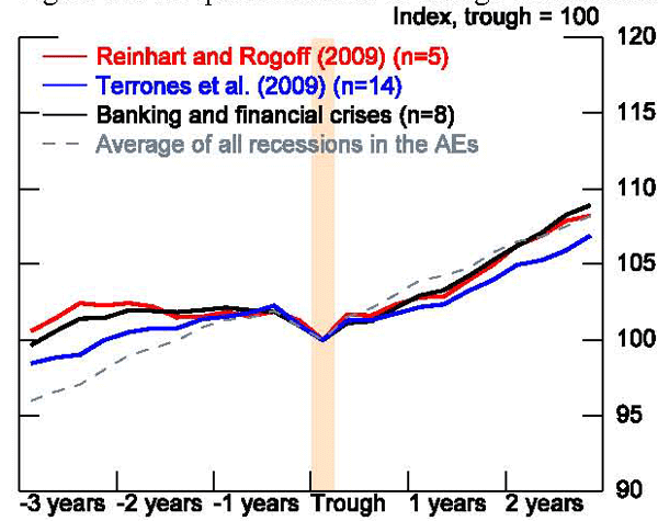
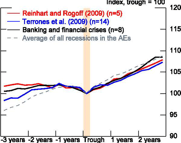
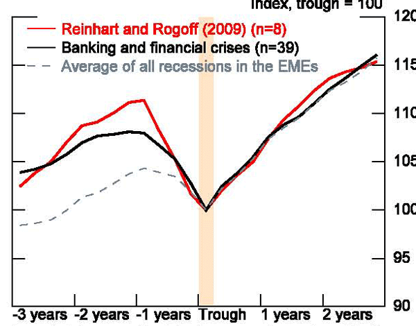
To confirm that indexing is central to our differences with the previous literature, we also ran robustness tests using the alternative methods of dating recessions and country samples for the AEs used in earlier work. Figures 7 and 8, display the output paths around the trough for the various samples of AE countries experiencing B&F crises found in Reinhart and Rogoff or Terrones et al. for both the two-quarter and the BBQ method of dating recessions. For the Reinhart and Rogoff recessions (excluding the Great Depression), the average path of GDP after a recession for B&F crises follows closely or is even stronger than our own, while the Terrones sample is just a touch weaker. To a first order, differences in recession classification and country sampling do not appear to alter our results. Figures 9 and 10 present similar results for the emerging economies, though only for Reinhart and Rogoff, as Terrones et al. does not cover emerging economies.8
B. Housing Slowdowns
Given the collapse in housing markets in a number of countries during the recent recession, we also looked at historical experiences with recoveries associated with severe slumps in housing markets. Our analysis is limited to the 18 advanced economies for which we could obtain reasonable historical data on housing markets and we define housing slumps simply in terms of changes in real house prices using quarterly OECD data starting in 1970.
The quarterly house price data are volatile, so to define a housing price slump we smooth each country's data using an HP filter with the low parameter of 100 and then look for local maxima and minima in the smoothed series. Returning to the unsmoothed data with the dates of the local peaks and troughs, we calculate the duration and depth of house price declines across the sample. Our methodology identifies 57 periods of house price declines, covering a significant portion of countries and time periods (occasionally across multiple recessions). For the United States (figure 11), this process identified four periods of real house price decline: the mid-1970s, the early 1980s, a brief period around 1990, and the most recent downturn. To classify a severe housing slump, we pick only the more sizable declines, those above the median. (For the United States, only the current housing slump would be classified as severe.) In these cases, the decline in real house prices is greater than 19 percent. They last for an average of 6½ years and fall an average of 33 percent.
Our paper focuses on the cyclicality of GDP, not real house prices, so our final step is matching housing slumps to recessions. We do this simply: if any quarter of the recession overlaps with any quarter of the housing slump, we classify the recession as associated with a severe housing slump. There are 35 such recessions.
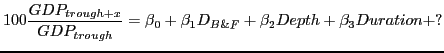
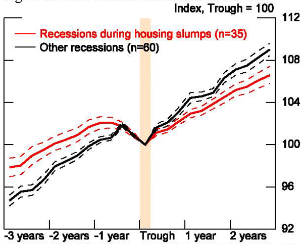
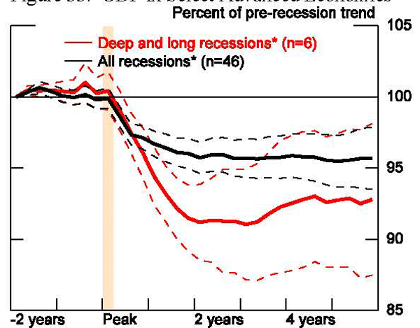
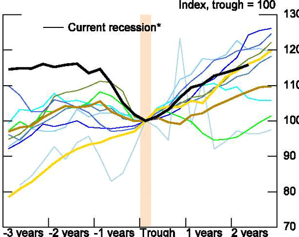
Dividing the OECD sample into recessions associated with severe housing slumps and those without reveals some interesting patterns. In particular, as shown in figure 12, housing-slump recessions tend to be longer and deeper and recoveries from these recessions are significantly slower. Table 4 runs a simple regression showing similar results.
C. Depth and Duration
Our result that the pace of growth after the trough of recessions associated with financial crises are similar to other recessions is somewhat surprising and leads to questions about what we know about recoveries following severe recessions more generally. In particular, how accurate is the second stylized fact that deep recessions are associated with faster bouncebacks? To address the questions, we characterize all recessions in terms of their depth - the decline in the level of GDP from peak to trough - and duration - the number of quarters from peak to trough. Figures 13 and 14 present histograms of the depth of the recessions in our sample for the advanced and emerging market economies, along with selected summary statistics, excluding the Great Recession. As mentioned above, the average decline in output for the AEs is 2.6 percent, with 12 percent of recessions associated with declines of more than 5 percent. The right tail is even more elongated for the EMEs, with the average decline being 6.4 percent, but 17 percent of the sample seeing output loss of 10 percent or greater. Figures 15 and 16 present the same analysis for recession duration. Not surprisingly, for both sets of countries, there is a mass of recessions lasting 2 quarters (the duration of output decline that defines a recession in our work). For the advanced economies, the average recession length is about 3 quarters with almost 30 percent of the sample experiencing output declines for a year or more. For the EMEs, the duration is more extreme. The average EME recession lasts a year, and 45 percent of recessions last more than a year with one, that for post-Soviet Russia, of almost 6 years.
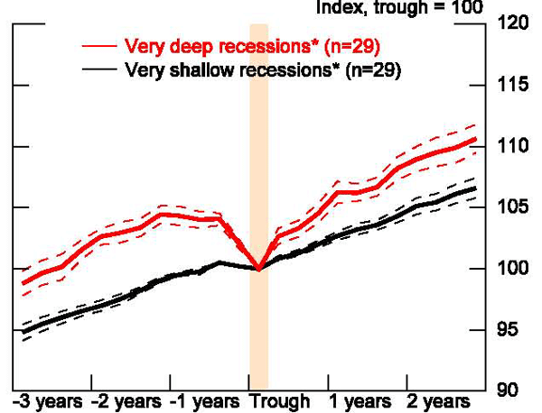
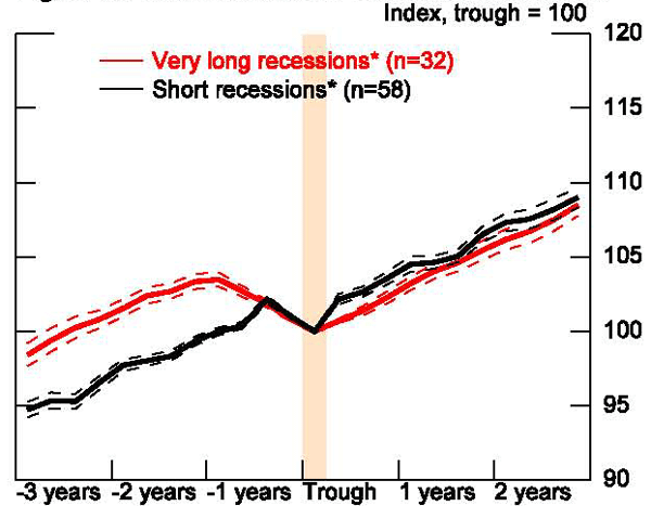
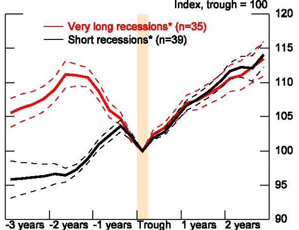
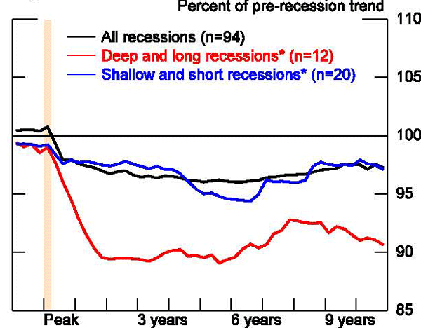
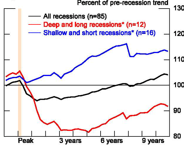
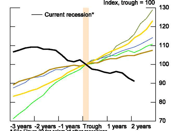
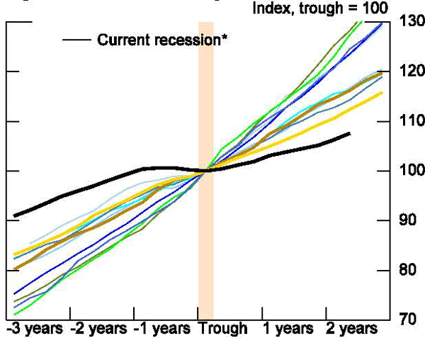
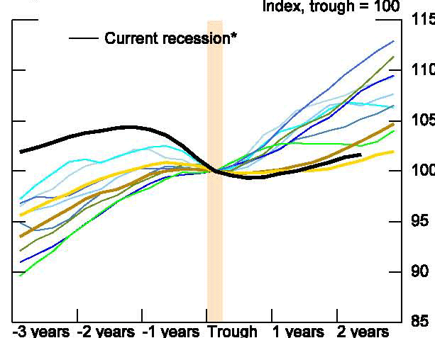
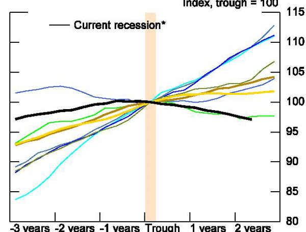
In Figures 17 through 20, we construct butterfly charts around the trough for recessions that are above the top 25th percentile in depth and duration and below the bottom 25th percentile for the AFEs and EMEs. In terms of recession depth, the charts certainly suggest that deeper recessions are associated with sharper bouncebacks than shallower recessions for both types of countries. The average level of output is 5 percent higher three years after a deep recession in the AEs and the EMEs. The results are different for long recessions. Here the average recovery appears slightly weaker following long recessions in the advanced economies, especially in the first few years. For the EMEs, there appears little difference between recoveries following long recessions than those following short recessions.
To provide a bit more rigorous look at this, table 5 presents the results of regressions of the level of GDP in the advanced economies one, two, and three years following a recession trough on the depth and duration of the recession, a dummy for whether the recession is associated with a banking or financial crisis, and a constant. Unlike with banking and financial crises, both depth and duration significantly affect the path of recovery, particularly in the first year. For example, for every 1 percentage point increase in recession depth, the level of output one year after the trough is a little over ½ percentage point greater. In contrast, a recession that is 1 quarter longer is associated with a similar-sized reduction in the pace of recovery. Over time, the drag from a longer recession appears to dissipate while the level of output is still roughly ½ percentage point higher following deep recessions. The results are even stronger for regressions on EME recessions (table 6). For these economies, a quarter longer recession is associated with a 1 percentage point lower level in output a year after the trough and 1½ percentage point lower level in output three years later. In contrast, a 1 percentage point greater decline in the level of output during the recession is associated with a ½ percentage point higher level of output rising to ¾ percentage point greater level by year three of the recovery. In all three versions, the coefficients on length and depth come in statistically significantly and with opposite signs.
In the previous literature, financial and banking crises have been linked to severe recessions - implying both deeper and longer downturns - which may explain why we are failing to get statistically significant effects of banking and financial crises - these impacts may be cancelling each other out. To check this, we take a closer look at the relationship between banking and financial crises and severity of recessions. Figures 21 and 22 present scatterplots of the depth and duration of recessions, again dividing countries by whether they are considered advanced or emerging market economies. Individual banking and financial crises are represented by the yellow dots and all other recessions are captured by the black dots. The vertical and horizontal lines represent the average duration and depth of recessions, respectively--yellow lines capturing the averages for banking and financial crises and black lines the average duration and depth for all other recessions. What was somewhat surprising to us is that banking and financial crises are not universally longer and deeper. Judging by the distance between the yellow and black lines, for the AEs, B&F crises tend to be longer but not much deeper than all other types of recessions. The reverse is true for the EMEs. For these economies, B&F recessions are associated with deeper but not much longer recessions. Table 7 details the summary statistics behind these charts. Prior to the Great Recession, the correlation between length and depth was .36 for the AEs and a much stronger .67 for EMEs.
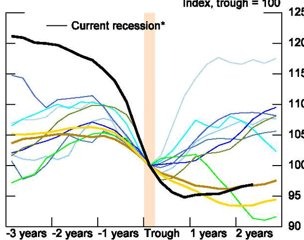
D. Implications
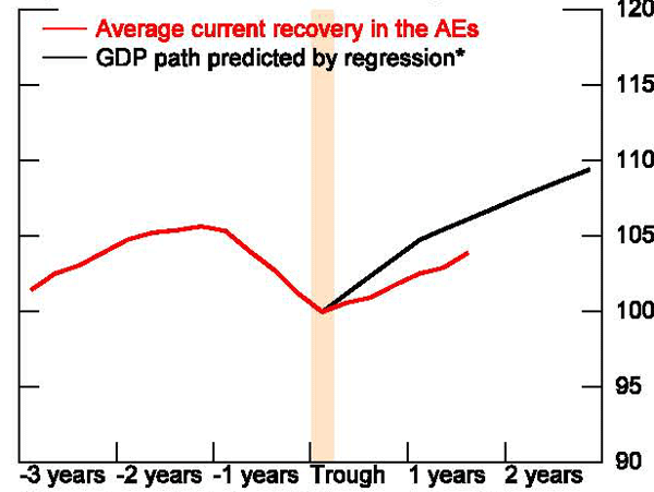
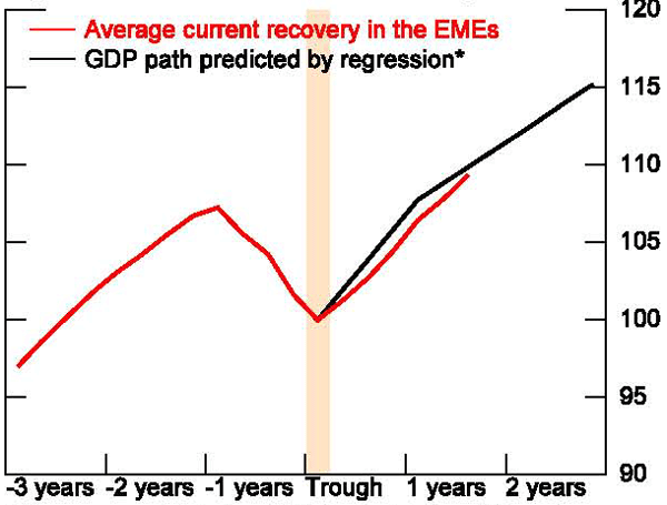
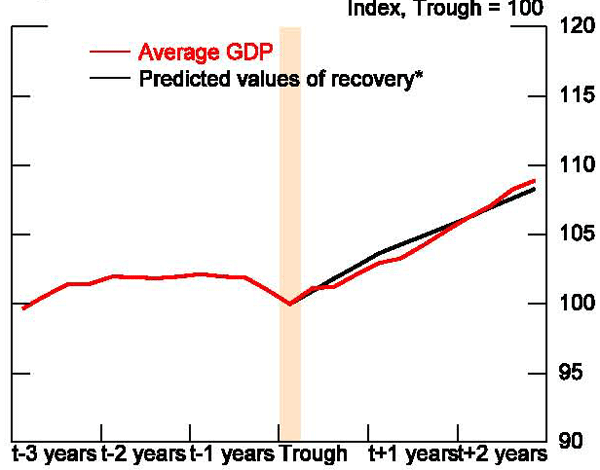
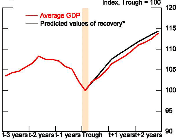
What do our results imply should be the pace of the current recovery? To show this, we use the coefficients from our three regressions above to predict the pace of recovery at 4, 8, and 12 quarters past the trough based on observed depth and duration in the current recession9. Figures 23 through 24 illustrate the results of this exercise. The solid black line represents the pace of recovery predicted for all AEs and EMEs, respectively, given the average depth and duration of the Great Recession and the red line represents the path of actual average AE or EME GDP in the current recovery. The pace of recovery in the AEs appears to be underperforming while that in the EMEs seems right on track.
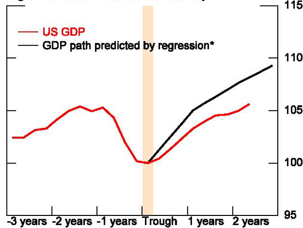
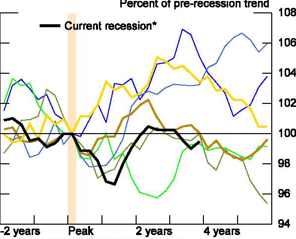
Turning to the United States, figure 25 compares the current U.S. recovery to past recoveries in the advanced economies. Although the U.S. Great Recession was longer and deeper than almost all previous U.S. and advanced economy recessions and was accompanied by extreme financial disruptions, the U.S. recovery aligned well with average AE recoveries until the first half of 2011 when the pace of recovery slowed sharply. However, figure 26 shows that the actual path of recovery is well below what would be predicted by our simple model of depth and duration, suggesting other factors, possibly related to the financial crisis, may be at play this time around.10 One could ask if generalization from overall AE experience to the U.S. economy is appropriate given its relatively high average growth rate and greater flexibility. In simple tests, however, we were unable to find compelling evidence that U.S. recoveries are typically faster than AE recoveries in general (tables 8 and 9).
E. Permanent Versus Transitory, or Does the Economy Ever Actually "Recover"
Despite the differences in recovery rates we have highlighted above for recessions that are long or deep, recovery rates across recessions are still quite similar. This implies that long and deep recessions are associated with large and sustained losses to output. In particular, the economy will not return to its long-term trend, implying a persistent gap between the pre-crisis trend and the post-crisis level of output. This result is consistent with Cerra and Saxena (2008) which finds that large output losses associated with financial crises are highly persistent.
Our work also suggests that large declines in output over long periods of time can have more permanent effects on the level of output. For example, using the regression results for the advanced economies, the pace of recovery is the same after a recession of 2 quarters duration that results in a 2 percent decline in output and one of twice that length and duration - suggesting a greater potential permanent loss in output from the more severe recession.
To press this result further, we conduct a series of exercises to test whether output returns to pre-recession trend levels. To do this, we face both a conceptual and a practical challenge. Often, macroeconomic data are detrended using HP or Kalman filters. Both of these techniques are two-sided moving average filters. This implies that the view of the past changes as the data evolves. In particular, and of great importance here, these detrending tools cannot accommodate a permanent deviation from trend. For this reason, we choose to use a simple exponential trend which can accommodate such long-lasting deviations. Even with this methodology, determining the appropriate pre-recession trend is somewhat tricky, to the extent that banking and financial crises are associated with bubbles or positive deviations from trend prior to the crisis. To avoid including the bubble in our trend, we calculate the four-year average growth rate for each country, two years prior to the peak, thus excluding the often rapid period of growth before the crisis. (The results are similar using average growth calculated over different pre-peak intervals.)
Having calculated a pre-recession trend, we then examine GDP as a percentage of this trend (figures 27 and 28) for the average recession and from particularly mild and severe recessions. Average GDP in the advanced economies never recovers to trend, even for short and shallow recessions. However, the average recession in the emerging economies does return to trend, and exceeds trend for short and shallow recessions. But, as for the AE recessions, for deep and long EME receesions, GDP does not drift back toward 100 percent of the pre-crisis trend, even after 10 years. For both AEs and EMEs, deep and long recessions lead to a sustained loss from pre-recession trend of about 8 to 10 percent after 10 years. While varying the specification of our regressions or the definition of pre-crisis trend can modify these loss estimates, these exercises all suggest a more sustained hit to output from severe recessions.
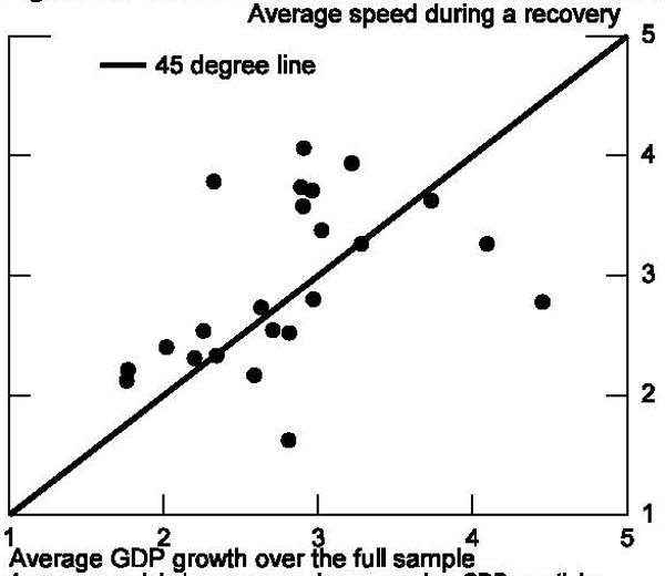
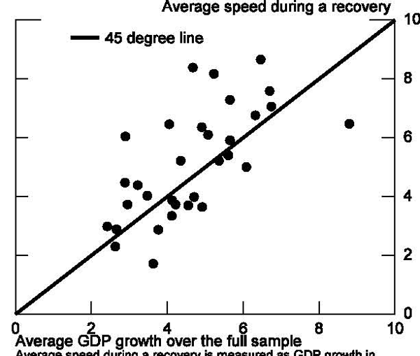
Another way of testing if GDP returns to its pre-crisis trend is to evaluate whether growth rates immediately after recessions differ from long-run average growth. We have examined this, first, by constructing scatterplots for the AE and EME countries of average growth over the sample for each country and average pace of growth three years after a recession trough (figures 29 and 30). If growth in recoveries proceeds at about average pace, then the points should line up close to the 45 degree line, indicating no quick return to pre-recession trend levels. In these charts, average growth seems very close to the pace of growth during recoveries. We also include a variable in our depth and duration regression to capture average pre-recession growth. It is possible that countries with faster trend growth experience faster growth coming out of recoveries. If these countries are also associated with greater propensity (or less) to experience banking and financial crises, then our estimates of post-trough growth may be biased. As seen in in table 10, pre-crises growth rates come in statistically insignificant - suggesting the average pace of growth prior to the recession does not affect the post-recession recovery rate.
Shifting back to our comparison with Cerra and Saxena, they find that B&F crises lead to permanent losses in output. Given our results on depth and duration, one might ask whether their result is purely a reflection of the depth and duration of the downturns associated with financial crises or is there something special about financial crises above and beyond the contour of the downturn which leads to permanently lower output? There are differences in methodology and data between the two studies - Cerra and Saxena restrict their analysis to the initial shock stemming from the first year of a banking crisis, focus solely on banking crises (treating currency and debt crises as separate), use simulations from VAR analysis to estimate the impact of banking crises, and compare banking crises to non-crisis growth performance whereas we draw comparisons to other recessions. Despite these differences, we can shed some light on this question.
Using the sample of non-crisis recessions, we regress the level of post-trough GDP on the depth and duration of the crisis, similar to table 5, but with a sample restricted to non-crisis recessions and of course without the B&F crisis explanatory variable. This gives us a prediction for the recovery given a recession of a certain depth and duration. We use the model to create a prediction for a recovery after a non-B&F related recession that has the same depth and duration of an average B&F crisis. Finally, we compare the prediction to the average of actual outcomes of B&F crises. Figures 31 and 32 show that the average recovery and the prediction are almost identical. There appears to be nothing inherently special about banking and financial crises that creates more of an output loss than similarly sized recessions unassociated with crises. Combining this simple experiment with our earlier results, we conclude that any recession of similar magnitude to a B&F crisis may lead to sustained losses in the level of output.
F. A Simple Look at What Doesn't Recover
Our work above suggests that the level of GDP, particularly after long and deep recessions, does not recover to its pre-crisis trend even five years after the start of a recession, thus it is important to understand what is driving this sustained output loss. In general, even for the advanced economies, it is a challenge to get comparable quarterly time series data across countries to allow a more granular look at post-recession behavior. One exception is a dataset developed by and detailed in Ohanian and Raffo (2011) which contains quarterly information on total hours, labor-force participation, employment, and average weekly hours for 15 OECD countries from 1960 to the 2010.11 With these data we can examine the broad supply-side components of output - total hours and output per hour - to see where the weakness in overall GDP lies following a recession. Figure 33 shows, for the smaller sample used here, the average behavior of the level of GDP as a percentage of pre-recession trend - divided into those that were particularly severe (in the top 25th percentile of depth and duration) and all others. In both cases, the level of output fails to return to the pre-recession trend, with the gap being particularly sizable (about 7½ percent) for severe recessions. Figures 34 and 35 break output down into total hours and output per hour for both sets of recessions. Interestingly, for typical recessions, the loss in output is a reflection of declines in both productivity and labor input. In contrast, for severe recessions, the sustained deviation in the level of output from trend is more than entirely accounted for by a loss in total hours - productivity actually increases relative to trend.
We next decompose total hours into labor-force participation, the employment rate, and average weekly hours (figure 36 through 38). Interestingly, whereas the workweek returns and even exceeds its pre-recession trend relatively quickly, employment and labor-force participation rates remain depressed - particularly after long and deep recessions. These results suggest the decline in output relative to pre-crisis trend, especially after severe recessions, is importantly concentrated in a reduction in the utilization of labor. For particularly bad recessions, the reduction in the employment and labor force participation rates is sustained even five years after the pre-recession peak.
IV. The Current U.S. Recovery in More Detail
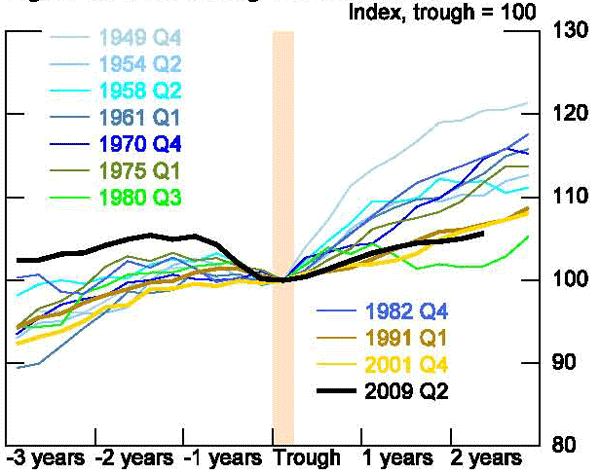
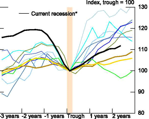
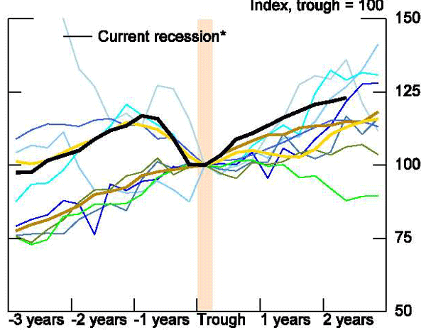
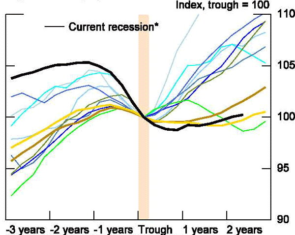
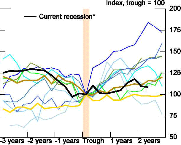
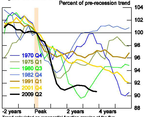
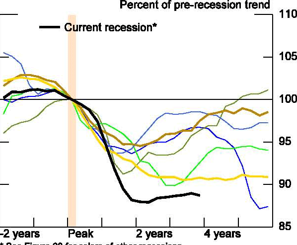
With the general knowledge of the features of recoveries in hand, we can now turn to characterizing the current U.S. recovery in more detail. The butterfly chart in figure 39 shows the evolution of U.S. GDP around the trough of every recession since 1947, separating the 1980s downturn into two recession periods.12 The thick black line denotes the current recession. Only the downturn in 1980 had a more sluggish pace of recovery two years after the trough.
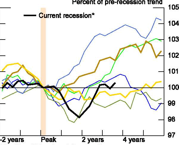
This anemic post-recession performance is not a reflection of weak outcomes in the manufacturing sector. After falling dramatically in the recent recession industrial production (figure 40) has since climbed at an about-average pace and real exports (figure 41) have surged nearly 25 percent. Non-residential investment (shown in figure 42) tells a similar story. The fall in investment was larger than in any previous recession, leaving a tremendous gap between the current level and the peak, but the pace of investment growth during the recovery has been on the high end of the more recent historical experiences.
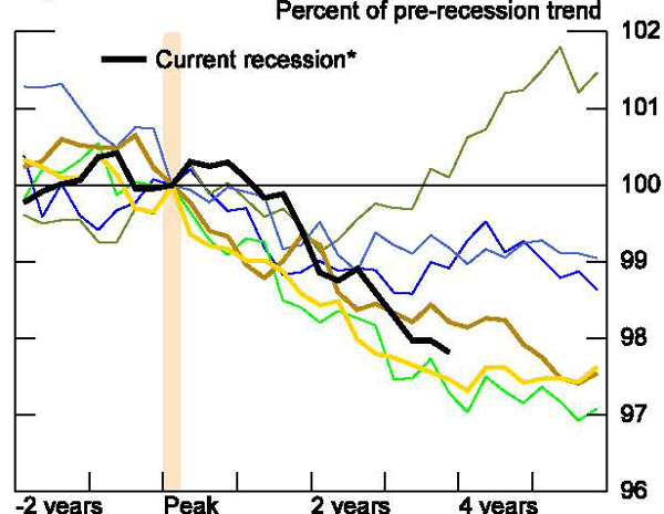
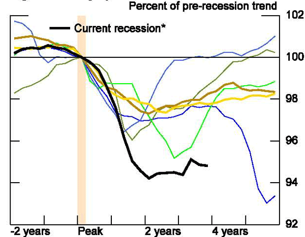
On the other hand, unusually poor recovery is evident in consumption and housing. The level of real private consumption (figure 43) has fallen behind every recession except the 1980 double dip. Residential investment remains below its level at the trough of the recession (figure 44) and house prices have underperformed all previous recoveries (figure 45).
A number of factors appear to be contributing to these areas. Credit growth, even outside of mortgage lending, has fallen further since the recession trough (figure 46) - undoubtedly reflecting tighter lending conditions but also weak demand. Consumer sentiment has also improved little over the past two years (figure 47) as income growth has been particularly slow (figure 48) and employment has languished (figure 49). Consumption performance has shown some variation - with goods consumption, especially for durables and motor vehicles, picking up at about on average pace (figures 50 to 52) but services consumption is markedly weaker than in previous recoveries (figure 53). Employment growth has been weak across the board but like consumption, relatively worse in in the services industries than the goods industries (figure 54 and 55). Also of note is the unusual behavior of state and local employment which was rising at a relatively slow pace prior to the recession and has shown declines matched only by the recession in 1980, with little hope of improvement going forward (figure 56).
The policy response in this recovery has been mixed. Monetary policy, even excluding long-term asset purchases and other non-traditional programs, has been larger than in most previous recoveries with the real federal funds rate (figure 57) remaining in negative territory two years after the recession trough. In contrast, government expenditures (figure 58), which had risen sharply during the recession, has leveled off noticeably since then especially compared with earlier recoveries. Further, although revenue fell more than in other recessions, the revenue growth following the recession is on the high end of previous recoveries (figure 59).
Finally, we apply similar supply-side analysis to the United States as above to the OECD countries.13 Re-indexing to the peak and taking deviations from a simple exponential pre-recession trend, shows that 2½ years after the recession trough the level of output in the United States is strikingly below trend (figure 60). This gap is driven entirely by a lack of hours (figure 61), as labor productivity has returned to trend (figure 62). As with the OECD results more generally, this hours gap reflects a downshift in labor force participation and employment rather than the workweek (figure 63 to 65).
V. Conclusion
We take away several key points from our work on recoveries. First, whether a recession is associated with a banking or financial crisis does not have a statistically significant effect on the pace of growth following recession troughs. This result surprised us and raises questions for future research about the exact channels through which banking and financial crises affect growth. In comparison, as might be expected, recoveries from recessions associated with severe housing downturns are found to be slower.
Second, the depth and duration of a recession does matter for recovery speed. Deeper recessions are associated with faster post-trough recoveries, in line with the view that pent-up demand and underutilized resources can contribute to a sharp snapback. In contrast, longer recessions are associated with slower post-trough growth, possibly reflecting skill and capital deterioration as recessions drag on. Banking and financial crises are associated with more severe recessions - deeper in the case of emerging market economies and longer in the case of the advanced economies - but do not appear to impose additional restraint to recoveries beyond the depth and duration. Currently, the emerging market economies are recovering as would be predicted given the depth and duration of their Great Recession experiences, but the advanced economies, including the United States, are lagging.
Third, we expand on earlier work in the literature that finds evidence that recessions, especially severe recessions, are associated with persistent negative deviations in the level of GDP from pre-crisis trend. This deviation appears to importantly reflect the lower utilization of labor, particularly a decline in employment and labor force participation rates from earlier trend levels. Going forward, it will be important to examine these results in line with what we know from the micro labor literature about skill deterioration, hysteresis, and long-term unemployment. Finally, we may need to reexamine the assumptions in many of our macro models that output levels eventually return to trend or reevaluate the concept of trend.
For the United States, the current recovery has been weaker than would have predicted based on the depth and duration of the recession alone. Without question, the labor market has performed particularly weakly - with especially tepid employment growth and a sharp decline in labor force participation. These developments raise questions about the financial and fiscal channels that affect labor demand and about the role of policy in the face of long and deep recessions.
References
Cerra, Valerie and Sweta Chaman Saxena, "Growth Dynamics: The Myth of Economic Recovery," American Economic Review, 2008, 98:1, p. 439-457.
Claessens, Stijn, M. Ayhan Kose, and Marco E. Terrones, "What Happens During Recessions, Crunches, and Busts?" IMF Working Paper, WP/08/274, December 2008.
Harding, Don and Adrian Pagan, "Dissecting the Cycle: a methodological investigation," Journal of Monetary Economics, 2002, vol 49, p 365-381.
Laeven, Luc and Fabian Valencia "Systemic Banking Crises: A New Database," IMF Working Paper, 08/224, November 2008.
Lopez-Salido, David and Edward Nelson, "Postwar Financial Crises and Economic Recoveries in the United States," mimeo, 2010.
Ohanian, Lee E and Andrea Raffo, "Hours Worked over the Business Cycles: Evidence from OECD Countries, 1960-2010," mimeo, 2011.
Romer, Christina and David Romer, "What Ends Recessions?" NBER Macroeconomics Annual, 1994, vol. 9, p13-80.
Reinhart, Carmen M. and Vincent R. Reinhart, "After the Fall" NBER Working Paper Series, Nuxmber 16334, September 2010.
Reinhart, Carmen M. and Kennth S. Rogoff, "The Aftermath of Financial Crises," NBER Working Paper Series, Number 14656, January 2009.
Terrones, Marco E., Alasdair Scott, Prakash Kannan, "From Recession to Recovery: How soon and how strong?" International Monetary Fund World Economic Outlook, April 2009, Chapter 3.
Table 1
| Total | Advanced Economies | Emerging Market Economies | |
|---|---|---|---|
| All Recessions | 271 | 137 | 134 |
| Excluding Great Recession of which... | 224 | 118 | 104 |
| Banking or Financial Crisis | 47 | 8 | 39 |
| Housing Related | -- | 35 | -- |
Table 2
| One year after: Coefficient | One year after: Std Error | Two years after: Coefficient | Two years after: Std Error | Three years after: Coefficient | Three years after: Std Error |
|---|---|---|---|---|---|---|
| Advanced Economies: B&F | -1.05 | 1.23 | -0.28 | 1.57 | 1.30 | 1.78 |
| Advanced Economies: Constant | 103.99 | 106.48 | 108.75 | |||
| Advanced Economies: R-squared | 0.00 | -0.01 | 0.00 | |||
| Emerging Economies: B&F | 0.17 | 1.09 | 0.20 | 1.85 | 1.25 | 2.58 |
| Emerging Economies: Constant | 106.78 | 110.90 | 114.51 | |||
| Emerging Economies: R-squared | -0.01 | -0.01 | -0.01 |
Table 2 is based on a simple linear regression of the form
where x is one, two, or three years, and ![]() is a dummy variable for whether the recession
was associated with a banking or financial crisis.
is a dummy variable for whether the recession
was associated with a banking or financial crisis.
A * indicates confidence at the 95 percent level, and a ** indicates confidence at a 99 percent level.
Table 3
| One year prior: Coefficient | One year prior: Std Error | Two years prior: Coefficient | Two years prior: Std Error | Three years prior: Coefficient | Three years prior: Std Error | ||||
|---|---|---|---|---|---|---|---|---|---|
| Advanced Economies: B&F | 0.84 | 1.11 | 3.20 * | 1.30 | 3.98 * | 1.67 | |||
| Advanced Economies: Constant | 101.28 | 98.76 | 95.67 | ||||||
| Advanced Economies: R-squared | 0.00 | 0.04 | 0.04 | ||||||
| Emerging Economies: B&F | 4.96 ** | 1.25 | 8.30 ** | 1.94 | 7.84 ** | 2/72 | |||
| Emerging Economies: Constant | 102.96 | 98.67 | 96.05 | ||||||
| Emerging Economies: R-squared | 0.08 | 0.11 | 0.05 | ||||||
Table 3 is based on a simple linear regression of the form
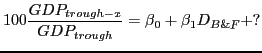
Table 4
| One year after: Coefficient | One year after: Std Error | Two years after: Coefficient | Two years after: Std Error | Three years after: Coefficient | Three years after: Std Error | |
|---|---|---|---|---|---|---|
| Advanced Economies: Housing | -1.57 * | 0.71 | -1.98 * | 0.83 | -1.32 | 0.95 |
| Advanced Economies: Constant | 104.52 | 107.15 | 109.20 | |||
| Advanced Economies: R-squared | 0.04 | 0.05 | 0.01 |
Table 4 is based on a simple linear regression of the form
where ![]() is a dummy variable for whether the
recession was associated with a housing slump.
is a dummy variable for whether the
recession was associated with a housing slump.
Table 5
| One year after: Coefficient | One year after: Std Error | Two years after: Coefficient | Two years after: Std Error | Three years after: Coefficient | Three years after: Std Error | |
|---|---|---|---|---|---|---|
| Advanced Economies: Depth | 0.64 ** | 0.11 | 0.61 ** | 0.15 | 0.42 ** | 0.18 |
| Advanced Economies: Duration | -0.62 ** | 0.20 | -0.52 | 0.27 | -0.19 | 0.32 |
| Advanced Economies: B&F | -0.40 | 1.17 | 0.18 | 1.58 | 1.27 | 1.87 |
| Advanced Economies: Constant | 104.20 | 106.45 | 108.23 | |||
| Advanced Economies: R-squared | 0.20 | 0.10 | 0.02 |
Tables 5 and 6 are based on a simple linear regression of the form
where Depth is a positive number measuring the fall in GDP during the recession as a percentage of peak GDP and Duration is the number of quarter from peak to trough.
Table 6
| One year after: Coefficient | One year after: Std Error | Two years after: Coefficient | Two years after: Std Error | Three years after: Coefficient | Three years after: Std Error | |
|---|---|---|---|---|---|---|
| Emerging Economies: Depth | 0.57 ** | 0.09 | 0.62 ** | 0.17 | 0.85 ** | 0.24 |
| Emerging Economies: Duration | -1.07 ** | 0.21 | -1.30 ** | 0.39 | -1.61 ** | 0.55 |
| Emerging Economies: B&F | -1.59 | 0.98 | -1.60 | 1.85 | -1.34 | 2.61 |
| Emerging Economies: Constant | 107.95 | 112.68 | 116.31 | |||
| Emerging Economies: R-squared | 0.19 | 0.11 | 0.07 |
Table 7a
| Depth: Mean (p=.26) | Depth: Std Dev (p=.26) | Duration: Mean (p=.00) | Duration: Std Dev (p=.00) | |
|---|---|---|---|---|
| Advanced Economies: B&F | 3.66 | 4.07 | 5.13 | 2.75 |
| Advanced Economies: Others | 2.58 | 2.49 | 2.97 | 1.36 |
Table 7b
| Depth: Mean (p=.00) | Depth: Std Dev (p=.00) | Duration: Mean (p=.20) | Duration: Std Dev (p=.20) | |
|---|---|---|---|---|
| Emerging Economies: B&F | 9.41 | 7.31 | 4.47 | 2.71 |
| Emerging Economies: Others | 4.92 | 5.94 | 3.71 | 2.80 |
Table 8
| One year after: Coefficient | One year after:Std Error | Two years after: Coefficient | Two years after:Std Error | Three years after: Coefficient | Three years after: Std Error | |
|---|---|---|---|---|---|---|
| Advanced Economies: U.S. Dummy | -0.24 | 1.72 | 0.37 | 2.18 | 2.80 | 2.46 |
| Advanced Economies: Constant | 103.93 | 106.45 | 108.74 | |||
| Advanced Economies: R-squared | -0.01 | -0.01 | 0.00 |
Table 8 is based on a simple linear regression of the form
where is a dummy variable for whether the recession occurred in the United States.
Table 9
| One year after: Coefficient | One year after: Std Error | Two years after: Coefficient | Two years after: Std Error | Three years after: Coefficient | Three years after: Std Error | |
|---|---|---|---|---|---|---|
| Advanced Economies: Depth | 0.64 ** | 0.11 | 0.61 ** | 0.15 | 0.42 ** | 0.18 |
| Advanced Economies: Duration | -0.65 ** | 0.19 | -0.51 * | 0.26 | -0.11 | 0.30 |
| Advanced Economies: U.S. Dummy | -0.32 | 1.52 | 0.34 | 2.06 | 2.87 | 2.42 |
| Advanced Economies: Constant | 104.25 | 106.41 | 107.95 | |||
| Advanced Economies: R-squared | 0.20 | 0.10 | 0.03 |
Table 9 is based on a simple linear regression of the form
Table 10a
| One year later: Coefficient | One year later: Std Error | Two years later: Coefficient | Two years later: Std Error | Three years later: Coefficient | Three years later: Std Error | |
|---|---|---|---|---|---|---|
| Advanced Economies:Depth | 0.50 ** | 0.13 | 0.45 * | 0.20 | 0.27 | 0.24 |
| Advanced Economies:Duration | -0.49 ** | 0.19 | -0.41 | 0.28 | -0.11 | 0.34 |
| Advanced Economies:Pre-crisis Growth | -0.05 | 0.13 | 0.18 | 0.19 | 0.27 | 0.24 |
| Advanced Economies:B&F | 0.04 | 1.02 | 0.55 | 1.51 | 1.70 | 1.85 |
| Advanced Economies:Constant | 103.77 | 105.46 | 106.95 |
Table 10b
| One year later: Coefficient | One year later: Std Error | Two years later:Coefficient | Two years later:Std Error | Three years later: Coefficient | Three years later: Std Error | |
|---|---|---|---|---|---|---|
| Emerging Economies: Emerging Economies: Depth | 0.56 ** | 0.09 | 0.64 ** | 0.17 | 0.83 ** | 0.26 |
| Emerging Economies: Duration | -1.11 ** | 0.21 | -1.36 ** | 0.39 | -1.71 ** | 0.58 |
| Emerging Economies: Pre-crisis Growth | 0.06 | 0.12 | 0.36 | 0.23 | 0.52 | 0.34 |
| Emerging Economies: B&F | -0.15 | 1.01 | 1.78 | 1.91 | 2.56 | |
| Emerging Economies: Constant | 106.96 | 110.00 | 112.77 |
Tables 5 and 6 are based on a simple linear regression of the form
where Trend is the 4 year average annual growth in the two years prior to the peak.
Figure 1. Recoveries in the entire sample
*Solid lines is the mean, with dashed lines plus or minus one standard error.
Figure 2. Recoveries
*Solid lines is the mean, with dashed lines plus or minus one standard error.
Figure 3. Recoveries in the Advanced Economies
*Solid lines is the mean, with dashed lines plus or minus one standard error.
Figure 4. Recoveries in the Emerging Economies
*Solid lines is the mean, with dashed lines plus or minus one standard error.
Figure 5. Recessions in the AEs, indexed to peak
*Solid lines is the mean, with dashed lines plus or minus one standard error.
Figure 6. Recessions in the EMEs, indexed to peak
*Solid lines is the mean, with dashed lines plus or minus one standard error.
Figure 7. Two-quarter method of dating AE recessions
A country is in a recession during two consecutive quarters of decline or one period of growth surrounded by periods of recession.
Figure 8. BBQ Method of dating AE recessions
A country is in a recession as identified by the procedure outlined in Harding and Pagan (2001)
Figure 9. Two-quarter method of dating EME recessions
A country is in a recession during two consecutive quarters of decline or one period of growth surrounded by periods of recession.
Figure 10. BBQ Method of dating, EME recessions
A country is in a recession as identified by the procedure outlined in Harding and Pagan (2001)
Figure 11. U.S. House Prices
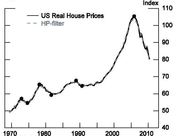
Note: Dots indicate turning points
Figure 12. GDP in Select Advance Economies
Recessions in severe housing slumps overlap with a period of house price declines over 19 percent.
Figure 13. Recessions in the Advanced Economies
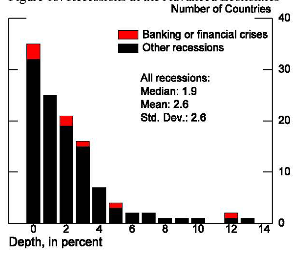
Figure 14. Recessions in the Emerging Economies
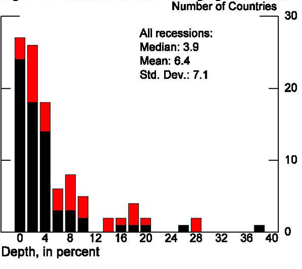
Figure 15. Recessions in the Advanced Economies
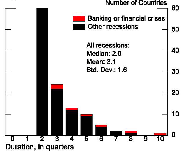
Figure 16. Recessions in the Emerging Economies
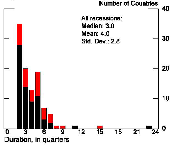
Figure 17. Recoveries in the Advanced Economies
*Solid lines are means, with dashed lines plus or minus one standard error
Extreme recessions are in the top 25% or bottom 25% of observed recessions.
Figure 18. Recoveries in the Emerging Economies
*Solid lines are means, with dashed lines plus or minus one standard error
Extreme recessions are in the top 25% or bottom 25% of observed recessions.
Figure 19. Recoveries in the Advanced Economies
*Solid lines are means, with dashed lines plus or minus one standard error
Very long recessions last as long or longer than those in the 75th percentiles.
Short recessions lasted two quarters.
Figure 20. Recoveries in the Emerging Economies
*Solid lines are means, with dashed lines plus or minus one standard error
Very long recessions last as long or longer than those in the 75th percentiles.
Short recessions lasted two quarters.
Figure 21. Recessions in the Advanced Economies
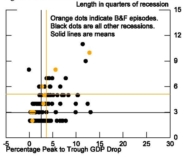
Figure 22. Recessions in the Emerging Economies
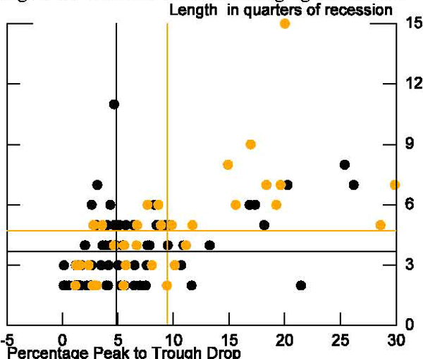
There is one additional black point at (39,23)
Figure 23. The Current AE recovery
*Regression predicts indexed GDP levels at 4, 8, and 12 quarters past the trough, based on the observed depth and duration of the recession.
Figure 24. The Current EME Recovery
*Regression predicts indexed GDP levels at 4, 8, and 12 quarters past the trough, based on the observed depth and duration of the recession.
Figure 25. Recoveries in the Advanced Economies
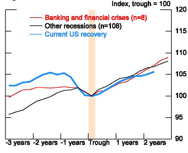
Figure 26. The Current U.S. recovery
*Regression predicts indexed GDP levels at 4, 8, and 12 quarters past the trough, based on the observed depth and duration of the recession.
Figure 27. Recoveries in the Advanced Economies
Trend calculated as exponential function growing at the four-year average two years prior to the peak
* Deep and long recessions are in the top 25th percent of recessions as measured by both depth and duration. Similarly, shallow and short recessions are in the bottom 25th percentile of each category.
Figure 28. Recoveries in the Emerging Economies
Trend calculated as exponential function growing at the four-year average two years prior to the peak
* Deep and long recessions are in the top 25th percent of recessions as measured by both depth and duration. Similarly, shallow and short recessions are in the bottom 25th percentile of each category.
Figure 29. Growth Rates in the Advanced Economies
Average speed during a recovery is measured as GDP growth in the three years after a trough.
Each data point represents one country.
Figure 30. Growth Rates in the Emerging Economies
Average speed during a recovery is measured as GDP growth in the three years after a trough.
Each data point represents one country.
Figure 31. B&F crises in the Advanced Economies
*Values from regressions estimating GDP at 4, 8, and 12 quarters past the trough. Regressions are depth and length of recession.
The sample covers recession in advanced economies since 1970.
Figure 32. B&F crises in the Emerging Economies
*Values from regressions estimating GDP at 4, 8, and 12 quarters past the trough. Regressions are depth and length of recession.
The sample covers recession in advanced economies since 1970.
Figure 33. GDP in Select Advanced Economies
*Solid lines are means, with dashed lines plus or minus one standard error. Trend is exponential function growing at the 4-year average 2 years prior to the peak. Deep and long recessions are in the top 25th percent of recessions measured by depth and duration.
Figure 34. Total Hours in Select Advanced Economies
*Solid lines are means, with dashed lines plus or minus one standard error. Trend is exponential function growing at the 4-year average 2 years prior to the peak. Deep and long recessions are in the top 25th percent of recessions measured by depth and duration.
Data are from Raffo and Ohanian (2010)
Figure 35. Output per Hour in Select AEs
*Solid lines are means, with dashed lines plus or minus one standard error. Trend is exponential function growing at the 4-year average 2 years prior to the peak. Deep and long recessions are in the top 25th percent of recessions measured by depth and duration.
Data are from Raffo and Ohanian (2010)
Figure 36. Labor Force Participation in Select AEs
*Solid lines are means, with dashed lines plus or minus one standard error. Trend is exponential function growing at the 4-year average 2 years prior to the peak. Deep and long recessions are in the top 25th percent of recessions measured by depth and duration.
Data are from Raffo and Ohanian (2010)
Figure 37. Employment Rate in Select AEs
*Solid lines are means, with dashed lines plus or minus one standard error. Trend is exponential function growing at the 4-year average 2 years prior to the peak. Deep and long recessions are in the top 25th percent of recessions measured by depth and duration.
Data are from Raffo and Ohanian (2010)
Figure 38. Average Weekly Hours in Select AEs
*Solid lines are means, with dashed lines plus or minus one standard error. Trend is exponential function growing at the 4-year average 2 years prior to the peak. Deep and long recessions are in the top 25th percent of recessions measured by depth and duration.
Data are from Raffo and Ohanian (2010)
Figure 39. GDP During U.S. Recessions
Note: since 1947.
Figure 40. Industrial Production
*See Figure 39 for colors of other recessions.
Figure 41. Real Exports
*See Figure 39 for colors of other recessions.
Figure 42. Non-residential Investment
*See Figure 39 for colors of other recessions.
Figure 43. Private Consumption
*See Figure 39 for colors of other recessions.
Figure 44. Residential Investment
*See Figure 39 for colors of other recessions.
Figure 45. Housing Prices
*See Figure 39 for colors of other recessions.
Figure 46. Consumer Credit
*See Figure 39 for colors of other recessions.
Figure 47. Consumer Sentiment (Michigan Index)
*See Figure 39 for colors of other recessions.
Figure 48. Personal Income
*See Figure 39 for colors of other recessions.
Figure 49. Employment
*See Figure 39 for colors of other recessions.
Figure 50. Goods Consumption
*See Figure 39 for colors of other recessions.
Figure 51. Household Durable Consumption
*See Figure 39 for colors of other recessions.
Figure 52. Motor Vehicle Consumption
*See Figure 39 for colors of other recessions.
Figure 53. Service Consumption
*See Figure 39 for colors of other recessions.
Figure 54. Goods-Producing Employment
*See Figure 39 for colors of other recessions.
Figure 55. Private Service Providing Employment
*See Figure 39 for colors of other recessions.
Figure 56. State and Local Government Employment
*See Figure 39 for colors of other recessions.
Figure 57. Real Federal Funds Rate
*See Figure 39 for colors of other recessions.
Federal Funds rate minus 4-quarter core inflaction.
Figure 58. Government Expenditures
*See Figure 39 for colors of other recessions.
Calculated as percent of GDP, then indexed to 100 at the trough of the recession.
Figure 59. Government Revenue
*See Figure 39 for colors of other recessions.
Calculated as percent of GDP, then indexed to 100 at the trough of the recession.
Figure 60. Gross Domestic Product
Trend calculated as exponential function growing at the five-year average prior to the peak
Figure 61. Total Hours
*See Figure 60 for colors of other recessions.
Trend calculated as exponential function growing at the five-year average prior to the peak
Figure 62. Output per Hour
*See Figure 60 for colors of other recessions.
Trend calculated as exponential function growing at the five-year average prior to the peak
Figure 63. Labor Force Participation
*See Figure 60 for colors of other recessions.
Trend calculated as exponential function growing at the five-year average prior to the peak
Figure 64. Employment Rate
*See Figure 60 for colors of other recessions.
Trend calculated as exponential function growing at the five-year average prior to the peak
Figure 65. Average Work Week
*See Figure 60 for colors of other recessions.
Trend calculated as exponential function growing at the five-year average prior to the peak
Appendix A. Data by Episode
Duration measured in quarters, Depth as percentage of GDP. Recessions after 2007 are not categorized.
| Country | Peak | Trough | IMF | Housing | AE/EME | Duration | Depth |
|---|---|---|---|---|---|---|---|
| Argentina | 1974 Q4 | 1976 Q1 | Currency | EME | 5 | 3.6 | |
| Argentina | 1977 Q2 | 1978 Q3 | EME | 5 | 4.9 | ||
| Argentina | 1980 Q3 | 1981 Q4 | Banking, Currency | EME | 5 | 9.8 | |
| Argentina | 1984 Q4 | 1985 Q3 | EME | 3 | 10.7 | ||
| Argentina | 1986 Q3 | 1987 Q1 | Currency | EME | 2 | 2.7 | |
| Argentina | 1988 Q1 | 1989 Q3 | Banking | EME | 6 | 15.6 | |
| Argentina | 1992 Q3 | 1993 Q1 | EME | 2 | 3.9 | ||
| Argentina | 1994 Q4 | 1995 Q3 | Banking, Currency, Debt | EME | 3 | 5.7 | |
| Argentina | 1998 Q2 | 2002 Q1 | Banking | EME | 15 | 20 | |
| Argentina | 2008 Q3 | 2009 Q1 | EME | 2 | 1.5 | ||
| Australia | 1971 Q3 | 1972 Q1 | AE | 2 | 1.3 | ||
| Australia | 1975 Q2 | 1975 Q4 | AE | 2 | 2.4 | ||
| Australia | 1977 Q2 | 1977 Q4 | AE | 2 | 0.7 | ||
| Australia | 1981 Q3 | 1983 Q2 | AE | 7 | 3.7 | ||
| Australia | 1990 Q4 | 1991 Q2 | AE | 2 | 1.4 | ||
| Australia | 2000 Q2 | 2000 Q4 | AE | 2 | 0.6 | ||
| Austria | 1974 Q3 | 1975 Q2 | AE | 3 | 2 | ||
| Austria | 1981 Q2 | 1981 Q4 | AE | 2 | 0.8 | ||
| Austria | 1982 Q2 | 1982 Q4 | AE | 2 | 0.4 | ||
| Austria | 1983 Q4 | 1984 Q2 | AE | 2 | 2 | ||
| Austria | 1992 Q3 | 1993 Q1 | AE | 2 | 0.8 | ||
| Austria | 2000 Q4 | 2001 Q3 | AE | 3 | 0.8 | ||
| Austria | 2008 Q2 | 2009 Q2 | AE | 4 | 4.8 | ||
| Belgium | 1974 Q2 | 1975 Q2 | AE | 4 | 2.8 | ||
| Belgium | 1976 Q3 | 1977 Q2 | AE | 3 | 0.8 | ||
| Belgium | 1979 Q4 | 1980 Q4 | Housing | AE | 4 | 2 | |
| Belgium | 1982 Q3 | 1983 Q1 | Housing | AE | 2 | 0.7 | |
| Belgium | 1992 Q3 | 1993 Q1 | AE | 2 | 1.9 | ||
| Belgium | 2001 Q2 | 2001 Q4 | AE | 2 | 0.5 | ||
| Belgium | 2008 Q2 | 2009 Q2 | AE | 4 | 4.1 | ||
| Brazil | 1980 Q4 | 1981 Q4 | EME | 4 | 7.8 | ||
| Brazil | 1982 Q3 | 1983 Q1 | Currency, Debt | EME | 2 | 5.5 | |
| Brazil | 1987 Q1 | 1987 Q3 | Currency | EME | 2 | 3.1 | |
| Brazil | 1988 Q1 | 1988 Q4 | EME | 3 | 3.5 | ||
| Brazil | 1989 Q4 | 1991 Q1 | Banking | EME | 5 | 8.9 | |
| Brazil | 1991 Q3 | 1992 Q3 | Currency | EME | 4 | 4.7 | |
| Brazil | 1995 Q1 | 1995 Q3 | Banking | EME | 2 | 2.9 | |
| Brazil | 1998 Q2 | 1999 Q1 | Currency | EME | 3 | 1.6 | |
| Brazil | 2001 Q1 | 2001 Q4 | EME | 3 | 1.2 | ||
| Brazil | 2008 Q3 | 2009 Q1 | EME | 2 | 5.6 | ||
| Canada | 1981 Q2 | 1982 Q4 | Housing | AE | 6 | 4.4 | |
| Canada | 1990 Q1 | 1991 Q1 | Housing | AE | 4 | 3.3 | |
| Canada | 2008 Q3 | 2009 Q2 | AE | 3 | 3.6 | ||
| Chile | 1971 Q4 | 1973 Q2 | Currency | EME | 6 | 8.6 | |
| Chile | 1974 Q2 | 1975 Q4 | EME | 6 | 16.8 | ||
| Chile | 1981 Q2 | 1982 Q4 | Banking, Currency | EME | 6 | 19.2 | |
| Chile | 1990 Q1 | 1990 Q3 | EME | 2 | 1.2 | ||
| Chile | 1998 Q2 | 1999 Q1 | EME | 3 | 4.1 | ||
| Chile | 2008 Q2 | 2009 Q2 | EME | 4 | 4.3 | ||
| China | 1971 Q2 | 1971 Q4 | EME | 2 | 0.2 | ||
| China | 1973 Q3 | 1974 Q2 | EME | 3 | 1.4 | ||
| China | 1975 Q3 | 1976 Q3 | EME | 4 | 4.7 | ||
| Colombia | 1982 Q2 | 1982 Q4 | Banking | EME | 2 | 1.2 | |
| Colombia | 1998 Q1 | 1999 Q2 | Banking | EME | 5 | 6.7 | |
| Costa Rica | 1995 Q3 | 1996 Q1 | EME | 2 | 2.7 | ||
| Costa Rica | 2008 Q1 | 2009 Q1 | EME | 4 | 3.6 | ||
| Czech Republic | 1996 Q4 | 1997 Q3 | Banking | EME | 3 | 2.4 | |
| Czech Republic | 2008 Q2 | 2009 Q2 | EME | 4 | 4.8 | ||
| Denmark | 1973 Q3 | 1975 Q2 | AE | 7 | 4.2 | ||
| Denmark | 1976 Q4 | 1977 Q2 | AE | 2 | 0.3 | ||
| Denmark | 1979 Q4 | 1981 Q2 | Housing | AE | 6 | 3.3 | |
| Denmark | 1986 Q3 | 1987 Q2 | Housing | AE | 3 | 0.6 | |
| Denmark | 1992 Q3 | 1993 Q2 | Housing | AE | 3 | 1.9 | |
| Denmark | 1997 Q2 | 1997 Q4 | AE | 2 | 1 | ||
| Denmark | 2000 Q4 | 2002 Q4 | AE | 8 | -0.1 | ||
| Denmark | 2008 Q2 | 2009 Q3 | AE | 5 | 7.3 | ||
| Estonia | 1998 Q3 | 1999 Q2 | EME | 3 | 2.4 | ||
| Estonia | 2007 Q4 | 2009 Q3 | EME | 7 | 20.2 | ||
| Finland | 1971 Q2 | 1971 Q4 | AE | 2 | 0.3 | ||
| Finland | 1975 Q1 | 1975 Q4 | Housing | AE | 3 | 2.2 | |
| Finland | 1980 Q3 | 1981 Q1 | AE | 2 | 2.7 | ||
| Finland | 1990 Q1 | 1992 Q3 | Banking | Housing | AE | 10 | 12.8 |
| Finland | 2008 Q1 | 2009 Q2 | AE | 5 | 10.3 | ||
| France | 1974 Q3 | 1975 Q2 | AE | 3 | 2.8 | ||
| France | 1980 Q1 | 1980 Q3 | AE | 2 | 0.3 | ||
| France | 1992 Q1 | 1993 Q1 | AE | 4 | 1.1 | ||
| France | 2008 Q1 | 2009 Q2 | AE | 5 | 3.9 | ||
| Germany | 1974 Q3 | 1975 Q1 | AE | 2 | 3.4 | ||
| Germany | 1981 Q3 | 1982 Q4 | AE | 5 | 2.2 | ||
| Germany | 1985 Q3 | 1986 Q1 | AE | 2 | 1.2 | ||
| Germany | 1992 Q3 | 1993 Q1 | AE | 2 | 2 | ||
| Germany | 1995 Q3 | 1996 Q1 | Banking | AE | 2 | 0.7 | |
| Germany | 2002 Q3 | 2003 Q2 | Banking | AE | 3 | 0.9 | |
| Germany | 2004 Q1 | 2004 Q3 | Banking | AE | 2 | 0.2 | |
| Germany | 2008 Q1 | 2009 Q1 | AE | 4 | 6.6 | ||
| Greece | 1973 Q3 | 1974 Q3 | AE | 4 | 12.4 | ||
| Greece | 1976 Q4 | 1977 Q2 | AE | 2 | 3 | ||
| Greece | 1979 Q2 | 1979 Q4 | AE | 2 | 3.1 | ||
| Greece | 1980 Q2 | 1981 Q1 | AE | 3 | 5.6 | ||
| Greece | 1981 Q3 | 1982 Q4 | AE | 5 | 4.6 | ||
| Greece | 1984 Q3 | 1985 Q1 | AE | 2 | 2.3 | ||
| Greece | 1990 Q1 | 1990 Q3 | AE | 2 | 7.1 | ||
| Greece | 1992 Q3 | 1993 Q1 | AE | 2 | 3.6 | ||
| Greece | 2000 Q1 | 2000 Q3 | AE | 2 | 1.1 | ||
| Hong Kong | 1973 Q4 | 1975 Q1 | EME | 5 | 4.9 | ||
| Hong Kong | 1981 Q4 | 1982 Q2 | EME | 2 | 2.9 | ||
| Hong Kong | 1984 Q2 | 1985 Q3 | EME | 5 | 4.1 | ||
| Hong Kong | 1988 Q4 | 1989 Q2 | EME | 2 | 1.3 | ||
| Hong Kong | 1995 Q1 | 1995 Q3 | EME | 2 | 0.4 | ||
| Hong Kong | 1997 Q3 | 1998 Q4 | EME | 5 | 8.8 | ||
| Hong Kong | 2000 Q4 | 2001 Q4 | EME | 4 | 2 | ||
| Hong Kong | 2002 Q4 | 2003 Q2 | EME | 2 | 2.5 | ||
| Hong Kong | 2008 Q1 | 2009 Q1 | EME | 4 | 7.6 | ||
| Hungary | 1995 Q1 | 1995 Q4 | EME | 3 | 1.2 | ||
| Hungary | 2008 Q1 | 2009 Q3 | EME | 6 | 8.3 | ||
| Iceland | 1982 Q2 | 1983 Q2 | Currency | AE | 4 | 3 | |
| Iceland | 1987 Q4 | 1988 Q3 | AE | 3 | 1.3 | ||
| Iceland | 1991 Q1 | 1992 Q3 | AE | 6 | 4.4 | ||
| Iceland | 1997 Q3 | 1998 Q1 | AE | 2 | 1.4 | ||
| Iceland | 2003 Q1 | 2003 Q3 | AE | 2 | 4.3 | ||
| Iceland | 2008 Q1 | 2010 Q2 | AE | 9 | 12 | ||
| India | 1975 Q2 | 1976 Q1 | EME | 3 | 1.6 | ||
| India | 1978 Q1 | 1979 Q2 | EME | 5 | 8.6 | ||
| India | 1981 Q2 | 1981 Q4 | EME | 2 | 0.2 | ||
| India | 1983 Q4 | 1984 Q2 | EME | 2 | 1.3 | ||
| Indonesia | 1997 Q3 | 1998 Q4 | EME | 5 | 18.2 | ||
| Ireland | 1982 Q3 | 1983 Q2 | Housing | AE | 3 | 1 | |
| Ireland | 1985 Q3 | 1986 Q2 | Housing | AE | 3 | 1.3 | |
| Ireland | 2007 Q1 | 2009 Q4 | AE | 11 | 11.4 | ||
| Israel | 2000 Q4 | 2001 Q4 | EME | 4 | 3.9 | ||
| Israel | 2008 Q3 | 2009 Q1 | EME | 2 | 1.3 | ||
| Italy | 1974 Q2 | 1975 Q2 | AE | 4 | 3.7 | ||
| Italy | 1977 Q1 | 1977 Q3 | AE | 2 | 1.4 | ||
| Italy | 1982 Q1 | 1982 Q4 | Currency | Housing | AE | 3 | 0.9 |
| Italy | 1992 Q1 | 1993 Q1 | Housing | AE | 4 | 1.5 | |
| Italy | 2001 Q1 | 2001 Q4 | AE | 3 | 0.6 | ||
| Italy | 2002 Q4 | 2003 Q2 | AE | 2 | 0.5 | ||
| Italy | 2004 Q3 | 2005 Q1 | AE | 2 | 0.1 | ||
| Italy | 2008 Q1 | 2009 Q2 | AE | 5 | 7 | ||
| Japan | 1974 Q3 | 1975 Q1 | Housing | AE | 2 | 0.3 | |
| Japan | 1997 Q1 | 1998 Q2 | Banking | Housing | AE | 5 | 3.2 |
| Japan | 2001 Q1 | 2001 Q4 | Housing | AE | 3 | 2.1 | |
| Japan | 2008 Q1 | 2009 Q1 | AE | 4 | 9.9 | ||
| Jordan | 1998 Q1 | 1998 Q3 | EME | 2 | 1.2 | ||
| Latvia | 1992 Q1 | 1993 Q4 | Currency | EME | 7 | 29.9 | |
| Latvia | 1994 Q3 | 1995 Q1 | EME | 2 | 3.1 | ||
| Latvia | 2007 Q4 | 2009 Q4 | EME | 8 | 25.4 | ||
| Lithuania | 2008 Q2 | 2009 Q4 | EME | 6 | 17.3 | ||
| Luxembourg | 1974 Q2 | 1975 Q3 | AE | 5 | 8.3 | ||
| Luxembourg | 1980 Q2 | 1981 Q2 | AE | 4 | 0.7 | ||
| Luxembourg | 2008 Q1 | 2008 Q4 | AE | 3 | 5.7 | ||
| Malaysia | 1974 Q3 | 1975 Q2 | EME | 3 | 1.3 | ||
| Malaysia | 1984 Q3 | 1985 Q3 | EME | 4 | 2 | ||
| Malaysia | 1997 Q4 | 1998 Q4 | Banking, Currency | EME | 4 | 11.1 | |
| Malaysia | 2000 Q4 | 2001 Q2 | EME | 2 | 1.1 | ||
| Malaysia | 2008 Q2 | 2009 Q1 | EME | 3 | 6.5 | ||
| Mexico | 1982 Q2 | 1983 Q2 | banking, Currency, Debt | EME | 4 | 5.5 | |
| Mexico | 1985 Q3 | 1986 Q4 | EME | 5 | 4.6 | ||
| Mexico | 1987 Q4 | 1988 Q2 | EME | 2 | 1.3 | ||
| Mexico | 1994 Q4 | 1995 Q2 | Banking, Currency | EME | 2 | 9.4 | |
| Mexico | 2000 Q3 | 2002 Q1 | EME | 6 | 2.6 | ||
| Mexico | 2008 Q1 | 2009 Q2 | EME | 5 | 8.5 | ||
| Netherlands | 1974 Q3 | 1975 Q2 | AE | 3 | 0.8 | ||
| Netherlands | 1980 Q1 | 1980 Q3 | Housing | AE | 2 | 2.5 | |
| Netherlands | 2008 Q1 | 2009 Q2 | AE | 5 | 4.6 | ||
| New Zealand | 1970 Q1 | 1970 Q3 | AE | 2 | 4 | ||
| New Zealand | 1971 Q3 | 1972 Q1 | AE | 2 | 6.5 | ||
| New Zealand | 1973 Q1 | 1973 Q3 | AE | 2 | 7.8 | ||
| New Zealand | 1974 Q3 | 1975 Q2 | Housing | AE | 3 | 9.9 | |
| New Zealand | 1977 Q2 | 1978 Q1 | Housing | AE | 3 | 13.1 | |
| New Zealand | 1982 Q3 | 1983 Q1 | AE | 2 | 4.6 | ||
| New Zealand | 1984 Q1 | 1984 Q3 | AE | 2 | 3.2 | ||
| New Zealand | 1985 Q1 | 1985 Q3 | AE | 2 | 3.1 | ||
| New Zealand | 1986 Q3 | 1987 Q1 | AE | 2 | 7 | ||
| New Zealand | 1990 Q4 | 1991 Q2 | AE | 2 | 3.8 | ||
| New Zealand | 1997 Q3 | 1998 Q1 | AE | 2 | 1.4 | ||
| New Zealand | 2007 Q4 | 2009 Q1 | AE | 5 | 2.4 | ||
| Norway | 1977 Q3 | 1978 Q1 | AE | 2 | 5.9 | ||
| Norway | 1978 Q3 | 1979 Q2 | AE | 3 | 1.2 | ||
| Norway | 1980 Q1 | 1980 Q3 | AE | 2 | 2.5 | ||
| Norway | 1991 Q2 | 1991 Q4 | Banking | Housing | AE | 2 | 0.6 |
| Norway | 1992 Q3 | 1993 Q1 | Housing | AE | 2 | 1.4 | |
| Norway | 2005 Q3 | 2006 Q1 | AE | 2 | 0.9 | ||
| Norway | 2008 Q2 | 2009 Q2 | AE | 4 | 2.5 | ||
| Peru | 1982 Q1 | 1983 Q4 | Banking, Currency | EME | 7 | 18.3 | |
| Peru | 1985 Q1 | 1985 Q3 | EME | 2 | 7 | ||
| Peru | 1987 Q3 | 1989 Q2 | EME | 7 | 26.2 | ||
| Peru | 1990 Q1 | 1990 Q3 | EME | 2 | 21.5 | ||
| Peru | 1992 Q1 | 1992 Q3 | EME | 2 | 5.2 | ||
| Peru | 1997 Q4 | 1999 Q1 | EME | 5 | 3.1 | ||
| Peru | 2000 Q1 | 2000 Q4 | EME | 3 | 5 | ||
| Peru | 2003 Q2 | 2003 Q4 | EME | 2 | 0.2 | ||
| Peru | 2008 Q3 | 2009 Q1 | EME | 2 | 2.6 | ||
| Philippines | 1983 Q2 | 1985 Q3 | Banking, Currency, Debt | EME | 9 | 16.9 | |
| Philippines | 1990 Q3 | 1991 Q1 | EME | 2 | 1.4 | ||
| Philippines | 1997 Q4 | 1998 Q2 | Banking, Currency | EME | 2 | 2.8 | |
| Poland | 2000 Q4 | 2001 Q2 | EME | 2 | 0.6 | ||
| Portugal | 1974 Q1 | 1975 Q2 | AE | 5 | 6 | ||
| Portugal | 1982 Q4 | 1984 Q2 | Banking, Currency | AE | 6 | 2.7 | |
| Portugal | 1992 Q2 | 1993 Q3 | AE | 5 | 2.6 | ||
| Portugal | 2001 Q4 | 2003 Q2 | AE | 6 | 2.1 | ||
| Portugal | 2004 Q2 | 2004 Q4 | AE | 2 | 0.2 | ||
| Portugal | 2007 Q4 | 2009 Q1 | AE | 5 | 4 | ||
| Russia | 1989 Q2 | 1995 Q1 | EME | 23 | 39.1 | ||
| Russia | 1995 Q3 | 1996 Q3 | EME | 4 | 5.4 | ||
| Russia | 2008 Q2 | 2009 Q2 | EME | 4 | 10.9 | ||
| Singapore | 1984 Q4 | 1985 Q4 | EME | 4 | 2 | ||
| Singapore | 1997 Q4 | 1998 Q3 | EME | 3 | 1.3 | ||
| Singapore | 2000 Q4 | 2001 Q3 | EME | 3 | 1.7 | ||
| Singapore | 2008 Q1 | 2008 Q4 | EME | 3 | 2.6 | ||
| Slovakia | 1998 Q4 | 1999 Q4 | Banking | EME | 4 | 6.7 | |
| Slovakia | 2008 Q3 | 2009 Q1 | EME | 2 | 6.4 | ||
| Slovenia | 2008 Q2 | 2009 Q3 | EME | 5 | 9.8 | ||
| South Africa | 1974 Q3 | 1975 Q1 | EME | 2 | 1.3 | ||
| South Africa | 1976 Q3 | 1977 Q2 | EME | 3 | 1.3 | ||
| South Africa | 1981 Q4 | 1983 Q1 | EME | 5 | 5.1 | ||
| South Africa | 1984 Q2 | 1985 Q3 | Currency, Debt | EME | 5 | 2.8 | |
| South Africa | 1990 Q1 | 1992 Q4 | EME | 11 | 4.6 | ||
| South Africa | 1998 Q1 | 1998 Q3 | EME | 2 | 0.1 | ||
| South Africa | 2008 Q3 | 2009 Q2 | EME | 3 | 2.6 | ||
| South Korea | 1979 Q2 | 1980 Q2 | EME | 4 | 3.9 | ||
| South Korea | 1997 Q3 | 1998 Q2 | Banking, Currency | EME | 3 | 8.1 | |
| South Korea | 2008 Q2 | 2008 Q4 | EME | 2 | 4.1 | ||
| Spain | 1974 Q4 | 1975 Q2 | AE | 2 | 0.6 | ||
| Spain | 1978 Q2 | 1979 Q1 | Banking | Housing | AE | 3 | 0.4 |
| Spain | 1980 Q3 | 1981 Q2 | Housing | AE | 3 | 0.3 | |
| Spain | 1992 Q2 | 1993 Q2 | AE | 4 | 1.8 | ||
| Spain | 2008 Q1 | 2009 Q4 | AE | 7 | 4.9 | ||
| Sweden | 1973 Q1 | 1973 Q3 | AE | 2 | 2.1 | ||
| Sweden | 1976 Q4 | 1977 Q2 | AE | 2 | 3 | ||
| Sweden | 1982 Q2 | 1983 Q1 | Housing | AE | 3 | 0.9 | |
| Sweden | 1990 Q4 | 1992 Q4 | Banking | Housing | AE | 8 | 5.6 |
| Sweden | 2007 Q4 | 2009 Q3 | AE | 7 | 7.8 | ||
| Switzerland | 1974 Q2 | 1975 Q3 | Housing | AE | 5 | 10.3 | |
| Switzerland | 1977 Q3 | 1978 Q1 | AE | 2 | 0.6 | ||
| Switzerland | 1981 Q2 | 1982 Q2 | AE | 4 | 1.7 | ||
| Switzerland | 1986 Q2 | 1986 Q4 | AE | 2 | 0.2 | ||
| Switzerland | 1990 Q3 | 1991 Q2 | AE | 3 | 1.4 | ||
| Switzerland | 1992 Q1 | 1993 Q1 | AE | 4 | 1.5 | ||
| Switzerland | 2002 Q2 | 2003 Q1 | AE | 3 | 0.9 | ||
| Switzerland | 2008 Q2 | 2009 Q2 | AE | 4 | 3.2 | ||
| Taiwan | 1974 Q1 | 1974 Q3 | EME | 2 | 2.3 | ||
| Taiwan | 2000 Q3 | 2001 Q3 | EME | 4 | 4.4 | ||
| Taiwan | 2008 Q1 | 2009 Q1 | EME | 4 | 9.5 | ||
| Thailand | 1996 Q3 | 1998 Q3 | Banking, Currency | EME | 8 | 14.9 | |
| Thailand | 2008 Q2 | 2009 Q1 | EME | 3 | 7.6 | ||
| Turkey | 1987 Q4 | 1989 Q2 | EME | 6 | 4.3 | ||
| Turkey | 1993 Q4 | 1994 Q2 | EME | 2 | 11.6 | ||
| Turkey | 2000 Q4 | 2001 Q2 | EME | 2 | 7.5 | ||
| Turkey | 2008 Q1 | 2009 Q1 | EME | 4 | 13.3 | ||
| United Kingdom | 1973 Q1 | 1974 Q1 | Housing | AE | 4 | 3.3 | |
| United Kingdom | 1975 Q1 | 1975 Q3 | Housing | AE | 2 | 1.5 | |
| United Kingdom | 1979 Q4 | 1981 Q1 | AE | 5 | 4.4 | ||
| United Kingdom | 1990 Q2 | 1991 Q3 | Housing | AE | 5 | 2.5 | |
| United Kingdom | 2008 Q1 | 2009 Q3 | AE | 6 | 6.6 | ||
| United States | 1973 Q4 | 1975 Q1 | AE | 5 | 3.3 | ||
| United States | 1980 Q1 | 1980 Q3 | AE | 2 | 2.2 | ||
| United States | 1981 Q3 | 1982 Q1 | AE | 2 | 2.8 | ||
| United States | 1990 Q3 | 1991 Q1 | AE | 2 | 1.2 | ||
| United States | 2008 Q2 | 2009 Q2 | AE | 4 | 5.3 | ||
| Uruguay | 1988 Q1 | 1988 Q4 | EME | 3 | 0.1 | ||
| Uruguay | 1994 Q3 | 1995 Q1 | EME | 2 | 2.2 | ||
| Uruguay | 1998 Q3 | 1999 Q4 | EME | 5 | 5.7 | ||
| Uruguay | 2001 Q1 | 2002 Q4 | Banking, Currency, Debt | EME | 7 | 19.6 | |
| Venezuela | 1979 Q2 | 1981 Q1 | EME | 7 | 3.1 | ||
| Venezuela | 1982 Q2 | 1983 Q4 | Debt | EME | 6 | 7.6 | |
| Venezuela | 1984 Q2 | 1985 Q1 | Currency | EME | 3 | 1.2 | |
| Venezuela | 1988 Q2 | 1989 Q3 | Currency | EME | 5 | 11.7 | |
| Venezuela | 1992 Q4 | 1994 Q1 | Banking, Currency | EME | 5 | 2.8 | |
| Venezuela | 1995 Q4 | 1996 Q2 | EME | 2 | 2.6 | ||
| Venezuela | 2000 Q1 | 2000 Q3 | EME | 2 | 1.6 | ||
| Venezuela | 2001 Q4 | 2003 Q1 | Currency | EME | 5 | 28.6 | |
| Venezuela | 2008 Q4 | 2010 Q1 | EME | 5 | 6.4 |
Appendix B. Sample Countries
| Country | First Value |
|---|---|
| Argentina | 1970 Q1 |
| Australia | 1970 Q1 |
| Austria | 1970 Q1 |
| Belgium | 1970 Q1 |
| Brazil | 1970 Q1 |
| Canada | 1970 Q1 |
| Chile | 1970 Q1 |
| China | 1970 Q1 |
| Colombia | 1970 Q1 |
| Costa Rica | 1991 Q1 |
| Czech | 1996 Q1 |
| Denmark | 1970 Q1 |
| Estonia | 1995 Q1 |
| Finland | 1970 Q1 |
| France | 1970 Q1 |
| Germany | 1970 Q1 |
| Greece | 1970 Q1 |
| Hong Kong | 1970 Q1 |
| Hungary | 1995 Q1 |
| Iceland | 1970 Q1 |
| India | 1970 Q1 |
| Indonesia | 1970 Q1 |
| Ireland | 1970 Q1 |
| Israel | 1970 Q1 |
| Italy | 1970 Q1 |
| Japan | 1970 Q1 |
| Jordan | 1992 Q1 |
| Latvia | 1992 Q1 |
| Lithuania | 1995 Q1 |
| Luxembourg | 1970 Q1 |
| Malaysia | 1970 Q1 |
| Mexico | 1970 Q1 |
| Netherland | 1970 Q1 |
| New | 1970 Q1 |
| Norway | 1970 Q1 |
| Peru | 1980 Q1 |
| Philippine | 1970 Q1 |
| Poland | 1995 Q1 |
| Portugal | 1970 Q1 |
| Russia | 1970 Q1 |
| Singapore | 1970 Q1 |
| Slovakia | 1993 Q1 |
| Slovenia | 1995 Q1 |
| South Africa | 1970 Q1 |
| South Korea | 1970 Q1 |
| Spain | 1970 Q1 |
| Sweden | 1970 Q1 |
| Switzerland | 1970 Q1 |
| Taiwan | 1970 Q1 |
| Thailand | 1970 Q1 |
| Turkey | 1987 Q1 |
| United Kingdom | 1970 Q1 |
| United States | 1970 Q1 |
| Uruguay | 1988 Q1 |
| Venezuela | 1970 Q1 |
Footnotes
1. Notable exceptions being Romer and Romer (1994) and Cerra and Saxena (2008). Return to text
2. The analysis of the U.S. data goes through the third quarter of 2011. Return to text
3. The BBQ method identifies cyclical peaks and troughs as local maxima in the two quarters preceding and the two quarters following. It then eliminates maxima that do not alternate between peaks and troughs or do not have a long enough time span, in this case 2 quarters from a peak to trough and five quarters from a trough to peak. Once these criteria are met, recessions are defined as the time between a peak and a trough. We did not use this method because it requires at least 5 quarters of recovery, which would restrict and potentially bias our sample. Return to text
4. This is similar to the methodology used in the IMF WEO analysis on recessions and recoveries (Terrones et al. 2009). Return to text
5. This decline is measured as the decline in the average GDP path in our sample. Because recessions are of different duration, the average decline from peak to trough across recessions is a different and slightly higher figure. Return to text
6. B&F recessions include Finland (1990), Iceland (1982), Italy (1982), Japan (1997), Norway (1991), Portugal (1982), Spain (1978), and Sweden (1990). Return to text
7. Complementary to our results, Lopez-Salido and Nelson (2010) find that recoveries are not systemically slower in the aftermath of financial crises in post-war United States. Return to text
8. Reinhart and Rogoff identify five AE recessions as banking crises. By our dating, the troughs of these recessions occur in: Finland (1992), Japan (1993), Norway (1991), Sweden (1992), and Spain (1979). Terrones et al. add Australia (1991), Denmark (1987), France (1993), Greece (1993), Italy (1993), Japan (1993), New Zealand (1987), the United Kingdom (1974), and the United Kingdom (1991), as well as a crisis in Germany around 1980 which does not correspond to a recession in our sample. In addition to the AEs, Reinhart and Rogoff also identify eight crises in the EMEs, fewer than in our sample: Argentina (2002), Colombia (1999), Hong Kong (1998), Indonesia (1998), Korea (1998), Malaysia (1998), the Philippines (1998), and Thailand (1998). Return to text
9. Housing declines were common but not universal in the most recent recession, so are not included in this part of the analysis. Including the severe housing downturn as an explanatory variable for the pace of the U.S. recovery, the current recovery is still underperforming the model's expectation but by only one percent. Return to text
10. Prior to the annual revision in July, the actual path of the U.S. recovery was very close to what would be predicted by the depth and duration regressions. Return to text
11. The countries included are Australia, Austria, Canada, Finland, France, Germany, Ireland, Italy, Japan, Korea, Norway, Spain, Sweden, the UK, and the US. Return to text
12. This section of the paper uses recession dating by the NBER in order to include the 2001 recession. The only other notable change is that NBER classifies the pre-recession peak of the Great Recession as 2007 Q3 instead of 2008 Q1. Return to text
13. For individual recessions, we use the trend based on the average growth in the five years prior to the pre-recession peak because the four-year average two years prior to the peak introduces too much noise. Without the benefit of an average over a large sample, the results are much more difficult to interpret. Return to text
This version is optimized for use by screen readers. Descriptions for all mathematical expressions are provided in LaTex format. A printable pdf version is available. Return to text