FEDS Notes
March 08, 2018
A Not-So-Great Recovery in Consumption: What is holding back household spending?
Aditya Aladangady and Laura Feiveson
This note was revised on March 16, 2018 to correct an error on Figure 1. The APC out of wealth is 0.035 not 0.35.
Historically, aggregate consumption (C) has closely tracked disposable personal income (Y), government transfers (T), and household net wealth (W). In this note, we show that this empirical relationship has broken down in recent years and explore potential explanations for why consumers--at least in the aggregate--may not be spending in line with recent income and wealth gains.1
We focus on how the consumption-to-income ratio--essentially the inverse of the personal saving rate--varies with the transfer-to-income ratio and the wealth-to-income ratio, as in the following equation:2
$$$$ \frac{C_t}{Y_t} = \alpha + \delta \frac{T_t}{Y_t} + \beta \frac{W_t}{Y_t } $$$$
The estimation of this equation, using data from 1960q1 to 2007q4, implies an average propensity to consume (APC, α) out of non-transfer income--such as wages and proprietor's income--of roughly 65 cents on the dollar.3 Transfers--which comprise in-kind benefits (Medicare, Medicaid, and food stamps) and cash benefits for low-income earners (the Earned Income Tax Credit) and retirees (Social Security)--are likely associated with a higher APC than non-transfer income, and thus would be associated with more spending. Indeed, the estimated coefficients imply an APC out of transfer income (α + δ) of 1.0,4 which means that transfer income is completely spent. Wealth would also induce consumers to increase their spending, conditional on income, and the estimated APC out of wealth (β) of 3.5 cents on the dollar lines up well with the range of estimates in the empirical literature.5
Figure 1 shows the actual consumption-to-income ratio plotted against the fitted values from the above equation. The relationship fits quite well through the Great Recession, with most deviations between the fitted and actual values closing within a few quarters. Around 2012, the fitted consumption-to-income ratio (the red line) shifted up considerably, reflecting the post-recession recovery in household wealth. Meanwhile, the actual consumption-to-income ratio (the black line) has fallen persistently short of the fitted value, leaving consumption nearly $500 billion, or 3 percent of DPI, below the predicted level as of 2017.
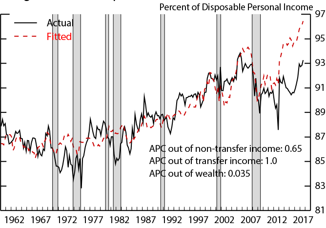
Note: Estimation period is 1960Q1 to 2007Q4. Shaded areas indicate recession periods as dated by the National Bureau of Economic Research (NBER).
Source: U.S. Dept. of Commerce, Bureau of Economic Analysis.
To better understand what is driving the divergence shown in Figure 1, we turn our attention to recent trends in transfers and wealth which determine the fitted values in the red line above. Figure 2 shows that the increase in transfers since the onset of the recession was broad-based, and did little to affect the composition of transfer income between in-kind and cash benefits. The increase reflects both policy responses to the recession and a longer-run upward trend in transfers largely due to an aging population. Overall, the growth in transfer income has been fairly gradual, and there is little evidence that a shift in the composition has caused a change in how households consume out of aggregate transfers.
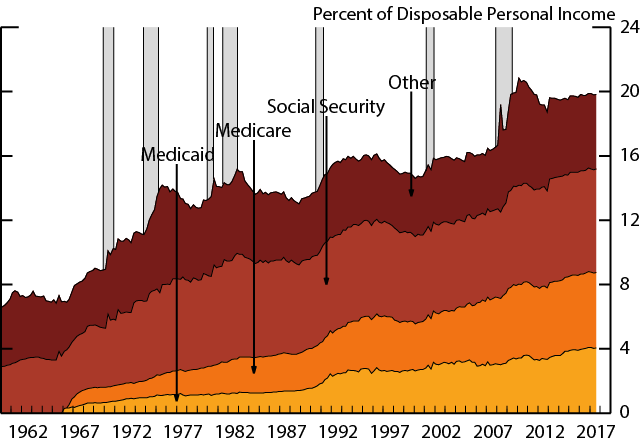
Note: "Other" includes unemployment insurance, food stamps, and the 2008 tax rebates. Gray shaded areas indicate recession periods as dated by the National Bureau of Economic Research (NBER).
Source: Financial Accounts of the United States.
Figure 3 shows the wealth-to-income ratio, which also is at a historically high level. The peak in the late 1990s reflected the tech boom, the peak in the mid-2000s reflected the housing bubble along with another stock market boom. After having fallen in the wake of the Great recession, household wealth has now exceeded its pre-recession peak, reflecting strong post-recession increases in both equity prices and house prices.
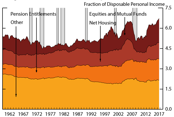
Note: "Other" includes check and savings deposits, consumer durables, and holdings of noncorporate equity. Gray shaded areas indicate recession periods as dated by the National Bureau of Economic Research (NBER).
Source: Financial Accounts of the United States.
Explanation 1: The Great Recession lowered expected growth and raised uncertainty
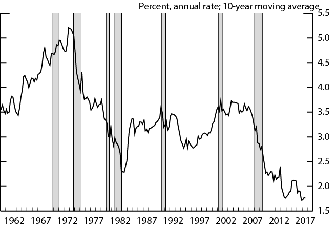
One possible explanation for why households are consuming less out of their current income and wealth than estimated in the equation above is that consumers may now have lower growth expectations or greater uncertainty about the trajectory of the economy than they had before the recession. Figure 4 provides some suggestive evidence that income growth expectations remain subdued. While the black line shows that headline sentiment readings have rebounded to their pre-recession levels, the red line shows that median (year-ahead) income growth expectations remain below their pre-recession levels.6 The divergence in these two series could be consistent with consumers adjusting to a "new normal", in which they base their overall sentiment (the black line) on a new, lower baseline of trend growth (the red line). And, indeed, a reassessment of growth that depended on recent experience would have likely lead to a downgrading of growth prospects--the 10-year moving average of real disposable personal income growth is at its lowest level in more than fifty years, as shown in Figure 5.
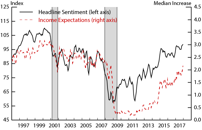
Note: Both series are constructed as 3-month moving averages. Shaded areas indicate recession periods as dated by the National Bureau of Economic Research (NBER).
Source: University of Michigan Survey of Consumers.
Note: Shaded areas indicate recession periods as dated by the National Bureau of Economic Research (NBER).
Source: U.S. Dept. of Commerce, Bureau of Economic Analysis.
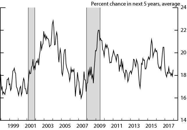
A related possibility is that consumers have more uncertainty about the future than they had before the recession, increasing household's desired precautionary savings. In the Michigan Survey, the probability of experiencing job loss within 5 years (Figure 6) is still a bit above its prerecession level, supporting the possibility that uncertainty has remained elevated in the recovery.
Note: Three-month moving average. Shaded areas indicate recession periods as dated by the National Bureau of Economic Research (NBER).
Source: University of Michigan Survey of Consumers.
All in all, lowered expectations and greater uncertainty are plausible reasons that recent spending has remained constrained despite increases in current income and wealth.
Explanation 2: Lower Housing Equity Extraction
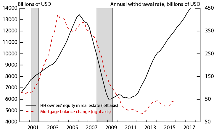
Although house prices are very close to their pre-crisis level, people are extracting much less equity from their homes. In Figure 7, the black line shows total nominal home equity which has surpassed its pre-recession peak, while the red line shows total home equity withdrawal, as proxied by the change in mortgage balances due to refinances or junior liens, which remains subdued.
Note: Shaded areas indicate recession periods as dated by the National Bureau of Economic Research (NBER).
Source: Andreas Fuster, Ellidh Geddes, and Andrew Haughwout (2017), Financial Accounts of the United States.
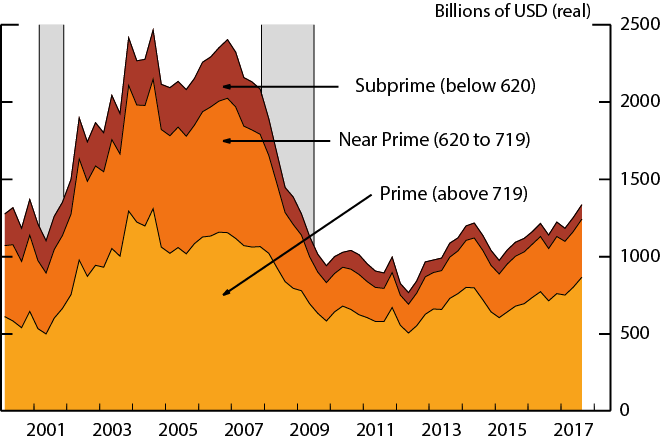
There are a few possible reasons, all of which are likely associated with a diminished APC out of housing wealth. First, housing equity has become more concentrated among older, high FICO score, and presumably, higher income individuals.7 These individuals are unlikely to be credit constrained and likely to have a lower APCs on average.8 Second, house price growth expectations may be lower or more uncertain than before the recession. Most house price expectations series do not start until 2007, after the housing peak, but, even so, the Michigan five-year-ahead expectations of house prices are much lower now than they had been in 2007. Finally, while overall credit standards have loosened considerably since the recession, the supply of home equity loans and mortgages remains tight for low credit score individuals, consistent with the diminished flow of mortgage credit going to this group during the recovery (Figure 8).
Note: Change in balance from 4 quarters prior, among those whose balance increased over that period. Gray shaded areas indicate recession periods as dated by the National Bureau of Economic Research (NBER).
Source: FRBNY CCP/Equifax.
These shifts give us reason to think that the APC out of housing wealth may be lower now, all else equal, at least compared to the mid-2000s.9
Explanation 3: Longer-Term Trends like increased inequality and population aging
The two previous explanations could be consistent with a break in the relationship between consumption, income, and wealth starting post-recession. But, it is possible--even likely--that some slower moving trends are also in play.
One well-documented long-term trend is the increase in income and wealth inequality.10 Since consumers at the top end of the distribution tend to have lower average propensities to consume than those at the bottom, as wealth and income shifts towards those consumers, one would expect the aggregate APCs out of wealth and income to have fallen gradually over time as resources became increasingly concentrated at the top of the distribution.11 In such a model, the fitted line in Figure 1 would have gradually shifted lower such that the current fitted consumption-to-income ratio would be more in line with actual. But, with income inequality already reaching elevated levels by the late 1990s and the mid-2000s the observed consumption-to-income ratios in this period might also be expected to fall below the model fitted value. In this sense consumption in these years may be surprisingly high. To explain those surprises, we might turn again to a story of inflated income expectations (for the late 1990s) or an abundance of credit supply and demand (for the mid-2000s).
Another long-term trend is population aging. However, this trend is unlikely to be putting downward pressure on the consumption-to-income ratio currently. Data from the Consumer Expenditure Survey shows the saving rate exhibits a hump-shaped lifecycle pattern, and as baby boomers are retiring and spending a larger fraction of their income, one might actually expect them to put upward pressure on the consumption-to-income ratio. To illustrate this effect, Figure 9 splits the population into those in peak-saving years (the red line, ages 40 to 55) and spending years (the black line, ages 25 to 35 and above 65).12 According to these rough categories, the population distribution would have put downward pressure on the consumption-to-income ratio through the mid-2000s when the proportion of "savers" peaked relative to "spenders". As of 2017, the relative proportions of these two groups are close to their historical average, and in fact, one might expect demographic trends will push up the consumption-to-income ratio over the next decade.
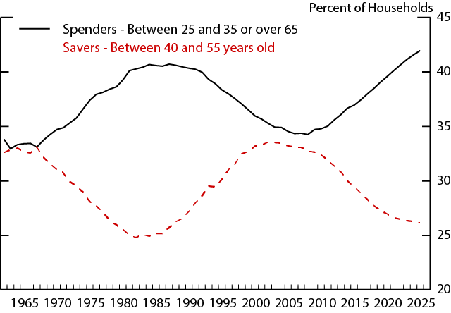
Source: U.S. Dept. of Commerce, Census Bureau.
References
Aladangady, A. (2017). "Housing Wealth and Consumption: Evidence from Geographically-linked Microdata". American Economic Review 107(11), 3415-3446.
Attanasio, O.P., Blow, L., Hamilton, R., Leicester, A. (2009), Booms and Busts: Consumption, House Prices and Expectations. Economica, 76: 20–50. doi:10.1111/j.1468-0335.2008.00708.x
Bianchi, F., Lettau, M., and Ludvigson, S.C., (2016), "Monetary Policy and Asset Valuation", NBER Working Paper 22572.
Bostic, R., Gabriel, S., and Painter, G. (2009)."Housing wealth, financial wealth, and consumption: New evidence from micro data," Regional Science and Urban Economics, Elsevier, vol. 39(1), pages 79-89, January.
Campbell, J.Y., and Cocco, J.F., (2007), "How do house prices affect consumption? Evidence from micro data", Journal of Monetary Economics, Volume 54, Issue 3, 2007, Pages 591-621, ISSN 0304-3932, https://doi.org/10.1016/j.jmoneco.2005.10.016.
Carroll, C., Otsuka, M., and Slacalek, J. (2011). How Large Are Housing and Financial Wealth Effects? A New Approach. Journal of Money, Credit and Banking, 43(1), 55-79. Retrieved from http://www.jstor.org/stable/20870039
Case, Karl E. & Quigley, John M. & Shiller, Robert J., (2013). "Wealth Effects Revisited 1975-2012," Critical Finance Review, now publishers, vol. 2(1), pages 101-128, July.
Cooper, D. (2013). "House Price Fluctuations: The Role of Housing Wealth as Borrowing Collateral". The Review of Economics and Statistics, 95:4, 1183-1197.
Davis, Morris, and Michael Palumbo. (2001) "A Primer on the Economics and Time Series Econometrics of Wealth Effects." Federal Reserve Board Finance and Economics Discussion Papers 2001-09.
Dynan, K., Skinner, J., and Zeldes, S. (2004) "Do the Rich Save More?" Journal of Political Economy, vol. 112(2).
Fuster, A., Geddes, E., Haughwout, A., (2017). "Houses as ATMs No Longer," Federal Reserve Bank of New York Liberty Street Economics (blog), February 15, 2017.
Guren, A., McKay, A., Nakamura, E., Steinsson, J. (2017). "Housing Wealth Effects: The Long View". Mimeo.
Lettau, M. and Ludvigson, S. (2001), Consumption, Aggregate Wealth, and Expected Stock Returns. The Journal of Finance, 56: 815–849. doi:10.1111/0022-1082.00347
Ludwig, A. and Slok, T. (2004). The relationship between stock prices, house prices and consumption in OECD countries. The B.E. Journal of Macroeconomics 4(1): 1–28.
Mian, A., Rao, K., Sufi, A., (2013). "Household Balance Sheets, Consumption, and the Economic Slump," The Quarterly Journal of Economics, Oxford University Press, vol. 128(4), pages 1687-1726.
Piketty, T., Saez, E., Zucman, G. (2017). "Distributional national Accounts: Methods and Estimates for the United States". Quarterly Journal of Economics. Forthcoming.
Piketty, T. and Saez, E. (2003). "Income Inequality in the United States, 1913-1998". Quarterly Journal of Economics. 118(1), 1-39.
Pistaferri, L. (2016). "Why has consumption remained moderate after the Great Recession?" mimeo.
Rudd, Jeremy B. and Whelan, Karl, A Note on the Cointegration of Consumption, Income, and Wealth (November 5, 2002). FEDS Working Paper No. 2002-53. http://dx.doi.org/10.2139/ssrn.361261
Slacalek, J. (2009). What drives personal consumption? The role of housing and financial wealth. The B.E. Journal of Macroeconomics 9(1): 1–37.
1. Pistaferri (2016) also explores the recent relative weakness of consumption using a combination of aggregate data and surveys, and explores similar explanations as we do in this note, though in more depth. Bianchi, Lettau, and Ludvigson (2016) also document the breakdown of the relationship between consumption, income, and wealth, using an equation similar to ours. They attribute the breakdown in this relationship to a low equilibrium interest rate, which is consistent with the explanations that we lay out in this note. Return to text
2. Davis and Palumbo (2001) and Carroll, et al (2011) provide a theoretical justification for this relationship based on models of consumer behavior. Lettau and Ludvigson (2001) estimate a similar error-correction model, but argue that aggregate wealth, not consumption, contributes to closing the gap over time. Rudd and Whelan (2002) note that estimates from variables supported by such theoretical models are not cointegrated in the data. Although the specification used here does not map exactly to theoretical justifications provided in the literature, it does appear to exhibit cointegration. Return to text
3. The estimation end date was chosen to coincide with the start of the Great Recession. Out-of-sample predictions tracked the observed consumption-to-income ratio closely through the recession and initial recovery before diverging around 2012. Using different estimation windows does little to affect the results we present. Return to text
4. The coefficients in the equation can more easily be seen as APCs in the transformed equation $$C_t=\alpha Y_t + \delta T_t + \beta W_t$$. Since DPI includes transfer income, the APC out of transfers is α+δ. Return to text
5. Results from a large literature using both micro data and time series approaches yields estimates of wealth effects varying from 2 cents to 8 cents, with most estimates falling close to 4 cents. Papers using time-series approaches include Case, et al (2013); Ludwig and Slok (2004); Slacalek (2009). Papers using micro-data approaches include Bostic, et al (2005); Campbell and Cocco (2007); Attanasio, et al (2008); Mian, et al (2013); Cooper (2013), among many others. Return to text
6. The headline sentiment index combines five questions on a household's assessment of current and future economic prospects. The income expectations line shows respondents' median, year-ahead nominal income growth predictions. Return to text
7. See Fuster, et al (2017). Return to text
8. Dynan, et al (2004). Return to text
9. While house price growth was unusually high in the mid-2000s, evidence in the literature suggests the aggregate consumption response to changes in housing wealth has been relatively stable over the past several decades. See Case, et al (2013), Aladangady (2017), and Guren, et al (2017). Return to text
10. See Piketty and Saez (2003) and Piketty, et al (2017). Return to text
11. See Dynan et al (2004) for evidence of a positive relationship between lifetime income and saving rates. Return to text
12. Data from the Consumer Expenditure Survey shows that the saving rate exhibits a hump-shaped lifecycle pattern, peaking among households with heads around 40-55 years old. Return to text
Aladangady, Aditya, and Laura Feiveson (2018). "A Not-So-Great Recovery in Consumption: What is holding back household spending?," FEDS Notes. Washington: Board of Governors of the Federal Reserve System, March 8, 2018, https://doi.org/10.17016/2380-7172.2159.
Disclaimer: FEDS Notes are articles in which Board staff offer their own views and present analysis on a range of topics in economics and finance. These articles are shorter and less technically oriented than FEDS Working Papers and IFDP papers.