
Price and Quality Dispersion in an Offshoring Market:Evidence from Semiconductor Production Services*
Keywords: Pricing, intra-industry trade
Abstract:
1 Introduction
In the last half century, reductions in transportation costs, communication costs, and barriers to trade have driven a fundamental change in the spatial and institutional organization of manufacturing production. It is now commonplace for individual design and fabrication steps in the manufacturing process to be implemented in different establishments, which are owned by different firms and located in different countries. This fragmentation of production means that a larger share of international transactions takes the form of processing trade: an input is fabricated, assembled, or processed abroad and then shipped back to the firm that designed it or elsewhere for additional processing (Hummels et al., 2001). As less developed economies such as China capture a greater share of the global market for tradable intermediates, the tasks performed overseas are increasingly done by relatively low-price suppliers. To determine the implications of this shift, it is essential to know whether low-price suppliers simply produce lower quality products or whether they offer real quality-adjusted discounts compared to their higher-price competitors.
We examine this question in the context of semiconductor wafer manufacturing services. Technological characteristics of production in this market make possible highly effective quality adjustment based on observable product characteristics. We utilize a novel proprietary database of semiconductor wafer transactions to document substantial shifts in production across geographic areas and show that suppliers with growing market shares typically charge much lower prices for observationally equivalent goods. Estimates from hedonic regressions reveal substantial constant-quality price differences across suppliers in different countries. For example, Chinese producers on average charged 17% less than firms in market leader Taiwan for otherwise identical products, and increased their market share from 7.1% in 2000 to 21.8% in 2011. By observing and directly controlling for quality differences across suppliers, we are able to circumvent the challenges faced by other papers in the literature. We thus follow Schott's (2008) suggestion to use "very detailed data about the hedonic attributes of goods produced and exported by China and developed economies" to reveal cross-country quality differences.
These sharp quality-adjusted price differences across suppliers raise the question of how price dispersion can persist without driving the high-priced suppliers out of the market. The contract semiconductor manufacturing industry is highly concentrated and faces very low transportation costs, so mechanisms generating quality-adjusted price variation based on search frictions or transportation costs are unlikely to apply in this context.2 Mechanisms based on product differentiation and preference for variety are also difficult to justify when customers purchase manufacturing services for a product of their own design.3
Instead, we develop a model reflecting the structure of the contract semiconductor manufacturing industry. In this model, sunk startup costs of producing a particular chip design with a particular supplier make it costly to switch suppliers (Klemperer, 1995). The industry "leader" is the first producer of a leading-edge wafer. Lower-priced suppliers, "followers," enter the market later, but since it is costly for customers to switch suppliers, the higher-priced leader preserves a substantial market share. The high cost of switching effectively locks-in buyers, giving the industry leader the incentive to continue charging high prices compared to its competitors. The model allows for the possibility that the leader is more skilled at producing more complex wafers, but we show that the price difference across suppliers exceeds the premium implied by any quality differences across suppliers.
The model also predicts that the degree of price dispersion across suppliers diminishes over time. The buyers that initially purchase from the leader eventually complete their production and exit. At the same time, new buyers enter the market. The leader will compete more aggressively for these new buyers as their locked-in customers phase out, implying a declining price differential across suppliers over time. We stress that this pattern in the dynamics of price dispersion is clearly absent in models that include only fixed unobserved quality differences across suppliers.
We test for this declining price differential using data for producers located in Taiwan and China, which together accounted for 72% of the market in 2011. In practice, Chinese producers enter the market for a given semiconductor technology at least 2 years later than Taiwanese producers, so we treat Taiwan as the "leader" and China as the "follower." We find that on average the price gap between Taiwan and China closes substantially over the life of a given semiconductor technology, falling from 39% in the year of Chinese entry to 10% after 5 years.
Our focus on price differences across suppliers is in sharp contrast with prior theoretical and empirical studies of semiconductor prices. Although semiconductor pricing has been studied frequently, nearly all prior work examines the markets for commodity semiconductor products such as microprocessors and DRAM memory chips.4 In these markets, there is little price variation across suppliers. Studies of processor and memory markets rule out quality-adjusted price variation and instead focus on learning-by-doing to explain stunning rates of average price decline.5 We focus on the market for contract semiconductor wafer fabrication services provided by firms called "foundries." Due to a lack of detailed data, this market has been studied infrequently in the previous literature, and it differs in important ways from processor and memory markets.6 Most foundry products are Application Specific Integrated Circuits (ASICs) requiring custom designs tailored to particular applications rather than being designed for general-purpose computing. As we show, this market exhibits substantial price variation across suppliers, which we argue is driven by product-specific fixed startup costs incurred because of the custom nature of each product. Thus, our modeling approach focuses on price variation between suppliers rather than on the sources of price declines across all suppliers, leaving for future work the task of modeling startup costs in the presence of declining marginal costs resulting from learning by doing.7
Our approach is more closely related to recent empirical work on firm dynamics by Foster et al. (2012). Using detailed plant-level data covering industries without much scope for quality differentiation, they find substantial variation across firms in quantity sold, even holding price fixed. Quantity sold increases as firms age, which the authors interpret as reflecting a dynamic process of "building a customer base," in which larger current sales increase future demand. Our framework based on costly switching across intermediate input suppliers generates a very similar demand structure; lowering the price to attract more customers in one period increases demand next period, as more customers are locked-in by the sunk startup cost. Thus, our model reflects a particular mechanism driving the more general phenomenon Foster et al. document. Their results suggest that various features of the market we discuss here may apply more broadly outside the semiconductor industry.
Our findings have important implications for at least two growing areas of research. First is the literature on trade and product quality, which seeks to understand how quality differences across suppliers affect the pattern of trade. Early papers in this literature interpreted all differences in price (unit value) across suppliers within narrow product classification as differences in quality.8 Our results contradict this assumption in the semiconductor manufacturing industry, as all of the products in our data fall within one narrow product classification9, and yet we observe substantial quality-adjusted price differences across suppliers. More recent work has developed tools for quality estimation in final goods markets based on product differentiation and consumers' love of variety.10 These models allow for quality-adjusted price variation, with higher quality goods capturing larger market share conditional on price. We show that in the dynamic context of our model, both relative prices and relative market shares move in the opposite direction of relative quality across suppliers. Thus, the approaches used in the previous literature should be employed with care when studying intermediate input quality, particularly in markets with large fixed costs of producing a given product at a given supplier.
Our results also closely relate to the emerging research on the implications of globalization for the accuracy of official aggregate price indexes and our understanding of the sources of economic growth. Feenstra et al. (forthcoming) examine three problems that bias standard import price measures upward: using a non-superlative index number formula, omitting the effect of tariffs on purchase prices, and omitting the effects of increased variety. Along with Houseman et al. (2011), we investigate another source of bias. We argue that price measures produced by most government statistical agencies, such as the BLS International Price Program, implicitly assume that price differences across suppliers reflect quality differences rather than pure quality-adjusted price dispersion. This approach generates upward-biased measures of input price growth and productivity growth in the presence of quality-adjusted price differences and shifts to lower-priced suppliers.
We follow Reinsdorf (1993) to calculate price indexes allowing us to bound the effect of this bias. We find that conventional price measures miss shifts toward lower-priced suppliers accounting for an average annual price decline of up to 1.2 percentage points per year. More generally, as overseas production becomes increasingly sophisticated, researchers and practitioners must address quality adjustment for tradable intermediates, paralleling prior efforts relating to domestically produced products. The measurement challenges we document in the wafer fabrication market likely preview similar challenges that will emerge in other industries as further offshoring of intermediate input production occurs.
This paper proceeds by first discussing the technology of wafer fabrication. We outline the key physical attributes of wafers relevant for price setting and document the shifting geography of production away from market leading firms in Taiwan and toward more recent entrants in China. In Section 3, we investigate price differences between overseas manufacturers using a hedonic framework to control for quality differences across transactions. We find that, even after controlling for quality using our detailed transaction-level data, prices in this offshore market still differ substantially across suppliers. In Section 4 we present the model of startup costs and sequential entry explaining how large quality-adjusted price differences could persist in this market. In Section 5 we confirm the model's prediction that the price gap between leading and lagging suppliers should close over time, ruling out various alternative explanations for the price variation across suppliers. Section 6 discusses the implications of our findings for the prior literatures just discussed, and Section 7 concludes.
2 Industry Background
To understand the subsequent analysis, we need to briefly review three important features of the contract semiconductor wafer manufacturing industry. First, there are distinct, measurable technological attributes of wafers that significantly affect their price. Our data are remarkable in part because they provide information on each of these technological characteristics, allowing us to control for quality differences in our analysis. Second, it has become more common for firms designing semiconductor chips to outsource the production of wafers to specialized manufacturing firms overseas. This business model results in the arm's-length purchases of semiconductor manufacturing services that will be the focus of our analysis and that have contributed to large shifts in the geographic distribution of wafer fabrication around the globe. Third, in contrast to general-purpose processors and memory chips that have been the focus of previous work, contract semiconductor manufacturing focuses primarily on custom designs produced in much smaller quantities. This custom aspect to production increases the importance of large fixed costs of producing a given chip at a particular foundry, which we argue drives quality-adjusted price variation across suppliers.
2.1 Semiconductor Wafer Technology
Semiconductor fabrication involves creating networks of transistors on the surface of a thin piece of semiconducting material.11 The process begins with the design and layout of a new chip. Semiconductor designers use complex software suites to specify the functionality of the chip, convert that logic into the corresponding network of transistors, determine the physical layout of those transistors, and simulate the behavior of the proposed design for debugging purposes.
Semiconductors are manufactured in a facility called a "fab". Transistors are created on the surface of the wafer through a photolithography process, in which successive layers of conducting and insulating materials are deposited on the surface of the wafer and chemically etched away in the appropriate places to form the desired pattern of transistors and necessary interconnections. Design layout software determines the etching pattern for each layer. This is then projected onto the wafer through a mask containing the desired pattern, in a process similar to developing a photograph by projecting light through a negative. Each step of the etching process is repeated multiple times across the wafer, resulting in a grid pattern of many copies of the chip. Once all transistors and connection layers are complete, the chips are tested in a process called "wafer probe," and any faulty chips are marked to be discarded. The wafer is cut up, leaving individual chips, called "die," which are placed inside protective packages and connected to metal leads that allow the chip to be connected to other components.
Semiconductor fabrication technology has advanced over time in discrete steps, defined by wafer size and line width (also called feature size). Increases in wafer size allow larger numbers of chips to be produced on a wafer. Most fabs currently produce 150mm (roughly 6 inches), 200mm (8 inches), or 300mm (12 inches) diameter wafers. Although larger wafers cost more to produce, each wafer contains many more die, so the move to a larger wafer has generally reduced the cost per die by approximately 30 percent (Kumar, 2007).
Line width is the size of the smallest feature that can be reliably created on the wafer. Decreased line width means that individual transistors are smaller. A 30 percent decrease in line width approximately doubles the density of transistors on a chip. This makes chips of a given functionality smaller, lighter, faster, and more energy efficient, and also makes it feasible to include more functions on a single chip. The number of transistors that can be produced on a chip has grown exponentially over time, following Moore's Law.12
Current line widths are measured in microns (![]() m) or nanometers (nm). The smallest line width currently being produced in volume is 20nm (Barak, 2012). As a rule
of thumb, Kumar (2007) estimates that moving a given chip design to a 30 percent smaller line width results in cost savings of approximately 40 percent, assuming the same number of defects in both processes. The primary drawback of smaller line widths is increased cost per
wafer, particularly early in the technology's life span. Masks are much harder to produce when creating smaller features. In addition, new process technologies often result in higher defect rates and lower yields, the fraction of chips on a wafer that function correctly. In spite of these
challenges, the benefits of increased die per wafer and better performance have outweighed the problems of decreased yields, which increase as the fabrication technology matures. Given the benefits of smaller line widths, semiconductor manufacturers have steadily moved toward newer technology. This
is apparent in Figure 1, which plots the technology composition of sales at Taiwan
Semiconductor Manufacturing Company (TSMC), the largest contract semiconductor manufacturer.
m) or nanometers (nm). The smallest line width currently being produced in volume is 20nm (Barak, 2012). As a rule
of thumb, Kumar (2007) estimates that moving a given chip design to a 30 percent smaller line width results in cost savings of approximately 40 percent, assuming the same number of defects in both processes. The primary drawback of smaller line widths is increased cost per
wafer, particularly early in the technology's life span. Masks are much harder to produce when creating smaller features. In addition, new process technologies often result in higher defect rates and lower yields, the fraction of chips on a wafer that function correctly. In spite of these
challenges, the benefits of increased die per wafer and better performance have outweighed the problems of decreased yields, which increase as the fabrication technology matures. Given the benefits of smaller line widths, semiconductor manufacturers have steadily moved toward newer technology. This
is apparent in Figure 1, which plots the technology composition of sales at Taiwan
Semiconductor Manufacturing Company (TSMC), the largest contract semiconductor manufacturer.
There are a number of options regarding the chemical compounds used to create the transistors themselves and how the transistors are arranged to implement logical functions. The most common technology, called complementary metal-oxide semiconductor (CMOS), a silicon-based chemical process, accounted for 97 percent of worldwide semiconductor production in 2008.13 We therefore restrict our analysis to CMOS and refer to each combination of wafer size and line width as a "process technology" (e.g., 200mm wafer, 180nm line width).
In order to examine constant-quality wafer price variation, we must define the set of technological characteristics that determine the quality of a given wafer. To guide this choice, we have consulted pricing models used by engineers to estimate production costs. Kumar (2008) presents a wafer cost model based on wafer size, line width, and logic family. The commercial cost estimation firm IC Knowledge distinguishes wafer cost estimates by wafer size, line width, logic family, number of polysilicon layers, and number of metal layers.14 All of these discrete characteristics are observable in our data, allowing us to construct credible constant-quality price measures in the analysis below.
2.2 Offshoring and the Foundry Business Model
In the early 1970s nearly all semiconductor producers were vertically integrated, with design, wafer fabrication, packaging, testing, and marketing performed within one company. Firms that perform both design and wafer fabrication are referred to as integrated device manufacturers (IDM). By the mid-1970s, IDMs began moving packaging and test operations to East Asia to take advantage of lower input costs (Brown & Linden, 2006; Scott & Angel, 1988). In spite of offshoring these relatively simple steps in the production process, firms maintained the more complex wafer fabrication operations in the home country.
As wafer fabrication technology advanced, however, it became prohibitively costly for younger and smaller semiconductor firms to stay at the frontier of process technology. The cost of building a fabrication facility has increased nearly 18 percent per year since 1970 and now stands at $4.2 billion (IC Knowledge, 2001; Global Foundries, 2009). Consequently, during the middle of the 1980s, younger and smaller firms began contracting with larger U.S. and Japanese IDMs to produce some of their more advanced designs in the latter's existing facilities (Hurtarte et al., 2007). Around the same time, new contract manufacturing services firms sprang up overseas that were entirely dedicated to manufacturing wafers designed by other parties. These firms, operating principally in Asia, are known as wafer "foundries." Taking advantage of these new overseas facilities, a number of young U.S. semiconductor firms began outsourcing all of their wafer fabrication. These factoryless goods producers, which have little or no in-house wafer manufacturing capability, are called "fabless" firms. In general, fabless firms perform chip design and layout, and use foundries and other contractors for mask production, wafer fabrication, packaging, and testing.
The fabless business model has grown quickly over the last 30 years. It now accounts for about a quarter of total semiconductor industry revenue.15 Some of the most prestigious U.S. chip makers, such as Fortune 500 firms Broadcom and AMD, are fabless firms.
Along with the shift from an integrated manufacturer to a foundry business model came a shift in production capacity toward Asia, where most large foundries are located. Table 1 shows how the share of worldwide foundry capacity has evolved in the last decade.16 In 2000, the majority of foundry capacity was already in Asia, mainly Taiwan. Since then, the share of capacity in Asia as a whole has only increased modestly, but there has been a notable shift in capacity within Asia. In particular, China has more than tripled its share of foundry capacity, largely at the expense of the industry leader, Taiwan. Thus, in Table 1, we get our first look at the emergence of China in the market for wafer fab services.
2.3 Foundry Production vs. Memory and Processor Markets
Economists have devoted substantial attention to studying semiconductor production in an effort to uncover the sources of rapid constant-quality price declines observed for high-tech products such as computers (Berndt & Rappaport, 2001) and communications equipment (Byrne & Corrado, 2012; Doms, 2005). Attention has focused on the most important semiconductor components of computers, namely microprocessors (Flamm, 2007; Dulberger, 1993; Grimm, 1998; Doms et al., 2003; Holdway, 2001) and memory chips (Aizcorbe, 2002; Flamm, 1993; Grimm, 1998).
However, general-purpose microprocessors and memory chips account for a minimal share of the market studied in this paper. Foundries instead specialize in custom chips for specific models of electronic devices such as cellular phones, hard drives, automobiles, and many others. These Application-Specific Integrated Circuits (ASICs) have been the subject of limited previous research and differ from memory and processors in important ways.17 ASICs are produced in smaller batches, each model requires a substantial investment in design, and they are more likely to be produced using technology one generation or more behind the leading edge.18 The most important characteristic for our analysis is the custom nature of each ASIC model. The uniqueness of each design generates substantial fixed costs of producing a given chip at a particular foundry, which we argue drives quality-adjusted price variation across suppliers (see Section 4).
3 The Distribution of Wafer Prices Across Countries
We use a new database of semiconductor wafer transactions to measure constant-quality price dispersion in semiconductor manufacturing services across supplying countries. The database provides information on all major technological characteristics that are relevant to product quality. We find that wafers produced in China sell at a 17% discount compared to otherwise identical wafers produced in Taiwan.
3.1 Wafer Price Data
Information on wafer prices comes from a proprietary database of semiconductor wafer purchases from foundries, collected by the Global Semiconductor Alliance (GSA), a nonprofit industry organization. The dataset consists of 6,916 individual responses to the Wafer Fabrication & Back-End Pricing Survey for 2004-2010. The survey has been conducted quarterly since 2001 and accounts for a representative sample of about 20 percent of the wafers processed by the foundry sector worldwide.19
The GSA dataset is unique in the amount of detail it provides for contract manufacturing of a high-technology product. For example, it includes information on the technological attributes that industry analysts and engineers report as being the key price-forming characteristics of wafers. These are logic family, line width, wafer size, and layers, as discussed in Section 2. In addition, GSA reports the location (country) of the foundry for each transaction and the price paid. This information allows us to examine how average prices vary by foundry location after controlling for all relevant technological characteristics determining the quality of the manufacturing services being purchased. An important limitation of the GSA data is the lack of firm identifiers. That is, we see information on individual transactions, including the country in which the producing foundry is located, but not the identity of the producing firm or buyer of wafer fabrication services.
As mentioned in Section 2, in an effort to focus our analysis on the ASIC market that dominates foundry production, we only analyze CMOS wafer transactions. Our sample thus omits niche markets for chips used in aerospace and high-power applications that require different production techniques. For the same reason, we also limit our sample to omit observations for products produced in countries that focus heavily on non-ASIC products: Europe, Israel, Japan, and Korea.20 Compared to the countries in our sample, foundries producing primarily in the dropped countries derived a much larger share of their revenue from analog devices (41.5% vs. 11.0%), a larger share from discrete devices and memory products (19.0% vs. 7.7%), and a much smaller share from computational logic devices characterizing the ASIC market (35.3% vs. 70.3%).21 The remaining countries in our sample accounted for 86.9% of foundry revenue in 2010.
Descriptive statistics for key variables in the GSA database are shown in Table 2.22 We observe 223 transactions per quarter, on average. All figures are weighted using data on shipments by country and technology from the Pure Play Foundry Market Tracker database produced by market research firm iSuppli.23 The changing technological characteristics of the fabrication process are evident in the statistics for wafer size and line width. Pilot production lines for 300 mm wafers were first introduced in 2000 and the share for this emerging technology rises from 3 percent of contracts to 20 percent of contracts over the survey. Similarly, new generations of lithography increase in share over time: 65 nanometer technology reached volume production in the overall semiconductor industry in 2006 and slowly gained share in the foundry market, accounting for 8 percent by 2010; 45 nanometer contracts were just emerging in 2010. Meanwhile, older technologies, with line widths larger than 250 nanometers, dwindle in prominence from 40 percent in 2004 to 33 percent in 2010. The number of metal and mask layers per wafer also rose somewhat over the period studied, reflecting a trend toward foundries handling increasingly complex designs.
3.2 Cross-Country Wafer Price Dispersion
Given these detailed data, we move to investigating the cross-country variation in wafer prices in a simple hedonic regression framework, controlling for all of the relevant technological aspects of quality variation across transactions. Specifically, we regress the log of the wafer price on a vector of quarter indicators, indicators for each wafer size and each line width, layer indicators, and the quantity of wafers purchased in the transaction.24 Table 3 presents the results.
The signs of all regression coefficients are intuitive. The omitted category is for 200mm wafers with 180nm line width, produced in Taiwan. More advanced production technologies, with larger wafers and smaller line widths, command higher prices. For example, the coefficient 0.671 implies that a 300mm wafer is 96% more expensive than an otherwise identical 200mm wafer produced in the same quarter.25 Similarly, a wafer with 150nm line width was 18% more expensive than an otherwise identical wafer with 180nm line width in the same quarter. Wafers involving more layers are more expensive, as these require more raw materials and more steps in the production process. Larger orders also command a bulk discount. All of these coefficients are very precisely estimated and highly statistically significant.
The regression also includes indicators for the country where the producing foundry is located. The coefficient -0.186 implies that a wafer produced in China sells at a 17% discount compared to an otherwise identical wafer produced in Taiwan. Singaporean and Malaysian producers also exhibit discounts relative to Taiwan, while producers in the U.S. charge higher prices for otherwise identical wafers. These large price differences across supplying countries are very precisely estimated and robust to changes in specification.26
These large price differences could reflect unmeasured quality differences across suppliers that are not captured by our regressors. One measure of quality difference not included in our hedonic regression is the difference in yields across countries, though these differences are unlikely to account for our results. First, the vast majority of yield improvements occur during the engineering phase of product development, which is omitted from our data.27 Second, managers at fabless firms report that they receive similar service from the major Taiwanese and Chinese foundries in terms of timeliness and yields.28 Third, to the extent possible, we have analyzed yield data directly.
The GSA survey included a yield question from 2005 to 2008 that reported yield quartiles (0-25%, 26-50%, 51-75%, 76-100%), but this measure is quite rough.29 Nearly all responses reported yields in the 76-100% range, and the question was dropped from the survey.30 This does, however, rule out very large yield differences across suppliers. At our request, GSA added a continuous yield measure to the survey for the third quarter of 2011, allowing respondents to enter any number from 0 to 100%. Controlling for technology as in Table 3, there were no statistically significant differences in yields across countries for those observations where yields were reported, nor were there statistically significant differences in the probability of reporting the yield by country or technology that would suggest selection bias from non-response.31 However, in both cases the estimates are very noisy, since the non-response rate for the continuous yield question was very high. This analysis is consistent with the anecdotal evidence against cross-country yield differences, but the large amount of non-response curtails the data's ability to generate strong statements regarding yield differences.
Another potential source of differences in quality across suppliers relates to the intellectual property, design tools, and engineering support each foundry provides to its customers to help facilitate the transition from chip design to the foundry's manufacturing process. It is possible that Taiwanese foundries provide better tools than their Chinese competitors, which could partly explain the observed differences in wafer prices between the two countries. In the absence of data on the quality of these tools and other services, we are unable to examine this hypothesis directly.
However, these alternative explanations cannot explain an important feature of the data. Constant yield differences or differences in the quality of service or design tools would lead to stable price differences across suppliers over time. Below we show that the price gap between Taiwanese and Chinese suppliers starts out very large and falls over the life of a process technology, behavior that these alternate explanations cannot explain. In contrast, the model of quality-adjusted price dispersion we present in the following section predicts just this pattern of closing price gaps within process technology.
4 A Model of Price Dispersion Across Intermediate Input Suppliers
In this section, we study price dispersion in a duopoly pricing game that is designed to reflect the key features of the semiconductor wafer fabrication market. On the demand side, buyers pay a startup cost to initiate production with a supplier, and if a consumer were to switch suppliers at a later date, it would have to pay this startup cost again. In this sense, the startup cost acts like a switching cost. On the supply side, one supplier enters the market first and enjoys a temporary monopoly. In the following period, the lagging supplier enters.
This setup yields two intuitive results. First, the switching cost generates equilibrium price dispersion. The idea here is that the switching cost partly insulates the leading firm from competition from the lower-price lagging supplier. This allows the leader to retain its past customers even when charging a higher price than the lagging supplier. Second, the price difference between the leading and lagging supplier narrows over time for a particular process technology. When the lagging supplier enters, the leader has a large base of customers. It wishes to charge a relatively high price to these buyers, who are partially locked-in because of the startup cost. However, as the leader's original customer base exits the market, the leader will have a stronger incentive to compete aggressively for newly entering customers. This reduces the price gap between the leader and follower. This result is a simple but important property of the model, as it yields a testable prediction about the source of price dispersion that is not consistent with many forms of unobservable quality differences across suppliers. This gives us a way of distinguishing between competing explanations for the observed price differences in Section 5.
4.1.1 Environment
The model has three periods. There are two types of agents in the market - buyers and manufacturers of an intermediate good. A cohort of buyers of mass one enters in each of the three periods. The period-1 cohort is present in periods 1 and 2, the period-2 cohort is present in periods 2 and 3, and the period-3 cohort is present in period 3.32 We assume that buyers have inelastic demand such that each buyer will purchase the intermediate good from one of the suppliers.
Even though buyers purchase the same input (i.e. the same wafer size, line width combination) from both suppliers, the manufacturing process must be tailored to each buyer's unique design. In other words, within a given size and line width pair, there is heterogeneity in chip design, and some
designs are more difficult to fabricate than others. Formally, we follow in the spirit of Klemperer (1995) and assume that design complexity, ![]() , is distributed
uniformly from 0 (lowest quality) to 1 (highest quality). This heterogeneity across designs would be unobservable to an econometrician who has data only on wafer size and line width. In this sense, the model nests as a special case the theory that price dispersion merely reflects a constant quality
difference.
, is distributed
uniformly from 0 (lowest quality) to 1 (highest quality). This heterogeneity across designs would be unobservable to an econometrician who has data only on wafer size and line width. In this sense, the model nests as a special case the theory that price dispersion merely reflects a constant quality
difference.
Turning to the manufacturers, Firm ![]() (Taiwan) is the leader and is present in the market from period 1 onward. Firm
(Taiwan) is the leader and is present in the market from period 1 onward. Firm ![]() (China) is the follower; it joins the market in period 2. We assume Firm
(China) is the follower; it joins the market in period 2. We assume Firm ![]() is at the technology frontier. For example, in the wafer market, it is thought
that Taiwan's fabrication plants have intellectual property that enables them to more efficiently produce a highly complex design. Accordingly, although Firm
is at the technology frontier. For example, in the wafer market, it is thought
that Taiwan's fabrication plants have intellectual property that enables them to more efficiently produce a highly complex design. Accordingly, although Firm ![]() can fabricate any chip, the
consumer must pay a cost to monitor and consult with this supplier. To be precise, we assume that buyers who purchase from Firm
can fabricate any chip, the
consumer must pay a cost to monitor and consult with this supplier. To be precise, we assume that buyers who purchase from Firm ![]() pay a per-period premium that is increasing in design
complexity,
pay a per-period premium that is increasing in design
complexity, ![]() (where
(where ![]() ).
).
The relative efficiency of Firm ![]() renders it a clear advantage. However, for any given design, we assume that Firm
renders it a clear advantage. However, for any given design, we assume that Firm ![]() faces a lower unit cost of production,
faces a lower unit cost of production, ![]() . Specifically, we assume that both firms have constant unit costs, and that
. Specifically, we assume that both firms have constant unit costs, and that
![]() . This is intended to reflect the difference in input costs across suppliers in Taiwan and China.
. This is intended to reflect the difference in input costs across suppliers in Taiwan and China.
When a buyer initiates production with a supplier, it must pay a startup cost, ![]() . This cost has to be paid again if the buyer switches suppliers. Thus, if a buyer purchased from Firm
. This cost has to be paid again if the buyer switches suppliers. Thus, if a buyer purchased from Firm
![]() in period 1 but switches to Firm
in period 1 but switches to Firm ![]() in period 2, it must pay
in period 2, it must pay ![]() again (independent of its quality). Hence, it would pay a price,
again (independent of its quality). Hence, it would pay a price, ![]() , to remain with
Firm
, to remain with
Firm ![]() in period
in period ![]() or it may switch to Firm
or it may switch to Firm ![]() , in which case it pays
, in which case it pays
![]() , where
, where ![]() is Firm
is Firm ![]() 's posted price this period,
's posted price this period, ![]() is the monitoring cost, and the startup cost
is the monitoring cost, and the startup cost ![]() acts as a switching cost.
acts as a switching cost.
Lastly, we rule out hold-up problems by assuming perfect contracting and follow the related literature on switching costs in prohibiting price discrimination. These assumptions are consistent with wafer supplier contracts, which i) enumerate measurable requirements for buyers and suppliers, ii)
specify sanctions if either party does not meet the specified requirements, and iii) explicitly limit the supplier's freedom in charging appreciably different prices across its customers. Hence, the price ![]()
![]() applies to all Firm
applies to all Firm ![]()
![]() buyers in period
buyers in period ![]() .
.
4.1.2 Solution
The problem is solved by backward induction. To analyze the terminal-period problem, we first conjecture that, in the prior period, Firm B attracts all period-2 entrants with
![]() In other words, we assume the least efficient producer will attract buyers with the least complex designs. This conjecture will be confirmed in equilibrium. In what
follows, since
In other words, we assume the least efficient producer will attract buyers with the least complex designs. This conjecture will be confirmed in equilibrium. In what
follows, since ![]() is uniformly distributed, we refer to the mass of buyers
is uniformly distributed, we refer to the mass of buyers ![]() as
Firm B's "customer base"; the mass of higher-quality buyers
as
Firm B's "customer base"; the mass of higher-quality buyers ![]() makes up Firm A's customer base.
makes up Firm A's customer base.
Firm A's terminal-period problem may now be stated as follows. There are three groups of buyers to whom Firm A may sell: members of its own customer base, members of Firm B's customer base, and buyers who enter in period 3 (period-3 entrants). The demand schedules for each of these cohorts is
given below. Throughout, we let
![]() represent the share of Firm
represent the share of Firm ![]() 's customer base that it retains in
period
's customer base that it retains in
period ![]() ;
;
![]() the share of period-
the share of period-![]() entrants that it attracts; and
entrants that it attracts; and
![]() the share of Firm
the share of Firm ![]() 's base acquired by Firm
's base acquired by Firm ![]() . Hence, since
. Hence, since ![]() is drawn from a uniform distribution, we have
is drawn from a uniform distribution, we have
![\begin{displaymath}\begin{array}{c} \sigma _{3}^{AA}\left( p_{3}^{A};\text{ }p_{... ...\right] =\frac{\tau -p_{3}^{A}+p_{3}^{B}% }{\tau }% \end{array}\end{displaymath}](img28.gif)
where
Then Firm A selects
The solution to Firm A's problem is a best-response function,
![]() . Figure 2 illustrates this solution for a moderate value of
. Figure 2 illustrates this solution for a moderate value of ![]() (and conditional on the calibration discussed below). Here, we provide intuition for a number of features of the policy rule, with a formal analysis in Appendix B.
(and conditional on the calibration discussed below). Here, we provide intuition for a number of features of the policy rule, with a formal analysis in Appendix B.
First, for given ![]() , Firm A's policy rule as a function of Firm B's price is partitioned into three regimes. For sufficiently small
, Firm A's policy rule as a function of Firm B's price is partitioned into three regimes. For sufficiently small ![]() , Firm A sells only to its customer base. To attract period-three entrants in the face of a low Firm B price, Firm A would have to lower its price, too. But if Firm B's price is sufficiently small, this will not be optimal. Since
it is costly for its customer base to switch suppliers, Firm A can set a higher price and earn greater profits by selling exclusively to its partially "locked-in" buyers.
, Firm A sells only to its customer base. To attract period-three entrants in the face of a low Firm B price, Firm A would have to lower its price, too. But if Firm B's price is sufficiently small, this will not be optimal. Since
it is costly for its customer base to switch suppliers, Firm A can set a higher price and earn greater profits by selling exclusively to its partially "locked-in" buyers.
Second, at the point where Firm A elects to compete for new entrants, its optimal price changes discretely. To see why, suppose the opposite - imagine Firm A's strategy were continuous. In that case, its share of period-three entrants would vary continuously as a
function of ![]() . This would mean that there exists a Firm B price such that Firm A chooses to attract a share of new (period-three) entrants just greater than zero. But this cannot be
optimal because
. This would mean that there exists a Firm B price such that Firm A chooses to attract a share of new (period-three) entrants just greater than zero. But this cannot be
optimal because ![]() . If Firm A were in this position, it could raise its price, discretely increasing profits from its old buyers because they face the discrete cost to switch and losing
only an infinitesimal amount of profit by foregoing sales to entrants. Therefore, profit from "gouging" its customer base must be higher.33
. If Firm A were in this position, it could raise its price, discretely increasing profits from its old buyers because they face the discrete cost to switch and losing
only an infinitesimal amount of profit by foregoing sales to entrants. Therefore, profit from "gouging" its customer base must be higher.33
Firm A's price will also change discretely at the point where it starts poaching from Firm B's customer base. This reflects the fact that buyers - in this case, members of Firm B's customer base - face a discrete cost to switch suppliers. As a result, Firm A will have to cut its price discretely to compensate firms which switch from B to A. Such a discrete price cut is only optimal if Firm A attracts enough Firm B customers. This will be true if Firm B's price is sufficiently high.
Firm B faces a symmetric problem and so has a similar best response function. The intersection of the two yields the terminal-period equilibrium, given ![]() . We denote the equilibrium
prices by
. We denote the equilibrium
prices by
![]() and
and
![]() .34
.34
It remains to determine the threshold, ![]() , which represents Firm B's share of period-2 entrants. To this end, we now sketch the period-2 problem. Although it is not uncommon in the
literature to assume myopic consumers, buyers in our model have perfect foresight, so we find subgame-perfect Nash equilibrium.35 A period-2 entrant with
design
, which represents Firm B's share of period-2 entrants. To this end, we now sketch the period-2 problem. Although it is not uncommon in the
literature to assume myopic consumers, buyers in our model have perfect foresight, so we find subgame-perfect Nash equilibrium.35 A period-2 entrant with
design ![]() will purchase from Firm A only if the discounted sum of period-1 and 2 prices is less than those the entrant would face if purchasing from Firm B. This implies that
will purchase from Firm A only if the discounted sum of period-1 and 2 prices is less than those the entrant would face if purchasing from Firm B. This implies that ![]() satisfies the indifference relation,
satisfies the indifference relation,
where
In addition, Firm A may have some its old buyers poached by Firm B. Specifically, Firm B attracts a buyer ![]() in Firm A's base if
in Firm A's base if
![]() . Since Firm A captures all (mass one) of period-1 entrants, this means that Firm B attracts a share of them equal to
. Since Firm A captures all (mass one) of period-1 entrants, this means that Firm B attracts a share of them equal to
![]() Thus, Firm A's demand schedule among members of its customer base is
Thus, Firm A's demand schedule among members of its customer base is
![]()
Putting this together, Firm A's problem is maximize
where
The solution to this optimization problem yields Firm A's best response as a function of
Because of the discontinuities in the pricing rules, it is difficult to solve the model in closed form. We instead choose an illustrative calibration and solve it numerically. There are five parameters,
![]() , to select. First, we assume the period is one year and so set
, to select. First, we assume the period is one year and so set
![]() , which implies an annual real interest rate that is slightly higher than 5 percent. Second, as it is the relative price that affects the allocation of buyers across suppliers, we can fix
, which implies an annual real interest rate that is slightly higher than 5 percent. Second, as it is the relative price that affects the allocation of buyers across suppliers, we can fix ![]() . We then set
. We then set
![]() to imply a unit cost of production that is 20 percent higher at the
leader. This choice results in a close match between the leader-follower price gap and the Taiwan-China price gap in the period of entry. Note that we do not target the change in the price gap; we let the model speak in this regard. Next, as equation (1) suggests, the extent of switching hinges on the value of
to imply a unit cost of production that is 20 percent higher at the
leader. This choice results in a close match between the leader-follower price gap and the Taiwan-China price gap in the period of entry. Note that we do not target the change in the price gap; we let the model speak in this regard. Next, as equation (1) suggests, the extent of switching hinges on the value of ![]() relative to
relative to ![]() . For example, a Firm B customer weighs the cost of switching to Firm A against the premium,
. For example, a Firm B customer weighs the cost of switching to Firm A against the premium, ![]() , that it saves by ending its contract with Firm B. Accordingly, we
normalize
, that it saves by ending its contract with Firm B. Accordingly, we
normalize ![]() and then select
and then select ![]() .
.
Two factors guide our choice of ![]() . First, since switching appears to be relatively rare in this market,
. First, since switching appears to be relatively rare in this market, ![]() must be sufficiently large. On the other hand, if
must be sufficiently large. On the other hand, if ![]() is too large, there may be no equilibrium. Intuitively, as
is too large, there may be no equilibrium. Intuitively, as ![]() increases, the "jumps" in the policy rule in Figure 2 grow larger: at the point where Firm A elects not to compete for new entrants, it will raise its price by a lot to gouge its locked-in buyers. But as these
jumps grow larger, it becomes more difficult to find a point of intersection between the two firms' best responses. Our strategy, then, is to set
increases, the "jumps" in the policy rule in Figure 2 grow larger: at the point where Firm A elects not to compete for new entrants, it will raise its price by a lot to gouge its locked-in buyers. But as these
jumps grow larger, it becomes more difficult to find a point of intersection between the two firms' best responses. Our strategy, then, is to set ![]() to be nearly the highest possible value
consistent with the existence of equilibrium, in this case
to be nearly the highest possible value
consistent with the existence of equilibrium, in this case ![]() .
.
Table 4 reports the results. There are a few we wish to highlight. First, the model implies that the degree of price dispersion declines over the product life cycle. The model implies a gap of roughly 40 log points in the period in which the lagging supplier enters, and a gap of around 20 log points in the next period. These results are very intuitive: the leader keeps its price elevated in period 2 in order to exploit its locked-in customers and then competes more aggressively for entrants once the original cohort of buyers exits the markets. These price gaps are quite close to the empirical estimates reported in the next section. For this reason, we believe that our calibrated model, although quite simple, provides a useful perspective on the dynamics of price dispersion in this market.
Second, the average log gap is 16 percent higher than it would be in the frictionless model. To see this, note that the average of the logarithmic price gaps under ![]() is 29. If we set
is 29. If we set
![]() in our model, one may show that the optimal prices are given by
in our model, one may show that the optimal prices are given by
![]() and
and
![]() These results imply a constant log difference in prices of 25 points. Hence, the gap implied by
These results imply a constant log difference in prices of 25 points. Hence, the gap implied by ![]() is
is
![]() percent higher. Lastly, the calibration of
percent higher. Lastly, the calibration of ![]() implies minimal
switching - 14 percent of Firm A's customer base (carried over from period 1) switches to Firm B in period 2. No buyer switches away from either supplier in period 3.
implies minimal
switching - 14 percent of Firm A's customer base (carried over from period 1) switches to Firm B in period 2. No buyer switches away from either supplier in period 3.
4.2 Discussion
In this section, we wish to first discuss the mapping from the model to features of the wafer industry which it is intended to represent. Second, though the model is written with a particular market in mind, it is instructive to relate it to the wider literature on costly switching.
4.2.1 Relation to Wafer Industry
The two suppliers in the model are intended to represent the Taiwan Semiconductor Manufacturing Company (TSMC) and China's Semiconductor Manufacturing International Corporation (SMIC). Each firm is the largest foundry in its respective country. TSMC is the overall industry leader. Its foundries consistently enter the market for a given process technology (wafer size, line width combination) at least 8 quarters ahead of Chinese foundries.37 This is why we assume in the model that the leader enters the market before its competitor.
Although the reason for China's later entry is not central to our argument, it likely occurs for a number of reasons. Chinese foundries may adopt new technology more slowly due to a relative lack of technical expertise in bringing new process technologies into the foundry industry. The larger and older Taiwanese firms have much more experience in this area. There are also restrictions on the export of the most advanced wafer fabrication equipment from manufacturers in the U.S., Europe, and Japan. These restrictions include the multilateral Wassenaar Arrangement and strong restrictions implemented by the Taiwanese Government that restrict the trade of dual-use technologies (EE Times, 1998).38
The cost of switching in the model is motivated by the large fixed costs of starting production of a particular design at any one supplier. Perhaps the most prominent example of the start-up cost ![]() , is the cost of a new mask (see Section 2). Each foundry has its own proprietary processes and technologies that are generally incompatible across manufacturers, which means that a mask set cannot be reused at a foundry other than the one where the wafer is initially produced. A
typical mask set designed for fabricating a 90nm wafer is priced at around $1.2 million. As a result, as one industry association noted, "The time and cost associated with [switching] tend to lock customers into a particular foundry."39
, is the cost of a new mask (see Section 2). Each foundry has its own proprietary processes and technologies that are generally incompatible across manufacturers, which means that a mask set cannot be reused at a foundry other than the one where the wafer is initially produced. A
typical mask set designed for fabricating a 90nm wafer is priced at around $1.2 million. As a result, as one industry association noted, "The time and cost associated with [switching] tend to lock customers into a particular foundry."39
Other examples of startup costs include the many chemical and mechanical adjustments and calibrations to manufacturing equipment that are implemented during the engineering phase of production for a particular design. These adjustments are so delicate and specific that customers are reluctant to switch to another production line in the same facility, much less to another foundry. There are also other less tangible resource costs of beginning a new foundry relationship. Negotiating a new supplier agreement requires a vast amount of information to be exchanged about the specific details of the wafer design and the technological requirements needed to manufacture the chips. These talks can absorb much attention of senior management.40
In comparison to the framework used here, alternative theories of price dispersion such as costly search (Burdett & Judd, 1983; Stigler, 1961) are less well suited to the wafer market and other similar intermediate input markets. The wafer market is highly concentrated, with a few large suppliers, so the cost to search for a foundry does not seem first-order. Instead, the rents that bind parties in long-term relationships in this market more likely result from the sort of relationship-specific investments that we have discussed.41
4.2.2 Relation to Literature
Although the model of section 4.1 was written with a particular market in mind, it is related to the treatment of costly switching in the broader literature. For example, the model is similar to Klemperer (1987). On the supply side, both models allow for a form of
product differentiation. On the demand side, both have overlapping generations of buyers. They differ insofar as Klemperer assumes the cost of switching is so high as to prohibit any switching in equilibrium. In addition, since ![]() is so substantial, Klemperer must assume that a sufficiently high share of period-1 buyers attrit after that period in order to induce both suppliers to compete for period-2 entrants.42 Otherwise, a supplier may find it optimal to simply "gouge" its own customer base in period 2 rather than lower its price to compete for new buyers. A high attrition rate depletes the customer base and gives the supplier a
reason to compete.43
is so substantial, Klemperer must assume that a sufficiently high share of period-1 buyers attrit after that period in order to induce both suppliers to compete for period-2 entrants.42 Otherwise, a supplier may find it optimal to simply "gouge" its own customer base in period 2 rather than lower its price to compete for new buyers. A high attrition rate depletes the customer base and gives the supplier a
reason to compete.43
With respect to more recent research, we wish to highlight three points. First, our simple three-period structure allows us to more easily focus on short-run equilibrium pricing dynamics with entry. Our objective differs from that of Dubé et al. (2009), who wish to estimate switching costs assuming that firms are very long-lived. Accordingly, they abstract from entry, assume infinitely lived sellers, and focus on steady-state equilibrium.
Second, it is common in the literature to allow for time-varying heterogeneity among buyers.44 In our context, this would amount to assuming that buyers take a new draw from the complexity distribution in each period. This form of heterogeneity is technically convenient, as it can eliminate the discontinuity in sellers' demand schedules.45 We have not introduced this feature simply because it has no obvious counterpart in the specific market we study.
Third, as in Klemperer (1987) and others, we prohibit price discrimination. Recent research by Cabral (2012) relaxes this restriction and allows suppliers to charge different prices to incumbent customers and new buyers. In our context, this approach would eliminate the fundamental tradeoff between gouging prior customers and competing for new entrants. Moreover, it is not clear this is a descriptively better model. As we noted, foundry contracts appear to restrict the extent of price discrimination. A more complete theory would, of course, generate this outcome endogenously, but as that model is beyond the scope of the present paper, we prohibit price discrimination directly.
5 Dynamics of Price Dispersion
The preceding model yields a clear testable prediction with respect to the dynamics of the price gap between leading and lagging suppliers of a given technology: the price gap for a given technology should fall over time following entry of the lagging supplier. In this section we take this prediction to the data.
We focus our analysis on the two largest foundry markets, China and Taiwan. We restrict the sample to technologies that were produced by both Chinese and Taiwanese foundries and drop observations for other production locations. The left side of Table 5 re-estimates the hedonic specification from Table 3 on this restricted sample. The China discount coefficient is very similar in Tables 3 and 5, as are the technology coefficients, so the sample restriction does not affect the results substantially. Then we measure the quarter in which a Chinese foundry first began producing wafers of each line width and wafer size combination, and in each quarter calculate the elapsed time since Chinese entry for each technology.46 We use an event-study style framework to show that Chinese foundries charge less than Taiwanese foundries upon entry, and that this gap closes as more time elapses since Chinese entry.
We let ![]() refer to the price in transaction
refer to the price in transaction ![]() , produced in country
, produced in country
![]() , using technology
, using technology ![]() , in quarter t. Define
, in quarter t. Define
![]() as the number of years since Chinese entry for the relevant technology (wafer size and line width pair) in the relevant quarter, i.e.
as the number of years since Chinese entry for the relevant technology (wafer size and line width pair) in the relevant quarter, i.e.
![]() in quarters 0-3 following Chinese entry,
in quarters 0-3 following Chinese entry,
![]() in quarters 4-7, etc. The estimation equation takes the following form.
in quarters 4-7, etc. The estimation equation takes the following form.

This specification can be thought of as a series of difference-in-differences estimates in which ![]() reports the price gap between China and Taiwan in the year of Chinese entry, and
each
reports the price gap between China and Taiwan in the year of Chinese entry, and
each
![]() reports the change in the price gap from the initial period to the
reports the change in the price gap from the initial period to the ![]() th
year. The remaining terms capture common trends and observables. The
th
year. The remaining terms capture common trends and observables. The ![]() capture the average price decline across both countries as the technology ages.
capture the average price decline across both countries as the technology ages. ![]() is a vector of all of the technological controls associated with transaction
is a vector of all of the technological controls associated with transaction ![]() . These include wafer size, line
width, number of layers, and order size. The
. These include wafer size, line
width, number of layers, and order size. The ![]() 's are quarter indicators.
's are quarter indicators.
This model allows us to estimate the changing price gaps across Chinese and Taiwanese producers for otherwise identical wafers. The model predicts ![]() (Chinese products are
cheaper upon entry),
(Chinese products are
cheaper upon entry),
![]() for all s (the price gap is smaller after entry), and that
for all s (the price gap is smaller after entry), and that
![]() grows in magnitude as
grows in magnitude as ![]() increases (the gap closes as the elapsed time
since Chinese entry increases).
increases (the gap closes as the elapsed time
since Chinese entry increases).
The estimation results are presented in Table 5. The coefficient on the China dummy ![]() is negative and statistically significant, indicating a 39% average
discount in the year of Chinese entry into the market.47 The time dummy coefficients
is negative and statistically significant, indicating a 39% average
discount in the year of Chinese entry into the market.47 The time dummy coefficients ![]() are also negative and increase in magnitude with elapsed time since Chinese entry, indicating decreasing average prices relative to the overall market as a technology ages. Of central interest are the coefficients on the interaction terms
are also negative and increase in magnitude with elapsed time since Chinese entry, indicating decreasing average prices relative to the overall market as a technology ages. Of central interest are the coefficients on the interaction terms
![]() . As anticipated, these are all positive and significant, indicating that the price gap between Taiwan and China for a particular technology closes in the years following Chinese
entry. Moreover, the magnitude increases with time, indicating that the price gap closes more as time since Chinese entry elapses for each technology. This can be seen more clearly by adding each interaction term coefficient to the China indicator coefficient to measure the gap itself in each year
following Chinese entry. The resulting estimates of the gap for each year following Chinese entry are presented in Figure 3, along with a 95% confidence interval.48 It is clear that the gap closes over time. One year after entry (4-7 quarters), the price gap has closed by 48%. With a small exception in the third year after entry (12-15 quarters), the price gap continues to close and
eventually closes by 79% after 5 or more years following entry.
. As anticipated, these are all positive and significant, indicating that the price gap between Taiwan and China for a particular technology closes in the years following Chinese
entry. Moreover, the magnitude increases with time, indicating that the price gap closes more as time since Chinese entry elapses for each technology. This can be seen more clearly by adding each interaction term coefficient to the China indicator coefficient to measure the gap itself in each year
following Chinese entry. The resulting estimates of the gap for each year following Chinese entry are presented in Figure 3, along with a 95% confidence interval.48 It is clear that the gap closes over time. One year after entry (4-7 quarters), the price gap has closed by 48%. With a small exception in the third year after entry (12-15 quarters), the price gap continues to close and
eventually closes by 79% after 5 or more years following entry.
These results are quite striking in how closely they fit the model's predictions. China enters a particular process technology market with a substantial price discount, and that discount falls as more time since Chinese entry has elapsed. This finding provides evidence consistent with our argument that China's delayed entry into the market for each process technology and substantial fixed startup costs drive the quality-adjusted price differences that we documented in Section 3.
These findings are inconsistent with unobserved quality differences that are constant over time. Thus, explanations for the China-Taiwan price difference based on brand loyalty, differences in customer service, fixed yield differences, or other time-constant unobservable differences across suppliers cannot explain this pattern in the data. Only the small price gap that remains 5 years following Chinese entry is likely to reflect these fixed quality differences across Taiwanese and Chinese suppliers. The findings are also inconsistent with unobserved quality differences that vary steadily over time irrespective of timing relative to the introduction of the relevant process technology. Thus, the price dynamics also cannot be explained by changes in intellectual property rights, changing exchange rates or trade policies, or other time-varying factors that progress steadily across process technologies; variation based on such changes would be captured by the quarter fixed effects in (3).
A remaining alternative argument that could justify these findings is that Chinese foundries enter a process technology with extremely low yields compared to Taiwanese foundries and that these yield differences close over time, explaining the converging price gap. Given the very large price discount of 39% upon entry, if yields drove price differences, they would likely have been so large that they would have been picked up even by the yield quartile measures present in the 2005-08 GSA data. There is no evidence of such large yield differences - in fact, not a single transaction produced at a Chinese foundry in that period reports yields below the 76-100% range. Thus, the empirical evidence strongly suggests that the observed price differences in Section 3 reflect the kind of mechanisms based on sequential entry and startup costs highlighted in the model in Section 4.
6 Additional Implications
In this section we discuss a few additional implications of quality-adjusted price differences across intermediate input suppliers, focusing on two areas of recent research interest. The first is the burgeoning literature studying how product quality differences across countries affect patterns of international trade. Our findings support recent work in that literature by casting doubt on the assumption that cross-country differences in unit values are fully explained by quality differences, even within narrow product classifications. However, our results reveal dynamic aspects of intermediate input markets that are not captured by static quality-measurement procedures. The second area focuses on the effects of offshoring of production on measures of input prices and productivity growth produced by government statistical agencies. We will show that the presence of quality-adjusted price differences across producers and substitution toward low price suppliers likely results in upward-biased measures of input price growth and productivity growth.
6.1 Cross-Country Product Quality Measurement
A large existing literature analyzes how to measure quality variation across suppliers of similar traded goods. Early papers in the literature assumed that the law-of-one-price holds within narrow product classification, and thus attributed all observed price (unit-value) differences across suppliers to unobserved differences in product quality.49 Subsequent studies documented positive relationships between unit values and trading country characteristics thought to be associated with quality, such as capital intensity and income (Schott, 2004; Hallak, 2006; Hummels & Klenow, 2005), suggesting that unit values do in fact contain information about quality variation across supplying countries.
In our data, price dispersion does reflect a degree of quality difference, but our results caution against assuming a one-to-one mapping between price and quality. Without technological controls, the average Chinese wafer price is 30% lower than Taiwan's, reflecting Chinese foundries' focus on trailing-edge products. After controlling for product characteristics, the price difference narrows; our results in Section 3 show that Chinese wafers are 17% cheaper than otherwise identical Taiwanese wafers. This finding rejects the price-as-quality assumption, which does not allow for the possibility of quality-adjusted price variation.
Reacting to various shortcomings of the price-as-quality assumption, more recent research accounts for quality-adjusted price variation across similar goods by assuming a love of variety, implying that goods are imperfect substitutes in consumption. In this context, goods from all sources will be consumed in at least some small amount, including goods that are expensive relative to their quality. However, such goods will capture a very small share of the market. This is the basis for identifying quality differences across countries; conditional on price, variation in market share reflects unobserved quality differences across suppliers. Recent papers utilizing variations on this approach include Hallak & Schott (2011), Hummels & Klenow (2005), Khandelwal (2010), and Kugler & Verhoogen (2011).
While this cross-sectional approach likely captures persistent differences in product quality across countries, our results highlight dynamic aspects of intermediate input markets that may confound quality inference based on market shares. In the model described in Section 4, differences in market share across suppliers do not necessarily reflect differences in product quality. Rather, the leading firm achieves a large market share simply by entering the market first and locking in a large number of customers early on. In the semiconductor foundry context, the average difference in Taiwanese and Chinese market shares would overstate the quality difference between the two.50 Moreover, the leader's relative price and relative market share fall as its relative quality increases from period 2 to 3. In this case both price (unit value) and market share based approaches to inferring quality would suggest declining relative quality, when it was actually increasing. We conclude from this exercise that even if long-run market share is a faithful indicator of average quality, the theoretical case for identifying the dynamics of product quality using changes in market share is not necessarily strong. Identifying these dynamics is critical to characterizing the effects of entry by new offshore suppliers. We suspect that progress on this front will likely require a more explicit application of models with product market frictions.
6.2 Input Price and Productivity Measurement
Quality-adjusted price dispersion across suppliers poses a particularly difficult challenge for price index construction. As an example, consider an import price index. Imagine that the agency preparing the index observes a buyer purchasing a high-priced good from Taiwan in one period and a lower-priced good from China in the subsequent period. The agency must decide what portion of the observed price decline to include in the index, based on what portion of the price difference reflects a real quality-adjusted discount rather than lower quality. This decision requires extremely detailed data on product characteristics. In the absence of this information, the U.S. Bureau of Labor Statistics typically assumes that there are no quality-adjusted price differences across suppliers and that any observed discount reflects lower quality. In practice, this assumption involves starting a new price series for the good purchased from the lower-cost supplier, so the price drop incurred by shifting to a cheaper supplier is omitted from the index. This approach is correct when the law of one price holds across suppliers. But when there are quality-adjusted price differences across suppliers, the resulting index will miss the price declines that occur with substitution toward lower cost intermediate input suppliers. Missing these input price declines leads to an upward-biased input price index, a downward-biased estimate of input quantity growth, and a corresponding upward-biased measure of productivity growth.
Houseman et al. (2011,2010) examine the implications of this bias for productivity mismeasurement in the U.S. manufacturing sector using the micro data underlying the U.S. import price index. They attempt to identify quality-adjusted price dispersion by, in part, comparing prices across countries within the same 10-digit Harmonized System (HS) product category. Their results imply an upward bias in the official productivity growth estimate of 0.1 to 0.2 percentage points per year from 1997 to 2007.
We view our empirical analysis in this section as complementary to that in Houseman et al. While our data do not span the entire manufacturing sector, they do provide much more detail on product attributes. In our context, this detail is needed to implement credible quality adjustments, since there is substantial quality variation across wafer suppliers even within 10-digit HS categories.51
We now apply our GSA data to revisit the implications of shifts in product sourcing for aggregate price indexes. Specifically, we calculate two price indexes for semiconductor wafer fabrication services. One includes price declines that coincide with shifts toward lower-price suppliers. The other mimics BLS practice and excludes these changes (see below for more details). Both are matched-model indexes, which start with quarterly price relatives for each "model" and aggregate across models using a Fisher index.52
The two indexes differ in their definition of what constitutes a model. The first, which we call the "technology-country index," considers both technology (wafer size and line width) and country of production as characteristics that define a model. This index reflects the statistical agency approach just described - technologically identical goods produced in separate countries are treated as distinct models. The aggregate price index is an average over model-specific inflation rates. This means that shifts in market share toward countries with lower price levels have no effect on this index. The second index, which we call the "technology-only index," defines a model based on technology alone. This index does reflect increases in the market share of low price level suppliers, since such shifts lower the average price of a given technology.53
In order to visualize the difference between the two price indexes, Figure 4 shows an example for a particular technology (300mm wafer, 90nm line width) from the third quarter of 2007 to the end of 2008.54 In this example, Taiwan is the sole producer until China enters in the second quarter of 2008, at a substantially lower price. The technology-only index, which is based on the average price across producing countries, falls below the Taiwanese price series immediately upon China's entry and continues to do so as China's market share increases over time. In contrast, the technology-country index averages the rates of inflation across countries and omits variation in the price level due to shifting sourcing patterns. Since the average Chinese price remains constant over time, while the Taiwanese price falls, the technology-country index lies above the Taiwanese price in spite of China's lower price level.
This pattern holds more generally across the full sample of technologies and quarters. The results of the index calculations are presented in Table 6 and Figure 5. The technology-country index falls by 10.4% per year, while the technology-only index falls much more quickly, 11.6% per year. This difference between the two indexes reflects substitution toward lower price suppliers within each wafer size, line width combination. Given the evidence already presented that a portion of the observed price differences across suppliers reflects real quality-adjusted price differences, the 1.2 percentage points per year difference between the two indexes likely reflects some degree of upward bias in the technology-country index, which assumes away quality-adjusted price differences.
Ideally, we would compare our price indexes to the analog in official statistics, but the BLS does not publish a similarly disaggregate index.55 Still, our analysis is informative regarding the process of index calculation utilized in official indexes such as the BLS International Price Program (IPP). Of central importance is the definition of a "product." In particular, we define products based on the technological characteristics of the manufacturing services being purchased from the foundry by the fabless firm. This approach supports the technology-only index calculation just described. In contrast, Nakamura & Steinsson's (forthcoming) analysis of the IPP micro data persuaded them that a product in the IPP is effectively defined as a "contract between a particular buyer and seller." Consistent with this interpretation, between 2004 and 2007, the IPP micro data exhibit no examples of semiconductor products switching suppliers, presumably because the new supplier relationship was considered a new product.56 This product definition closely mimics our technology-country index by omitting differences in price level across suppliers. In fact, it is even more subject to substitution bias because it not only omits price declines due to substitution across countries but also omits price declines due to substitution across suppliers within the same country.
7 Conclusion
In this paper, we have investigated pricing and product sourcing in the offshore market for semiconductor wafer fabrication services. Using detailed, transaction-level data, we detect notable variation in prices across suppliers for observationally equivalent goods, with China in particular offering substantial discounts. We also found significant shifts in production toward lower priced suppliers.
We interpret these findings within a model of sequential entry of suppliers and fixed costs of beginning production with a given supplier. The model shows that these features amplify price differences across suppliers beyond what would be seen in a frictionless model. The model also implies a falling price gap between leading and lagging suppliers of a particular technology, a pattern that is not present in a frictionless model and cannot be explained by constant unobservable quality differences across suppliers. We confirm this pattern in the case of Taiwanese and Chinese wafer manufacturers.
Our findings have important implications for prior work studying quality variation across suppliers of otherwise similar goods. We consider a mechanism for generating quality-adjusted price variation that differs from those in the previous literature studying cross-country quality and price differences. Our findings support recent work in that literature by rejecting the assumption that differences in unit values are fully explained by quality differences, but also highlight dynamic aspects of intermediate input markets that are not captured by static quality-measurement procedures. We also contribute to emerging research demonstrating the challenges posed by offshoring when calculating official aggregate price indexes. Our analysis shows that shifts toward lower-priced suppliers accelerated the average annual price decline of semiconductor wafers by 1.2 percentage points per year and argue that these declines are likely to be omitted from standard official index calculations.
Going forward, there are at least two important avenues for related research. First, we conjecture that frictions are not unique to the market for wafer fabrication services. Although the difficulties of switching suppliers are particularly large in this sector, the costs involved in initiating a new overseas relationship are likely to be appreciable in most cases. To this end, analyses of price dispersion in other offshoring markets would be revealing.
Our findings also suggest that official index calculations could benefit from the types of quality adjustment procedures we implement here. Although this would likely be difficult in certain product markets, our results suggest that it could be quite beneficial to implement more detailed quality adjustment procedures for sectors with rapid technological change and fixed costs generating quality-adjusted price dispersion across producers. The U.S. Producer Price Index already implements such hedonic quality adjustments for selected high tech products (Holdway, 2001). As offshore contract manufacturers move into more complex markets, other indexes such as the IPP would benefit from similar adjustments.
Bibliography
Board of Governors of the Federal Reserve System (U.S.), Finance and Economics Discussion Series 2002-13.
Board of Governors of the Federal Reserve System (U.S.), Finance and Economics Discussion Series 2002-37.
Electronics Design Chain 1:17-20.
In R. C. Feenstra (ed.), Empirical Methods for International Trade, pp. 171-202. MIT Press.
Electronic Engineering Times .
American Economic Review 91:268-273.
mimeo .
Econometrica 78:453-508.
In Brookings Trade Forum: 2005. Washington, DC: Brookings Institution Press.
Econometrica 51:955-69.
mimeo .
mimeo .
In Measuring Capital in the New Economy, vol. 65 of NBER Studies in Income and Wealth, pp. 323-362. University of Chicago Press.
Federal Reserve Bank of San Francisco, Working Papers in Applied Economic Theory 2003-14.
Journal of Marketing Research 46:435-445.
In Price Measurements and their Uses, vol. 57 of National Bureau of Economic Research Studies in Income and Wealth,, pp. 103-124. University of Chicago Press.
EE Times .
American Economic Journal: Economic Policy .
In Price Measurements and their Uses, vol. 57 of National Bureau of Economic Research Studies in Income and Wealth, pp. 157-197. University of Chicago Press.
Brookings.
mimeo .
mimeo .
Bell Journal of Economics 14(2):522-530.
Survey of Current Business 78 (2):8-24.
Journal of International Economics 68(1):238-265.
Quarterly Journal of Economics 126(1):417-474.
Accessed January 26, 2011.
Journal of Economic Perspectives 25(2):111-132.
Board of Governors of the Federal Reserve System, International Finance Discussion Papers (1007).
Journal of International Economics 54:75-96.
American Economic Review 95(3):704-723.
Journal of Political Economy 102(6):1200-1227.
Review of Economic Studies 77(4):1450-1476.
RAND Journal of Economics 18(1):138-150.
Review of Economic Studies 62:515-539.
Review of Economic Studies 79(1):307-339.
IEEE Solid-State Circuit Society News 12(1):22-27.
McGraw-Hill Professional.
mimeo. University of California at Berkeley .
Board of Governors of the Federal Reserve System, International Finance Discussion Papers (991).
In-Stat .
Electronics .
American Economic Review .
In Price Measurements and their Uses, vol. 57 of National Bureau of Economic Research Studies in Income and Wealth, pp. 227-254. University of Chicago Press.
Journal of Political Economy 82(1):34-55.
The Quarterly Journal of Economics 119(2):647-678.
Economic Policy 23:5-49.
Environment and Planning A 20(8):1047-67.
Journal of Marketing Research 46(4):446-449.
Journal of Political Economy 108(4).
Journal of Political Economy 69:213-25.
Journal of Political Economy 112(6):1181-1222.
Journal of Industrial Economics 44:81-87.
Prentice Hall PTR.
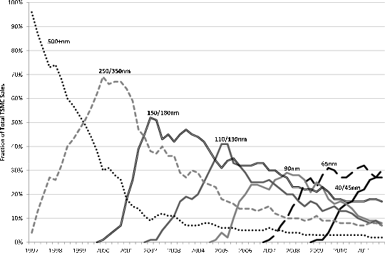
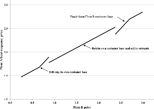
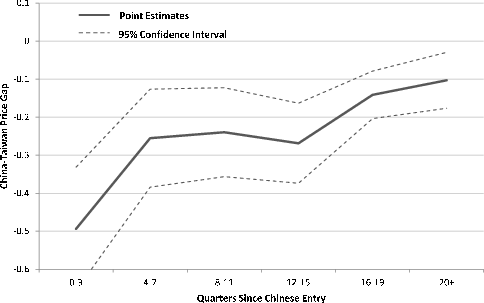
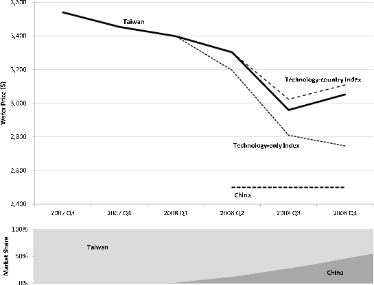
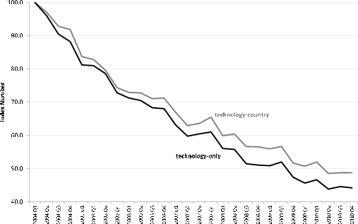
Table 1. Foundry Capacity by Country
| Year | Global CapacityFoundry | Global Capacity Total Industry | Country Capacity Taiwan | Country Capacity China | Country Capacity Singapore | Country Capacity Europe | Country Capacity USA | Country Capacity Japan | Country Capacity S. Korea | Country Capacity Malaysia |
|---|---|---|---|---|---|---|---|---|---|---|
| 2000 | 874.737109570064 | 9461.53253245564 | 0 | 0 | 0 | 0 | 0 | 0 | 0 | 0 |
| 2001 | 972.091306990446 | 8285.67064728895 | 0 | 0 | 0 | 0 | 0 | 0 | 0 | 0 |
| 2002 | 1010.68852864161 | 8646.10858899783 | 0 | 0 | 0 | 0 | 0 | 0 | 0 | 0 |
| 2003 | 1149.85203171305 | 9018.04266557573 | 0 | 0 | 0 | 0 | 0 | 0 | 0 | 0 |
| 2004 | 1428.77404458359 | 10000.0441853438 | 0 | 0 | 0 | 0 | 0 | 0 | 0 | 0 |
| 2005 | 1739.37538315672 | 11072.9014921517 | 0 | 0 | 0 | 0 | 0 | 0 | 0 | 0 |
| 2006 | 1950.75608791508 | 12320.3797340289 | 0 | 0 | 0 | 0 | 0 | 0 | 0 | 0 |
| 2007 | 2156.93903551593 | 13587.9470442821 | 0 | 0 | 0 | 0 | 0 | 0 | 0 | 0 |
| 2008 | 2401.15309536902 | 14296.6754834287 | 0 | 0 | 0 | 0 | 0 | 0 | 0 | 0 |
| 2009 | 2546.03442795936 | 14058.4722389046 | 0 | 0 | 0 | 0 | 0 | 0 | 0 | 0 |
| 2010 | 2812.24933898808 | 14230.1597867493 | 0 | 0 | 0 | 0 | 0 | 0 | 0 | 0 |
| 2011 | 3176.50233492936 | 14922.7709916458 | 0 | 0 | 0 | 0 | 0 | 0 | 0 | 0 |
Capacity measured in thousand 8-inch equivalent wafer starts per month. Note: Includes pure-play foundries only. Source: iSuppli
Table 2. Descriptive Statistics
| Variable | Mean | Standard Deviation | Mean 2004 | Mean 2005 | Mean 2006 | Mean 2007 | Mean 2008 | Mean 2009 | Mean 2010 |
|---|---|---|---|---|---|---|---|---|---|
| Price Per Wafer ($) | 1204.221 | 949.2834 | 1321.01 | 1293.506 | 1298.535 | 1189.68 | 1120.338 | 1080.392 | 1126.085 |
| Number of Wafers Contracted | 11865 | 22302.74 | 8344.605 | 14912.17 | 10544.97 | 16767.34 | 9260.243 | 9692.421 | 13533.24 |
| Metal Layers | 4.600483 | 1.772773 | 4.216975 | 4.55892 | 4.84714 | 4.763979 | 4.621442 | 4.559621 | 4.635302 |
| Mask Layers | 25.71864 | 7.30606 | 23.69441 | 24.51627 | 26.36987 | 26.73965 | 25.85561 | 26.27401 | 26.58069 |
| Polysilicon Layers | 1.231062 | 0.4579373 | 1.364623 | 1.21062 | 1.204816 | 1.194165 | 1.302794 | 1.144764 | 1.195649 |
| Wafer size: 150 millimeters | 0.1583186 | 0.3650687 | 0.1833477 | 0.1724397 | 0.1492147 | 0.0987856 | 0.170198 | 0.1616495 | 0.1725953 |
| Wafer size: 200 millimeters | 0.7289038 | 0.4445612 | 0.7888104 | 0.7612831 | 0.7566809 | 0.8078464 | 0.6810361 | 0.6757087 | 0.6309607 |
| Wafer size: 300 millimeters | 0.1127776 | 0.316346 | 0.0278419 | 0.0662772 | 0.0941045 | 0.0933679 | 0.148766 | 0.1626418 | 0.196444 |
| Line width: 45 nanometers | 0.0037641 | 0.0612413 | 0 | 0 | 0 | 0 | 0 | 0 | 0.0263485 |
| Line width: 65 nanometers | 0.0273947 | 0.1632437 | 0 | 0 | 8.11e-05 | 0.009551 | 0.0363475 | 0.066057 | 0.0797263 |
| Line width: 90 nanometers | 0.0449413 | 0.2071918 | 0.0006919 | 0.0155024 | 0.0400222 | 0.0507524 | 0.0838866 | 0.0614692 | 0.0622644 |
| Line width: 130 nanometers | 0.1514773 | 0.3585422 | 0.1154788 | 0.1630363 | 0.1825234 | 0.1708644 | 0.1395889 | 0.135983 | 0.1528667 |
| Line width: 150 nanometers | 0.0551305 | 0.2282531 | 0.0668635 | 0.0771576 | 0.0995197 | 0.0880599 | 0.0317013 | 0.0128694 | 0.0097422 |
| Line width: 180 nanometers | 0.261541 | 0.439509 | 0.2458474 | 0.2315685 | 0.2431226 | 0.2810113 | 0.2629212 | 0.3096241 | 0.2566917 |
| Line width: 250 nanometers | 0.1227607 | 0.3281886 | 0.1664442 | 0.1670349 | 0.1297824 | 0.1488618 | 0.1018625 | 0.0679184 | 0.0774209 |
| older vintage than 250 nanometers | 0.3329904 | 0.4713208 | 0.4046743 | 0.3457004 | 0.3049486 | 0.2508991 | 0.343692 | 0.3460789 | 0.3349394 |
6253 Observations Source: Authors' calculations based on GSA Wafer Fabrication & Back-End Pricing Survey and iSuppli shipments data
Table 3. Hedonic Wafer Price Regression - Dependent variable: log of price per wafer
| Variable | Coefficient | Standard Error | t Statistic |
| Foundry Location: China | -0.1863594 | 0.0271428 | -6.87 |
| Foundry Location: Malaysia | -0.2776145 | 0.0418349 | -6.64 |
| Foundry Location: Singapore | -0.0614042 | 0.0162973 | -3.77 |
| Foundry Location: United States | 0.0678997 | 0.0304368 | 2.23 |
| Wafer size: 150 millimeters | -0.467437 | 0.0321433 | -14.54 |
| Wafer size: 300 millimeters | 0.6712808 | 0.0212408 | 31.6 |
| Line width: greater than or equal to 500 nanometers | -0.2452503 | 0.0531494 | -4.61 |
| Line width: 350 nanometers | -0.1669725 | 0.0334428 | -4.99 |
| Line width: 250 nanometers | -0.0607997 | 0.0259641 | -2.34 |
| Line width: 150 nanometers | 0.1687635 | 0.0271567 | 6.21 |
| Line width: 130 nanometers | 0.3564338 | 0.0180048 | 19.8 |
| Line width: 90 nanometers | 0.47865 | 0.0324054 | 14.77 |
| Line width: 65 nanometers | 0.6755488 | 0.0300404 | 22.49 |
| Line width: 45 nanometers | 0.9617313 | 0.0615799 | 15.62 |
| Number of Metal Layers | 0.0761487 | 0.0072132 | 10.56 |
| Number of Polysilicon Layers | 0.0265977 | 0.0241684 | 1.1 |
| Number of Mask Layers | 0.0047293 | 0.0015888 | 2.98 |
| Epitaxial Layer Indicator | 0.0636705 | 0.0371153 | 1.72 |
| log Number of Wafers Contracted | -0.0557653 | 0.0042313 | -13.18 |
| R-squared | 0.909 | 0.909 | 0.909 |
| Observations | 6253 | 6253 | 6253 |
Specification also includes quarterly indicator variables non-CMOS production not included Baseline case (omitted category) is Taiwan, 200 millimeters, 180 nanometers Weighted using iSuppli shipment weights Standard errors adjusted for 28 quarter clusters
Table 4. Simulation Results
| log of ratio of price A to price B | Probability of switching | Firm A market share | |
|---|---|---|---|
| Period 2 | 0.394 | 0.14 | 0.67 |
| Period 3 | 0.186 | 0 | 0.55 |
Specifications include quarter indicator variables, wafer size indicators, line width indicators, layer controls, and contract size. Observations pertaining to Chinese and Taiwanese foundries only. Technologies with no Chinese production omitted non-CMOS production not included Baseline case (omitted category) is Taiwan, 200mm, 180nm Weighted using iSuppli shipment weights Standard errors adjusted for 28 quarter clusters * significant at 10% level, ** 5%, *** 1%
Table 5. Closing Price Gaps Within Technology - Dependent variable: log of price per wafer
| Variable | Baseline Coefficient | Baseline Standard Error | Closing price gap Coefficient | Closing price gap Standard Error |
|---|---|---|---|---|
| China | -0.1978349 | (0.029)*** | -0.4939995 | (0.079)*** |
| Time since Chinese entry: | ||||
| Time since Chinese entry: 4-7 quarters | -0.1278627 | (0.026)*** | ||
| Time since Chinese entry: 8-11 quarters | -0.2620442 | (0.028)*** | ||
| Time since Chinese entry: 12-15 quarters | -0.3925831 | (0.043)*** | ||
| Time since Chinese entry: 16-19 quarters | -0.4499613 | (0.040)*** | ||
| Time since Chinese entry: greater than or equal to 20 quarters | -0.4779293 | (0.063)*** | ||
| Interaction: China and 4-7 quarter dummy | 0.2386646 | (0.102)** | ||
| Interaction: China and 8-11 quarter dummy | 0.2545047 | (0.095)** | ||
| Interaction: China and 12-15 quarter dummy | 0.2253633 | (0.089)** | ||
| Interaction: China and 16-19 quarter dummy | 0.3526314 | (0.081)*** | ||
| Interaction: China and greater than or equal to 20 quarters dummy | 0.3911554 | (0.073)*** | ||
| Technological controls from Table 3 | X | X | X | X |
| Quarter indicators | X | X | X | X |
| R-squared | 0.919 | 0.919 | 0.932 | 0.932 |
| Observations | 5303 | 5303 | 5303 | 5303 |
Table 6: Matched-Model Price Index Results
| technology-country index | technology-only index | |
|---|---|---|
| 2004 Q1 | 100.0 | 100.0 |
| 2004 Q2 | 97.0 | 96.0 |
| 2004 Q3 | 92.8 | 90.5 |
| 2004 Q4 | 91.9 | 88.2 |
| 2005 Q1 | 83.7 | 81.2 |
| 2005 Q2 | 82.8 | 81.0 |
| 2005 Q3 | 79.6 | 78.6 |
| 2005 Q4 | 74.3 | 72.8 |
| 2006 Q1 | 72.9 | 71.2 |
| 2006 Q2 | 72.8 | 70.5 |
| 2006 Q3 | 71.0 | 68.3 |
| 2006 Q4 | 71.3 | 68.0 |
| 2007 Q1 | 66.9 | 63.1 |
| 2007 Q2 | 63.0 | 59.8 |
| 2007 Q3 | 63.6 | 60.5 |
| 2007 Q4 | 65.5 | 61.0 |
| 2008 Q1 | 59.9 | 56.1 |
| 2008 Q2 | 60.4 | 55.8 |
| 2008 Q3 | 56.6 | 51.5 |
| 2008 Q4 | 56.6 | 51.1 |
| 2009 Q1 | 56.0 | 50.9 |
| 2009 Q2 | 56.7 | 52.0 |
| 2009 Q3 | 51.7 | 47.4 |
| 2009 Q4 | 50.7 | 45.7 |
| 2010 Q1 | 52.0 | 46.7 |
| 2010 Q2 | 48.6 | 43.9 |
| 2010 Q3 | 48.8 | 44.6 |
| 2010 Q4 | 48.8 | 44.2 |
| 2004 | 95.4 | 93.7 |
| 2005 | 80.1 | 78.4 |
| 2006 | 72.0 | 69.5 |
| 2007 | 64.7 | 61.1 |
| 2008 | 58.4 | 53.6 |
| 2009 | 53.8 | 49.0 |
| 2010 | 49.5 | 44.8 |
| Average Yearly Change '04-'10 | -10.4% | -11.6% |
A. Data
In this appendix, we describe the data sources and steps taken in the construction of the dataset used in our analysis.
A.1 Wafer Prices
As discussed in Section 3.1, our wafer price data come from a proprietary database of semiconductor wafer purchases from foundries, collected by the Global Semiconductor Alliance (GSA). We implement a number of data cleaning procedures before the main analysis.
First, we implement a variety of sample restrictions. We drop observations corresponding to engineering runs that occur during the design stage prior to volume production. We omit a few observations reporting the obsolete 100mm wafer diameter. As discussed in Section 2.1, we keep only observations corresponding to CMOS process technology, which dominates the foundry market, and omit other processes that are quite distinct and serve niche markets for high-power, defense, aerospace applications. We also keep only observations for wafers produced by so-called "pure-play" foundries, and omit transactions involving integrated device manufacturers (IDMs) that do both design and fabrication.
Table A1 shows that 6,916 observations satisfy these sample restrictions. We drop an additional 663 observations for a variety of reasons. 576 observations do not report the location of production, 1 observation reports an implausibly large order (which distorts the price per wafer), and 86 observations report technologies (wafer-size, line-width combinations) for which other sources (see below) report no production in the reported country and quarter.
Finally, we also combine closely related line widths. Any line width greater than or equal to 500nm is combined into the 500nm code. 140 and 150nm widths are combined into the 150nm code. 80 and 90nm widths are combined into the 90nm code. 60 and 65nm widths are combined into the 65nm code. 40 and 45nm widths are combined into the 45nm code. In all of these cases, one of the combined widths is vastly dominant in the market, and it would be difficult to separately identify prices less prevalent line width with very few observations.
A.2 Semiconductor Wafer Shipments
Our price indexes use quantity information to weight observations across process technologies (though the qualitative nature of the results does not depend upon the choice of weighting scheme). The GSA data include quantity information for each shipment, but aggregating this information yields quite volatile aggregate quantity measures for each technology. Instead of using this quantity information from GSA, we employ data published by HIS iSuppli in their "Pure Play Foundry Market Tracker." This report is a global census of semiconductor foundries, including 91 fabs belonging to 20 companies. Annual and quarterly frequency data begin in 2000 and 2002, respectively. Characteristics provided for each fab include company of ownership, location, wafers shipped per month at full capacity, and diameter of wafers shipped. This allows us to construct capacity by region and wafer size (Table 1).
In addition, the report provides information on wafer shipments for specific technologies (line widths) by company, but not by plant. For 11 of the companies covered, this information is sufficient to construct the needed wafer size-by-line width-by-country weights for our analysis without further assumptions. In two cases, only one fab is active in the period we cover, and in nine cases, all the company's fabs employ the same wafer diameter and are located in the same country.
The remaining companies either have fabs in multiple regions, or fabricate wafers of multiple diameters, or both. In these cases, we first estimate wafer shipments by technology for each fab, which allows us to divide production between countries for each technology. To do this, we employ three additional resources: the partial information on the timing of technology introduction by plant from the IHS iSuppli report; company information provided in public statments; and extensive discussions with iSuppli.57 Specifically, the "Market Tracker" lists the technologies employed (without output shares) in each fab at the time of publication, which we have for previous vintages of the database beginning in Q1 2010. This information allows us to construct technology-by-country-by-quarter weights for an additional 2 companies. In these cases, each with two fabs in operation, we were able to identify one company fab exclusively employing a single category of legacy technology (500nm and above), leaving the remaining fab to account for the residual company production.
In the remaining 7 cases, to arrive at the weights, we need further information about the technology employed at specific plants. A search of company press releases and industry press reports yielded information on the timing of introduction of particular line widths at specific fabs in several cases, but information on the relative importance of each technology by fab is not available. To fill this gap we appeal to information on industry norms gathered from iSuppli and other reports and discussions with industry analysts. We assume that several rules hold in general: (1) fabs add new technologies progressively-adding a line width more advanced than all technologies used in previous periods; (2) fabs ramp up output of new technologies linearly over a four-quarter period; (3) companies introduced new technologies first at the company's most advanced fab; (4) when not ramping a new technology, fabs split production evenly among the 2-4 technologies in production. Individual companies often required deviations from these rules based on information regarding specific fabs to match the overall company technology mix.
Table A2 shows the specific assumptions we made for each foundry in generating the weights, and we have made available the resulting set of weights by country, wafer size, line width, and quarter at:
We also use these data to calculate the time since Chinese entry for each production technology in Section 5.Table A.1: Dropped Observations
| Total observations | 6916 |
|---|---|
| Used in analysis | 6253 |
| Dropped | 663 |
| Missing foundry location | 576 |
| Implausibly large order reported* | 1 |
| Inconsistent | 86 |
There may be multiple reasons to drop an observation * Confirmed with GSA
Table A.2: Technology Assumptions by Country
| Company | number of fabs | number of countries | number of wafer diameters | Notes on Assumptions |
|---|---|---|---|---|
| Altis Semiconductor | 1 | 1 | 1 | |
| ASMC | 3 | 1 | 2 | Small diameter fab produces legacy technology. Large diameter fab produces remaining more advanced technology. |
| CRMC | 4 | 1 | 2 | All fabs are same diameter until 2009. No assumptions needed. 2009-2011: small diameter fabs produce all reported legacy technology and amount of 350nm indicated by historical pattern. Remaining shipments from large diameter fabs. |
| Dongbu Hi Tek | 2 | 1 | 1 | |
| Episil | 4 | 1 | 1 | |
| Globalfoundries/ Chartered | 11 | 2 | 3 | 2004-2008: Single country Small diameter fab capacity split evenly between 350nm and legacy technology. Large diameter fabs produce all shipments using 130nm and more advanced technology. Medium diameter fabs produce remaining more advanced technology. 2009-2011: Begin with 2008 mix from existing locations. Ramp up 65nm and 45nm with timing indicated in reports. Residual is production in single remaining location. |
| Grace | 2 | 1 | 1 | |
| He Jian | 2 | 1 | 1 | |
| HHNEC | 3 | 1 | 1 | |
| HuaLi | 1 | 1 | 1 | |
| Landshunt Silicon Foundry GmbH | 2 | 1 | 1 | |
| Phenitec | 3 | 1 | 1 | |
| Silterra | 3 | 1 | 1 | |
| SMIC | 10 | 1 | 2 | All 150nm and less advanced technology produced at medium-diameter fabs. All 65nm and 90nm is produced at large-diameter fabs. Assign 130nm production based on guidance from industry analysts. |
| SSMC | 1 | 1 | 1 | |
| TowerJazz | 5 | 3 | 2 | Small diameter fab produces 350nm and legacy technology. Remainder split among other locations proportional to capacity. |
| TSMC | 13 | 4 | 3 | Production at one location known with certainty. Second set of fabs known to be divided between 250nm and 350nm assumed to be split evenly. Third set of fabs assumed to be split evenly among 5 technologies (130nm 150nm 250nm 350nm 500nm) Small diameter fab accounts for nearly all legacy technology and small share of 350nm & 250nm. Small amount of legacy production in second location indicated by data. Large diameter fabs account for all production using 90nm and more advanced technologies. Residual capacity at these fabs split evenly between 130nm 150nm and 180nm until drawing down to minimal to offset ramp-up of 65nm technology. Residual goes to medium diameter production at remaining location. |
| UMC | 12 | 3 | 3 | Production at one location known with certainty. Small diameter fab split evenly between 350nm and legacy technology. Remaining 350nm and legacy technology and all 150nm 180nm and 250nm production from medium-diameter fabs. Large diameter fabs account for all production using 65nm and more advanced technologies. assumptions required to split 90nm-130nm between 200mm and 300mm. 2008-2011: Remaining medium-diameter capacity split evenly between 90nm and 130nm. Residual production using these technologies at large-diameter fabs. |
| Vanguard | 2 | 1 | 1 | |
| X-Fab Semiconductor Foundries AG | 6 | 4 | 2 | Split legacy technology production between small-diameter fabs in two locations proportional to capacity. 350nm at known location medium diameter. Residual is implied at third location. |
B. Details of the Terminal-Period Problem
This appendix provides analytical results for the model's terminal period problem. Throughout, we omit the period-3 subscript from the notation.
B.1 Four Cases
The analysis of Firm A's optimal policy in the terminal period is organized around two observations. First, Firm A can charge up to
![]() and still retain all of its customer base, whereas the firm must charge no more than
and still retain all of its customer base, whereas the firm must charge no more than
![]() to attract any new entrants. Therefore, if
to attract any new entrants. Therefore, if ![]() is sufficiently large such
that
is sufficiently large such
that
![]() , then Firm A retains all of its customer base when it sets a price that is low enough to attract any
new buyers. Otherwise, the firm may relinquish its relatively low-complexity old buyers and yet still compete for new higher-complexity entrants. Second, Firm A can charge up to
, then Firm A retains all of its customer base when it sets a price that is low enough to attract any
new buyers. Otherwise, the firm may relinquish its relatively low-complexity old buyers and yet still compete for new higher-complexity entrants. Second, Firm A can charge up to ![]() and still
capture all new entrants, whereas it must charge no more than
and still
capture all new entrants, whereas it must charge no more than
![]() to capture any members of Firm B's customer base. Therefore, if
to capture any members of Firm B's customer base. Therefore, if ![]() is sufficiently large such that
is sufficiently large such that
![]() , then Firm A captures all new entrants when it sets a price that is low enough to poach any of Firm B's customer
base. Otherwise, Firm A may be able to poach Firm B's highest-complexity customers even if it does not attract all new entrants.
, then Firm A captures all new entrants when it sets a price that is low enough to poach any of Firm B's customer
base. Otherwise, Firm A may be able to poach Firm B's highest-complexity customers even if it does not attract all new entrants.
This discussion indicates that the form of the optimal policy depends on how ![]() compares to
compares to
![]() and
and
![]() . There are 4 separate cases (and one knife-edge case) to consider:
. There are 4 separate cases (and one knife-edge case) to consider:
Case #1: The first is the case of a large startup cost in the sense that
![]() . This implies that i) if a firm participates in the new buyer market, it necessarily retains all old buyers and
ii) if it poaches its competitor's customer base, it necessarily captures all period-3 entrants.
. This implies that i) if a firm participates in the new buyer market, it necessarily retains all old buyers and
ii) if it poaches its competitor's customer base, it necessarily captures all period-3 entrants.
Case #2: In the second case,
![]() This occurs if the startup cost is moderate and Firm A's customer base includes only the highest-quality buyers (
This occurs if the startup cost is moderate and Firm A's customer base includes only the highest-quality buyers (![]() is above 1/2). Since these buyers are most reluctant to switch to Firm B, Firm A can charge them a relatively high price. It follows that, if Firm A lowers its price enough to attract any
period-3 entrants, it will also retain its entire customer base. In addition, since
is above 1/2). Since these buyers are most reluctant to switch to Firm B, Firm A can charge them a relatively high price. It follows that, if Firm A lowers its price enough to attract any
period-3 entrants, it will also retain its entire customer base. In addition, since ![]() is high, Firm B's customer base also includes some relatively high-quality buyers, who pay the
monitoring cost to purchase from Firm B. Therefore, Firm A may be able to poach some of its competitor's customers even if it does not sell to all new entrants.
is high, Firm B's customer base also includes some relatively high-quality buyers, who pay the
monitoring cost to purchase from Firm B. Therefore, Firm A may be able to poach some of its competitor's customers even if it does not sell to all new entrants.
Case #3: In the third case,
![]() This occurs if the startup cost is moderate and Firm A's customer base is relatively large (
This occurs if the startup cost is moderate and Firm A's customer base is relatively large (![]() is below 1/2). This means Firm A may capture high-quality new entrants and yet shed some of its lowest-quality old buyers. Thus, it does not necessarily retain its customer base if it attracts any new entrants. At the same
time, since
is below 1/2). This means Firm A may capture high-quality new entrants and yet shed some of its lowest-quality old buyers. Thus, it does not necessarily retain its customer base if it attracts any new entrants. At the same
time, since
![]() , the price that Firm A must charge to poach is so low that it will also capture all new entrants if it poaches at all.
, the price that Firm A must charge to poach is so low that it will also capture all new entrants if it poaches at all.
Case #4: Lastly, we consider the case
![]() . In this case the startup cost is small, such that Firm A may shed some of its old buyers and yet still compete
for the higher-quality new entrants. Similarly, it also may poach the higher-quality members of Firm B's customer base even if it has not captured all new entrants.
. In this case the startup cost is small, such that Firm A may shed some of its old buyers and yet still compete
for the higher-quality new entrants. Similarly, it also may poach the higher-quality members of Firm B's customer base even if it has not captured all new entrants.
Knife-edge Case: There is also a "knife-edge" case in which
![]() . If this holds, then the price at which Firm A just retains all old buyers (
. If this holds, then the price at which Firm A just retains all old buyers (
![]() ) precisely coincides with the price at which Firm A begins to capture new entrants (
) precisely coincides with the price at which Firm A begins to capture new entrants (
![]() ). This means that sales evolve smoothly from one regime to the next: as Firm A's price falls just below
). This means that sales evolve smoothly from one regime to the next: as Firm A's price falls just below
![]() , it does not acquire any more of its customer base (it has already captured all of them) but instead, its share of new entrants starts to rise. Moreover, the Firm A price
at which it captures all new entrants (
, it does not acquire any more of its customer base (it has already captured all of them) but instead, its share of new entrants starts to rise. Moreover, the Firm A price
at which it captures all new entrants (
![]() ) coincides with the price at which it begins to attract buyers in Firm B's customer base (
) coincides with the price at which it begins to attract buyers in Firm B's customer base (
![]() ). Hence, in this case, Firm A's sales and profits will vary continuously as a function of its own price. This yields a smooth best-response function. As we will
see, the same is not true of the best-response function outside of this knife-edge case.
). Hence, in this case, Firm A's sales and profits will vary continuously as a function of its own price. This yields a smooth best-response function. As we will
see, the same is not true of the best-response function outside of this knife-edge case.
B.2 Case #2:
The calibration we present in Section 4.1 is consistent with Case #2. We provide details of the terminal period problem for this case here. It is straightforward to apply similar logic to the other cases. In Case #2, Firm A selects a price within one of four mutually exclusive regimes:
Regime I: In this regime, Firm A charges
![]() , which means it sells exclusively to members of its customer base. Since
, which means it sells exclusively to members of its customer base. Since ![]() is uniformly distributed on the unit interval, sales to its old buyers are given by
is uniformly distributed on the unit interval, sales to its old buyers are given by
![]() , and so its problem is to maximize
, and so its problem is to maximize
![]() . There is an interior solution to this maximization problem as long as
. There is an interior solution to this maximization problem as long as
![]() , as we have assumed. It follows that the optimal price in the interior of this regime is
, as we have assumed. It follows that the optimal price in the interior of this regime is
![]() and profits are
and profits are
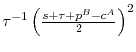 .
.
It is helpful to know the set of Firm B prices consistent with an interior solution in this regime. The Firm B price that induces Firm A to set
![]() satisfies
satisfies
![]() . This yields
. This yields
![]() The Firm B price such that Firm A wishes to set
The Firm B price such that Firm A wishes to set
![]() solves
solves
![]() which yields
which yields
![]() Hence, in Regime I, an interior solution obtains if
Hence, in Regime I, an interior solution obtains if
![]() 58
58
If Firm B's price is outside the range
![]() , then Firm A's optimal strategy is to charge a price at the corner of the Regime I range. For example, if Firm A faces
, then Firm A's optimal strategy is to charge a price at the corner of the Regime I range. For example, if Firm A faces
![]() , its desired price is less than the minimum admitted under Regime I and would imply that Firm A captures a share of its customer base that is greater than 1. This is
clearly impossible, so Firm A will instead charge the minimum price of
, its desired price is less than the minimum admitted under Regime I and would imply that Firm A captures a share of its customer base that is greater than 1. This is
clearly impossible, so Firm A will instead charge the minimum price of
![]() . A similar argument applies to
. A similar argument applies to
![]() . In that case Firm A charges the maximum price consistent with Regime I of
. In that case Firm A charges the maximum price consistent with Regime I of
![]()
Figure B1 shows Firm A's Regime I best response function for the calibration described in Section 4.1. Given the calibration,
![]() and
and
![]() . Thus, for
. Thus, for ![]() between 0 and 0.66, Firm A's Regime I optimal
price represents an interior solution, so the slope of that portion of the best response function is
1/2. For
between 0 and 0.66, Firm A's Regime I optimal
price represents an interior solution, so the slope of that portion of the best response function is
1/2. For ![]() greater than 0.66, Firm A's Regime I optimal price is a
corner solution such that
greater than 0.66, Firm A's Regime I optimal price is a
corner solution such that
![]() and the slope is 1.
and the slope is 1.
Regime II: In this region, Firm A selects the best price within the range,
![]() . The price,
. The price,
![]() , makes the highest-quality new buyer indifferent between the two firms, whereas
, makes the highest-quality new buyer indifferent between the two firms, whereas
![]() is just low enough to attract the highest-quality Firm B (old) buyer. Notice that the set of prices between
is just low enough to attract the highest-quality Firm B (old) buyer. Notice that the set of prices between
![]() and
and
![]() (the minimum feasible price under Regime I) is excluded from Regime II. This is for good reason: if Firm A set a price in this range, it would not attract any new
entrants but would receive a lower price from each of its locked-in (old) buyers. Hence, it never chooses a price in this set. In other words, Firm A's demand schedule jumps downwards at
(the minimum feasible price under Regime I) is excluded from Regime II. This is for good reason: if Firm A set a price in this range, it would not attract any new
entrants but would receive a lower price from each of its locked-in (old) buyers. Hence, it never chooses a price in this set. In other words, Firm A's demand schedule jumps downwards at
![]() .
.
Since Firm A retains all of its customer base in Regime II, its problem is to maximize
![]() . This has solution
. This has solution
![]() , which implies profits of
, which implies profits of
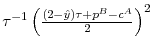 .
.
We can again solve for the set of Firm B prices that is consistent with an interior solution in this regime. The Firm B price that induces Firm A to set
![]() is
is
![]() . The Firm B price such that Firm A sets
. The Firm B price such that Firm A sets
![]() is
is
![]() Thus, in this regime, there is an interior solution if
Thus, in this regime, there is an interior solution if
![]()
As above, if Firm B's price is outside the range
![]() , then Firm A's optimal strategy is to charge a price at the corner of the Regime II range. If
, then Firm A's optimal strategy is to charge a price at the corner of the Regime II range. If
![]() , then Firm A charges the Regime II minimum price of
, then Firm A charges the Regime II minimum price of
![]() . If
. If
![]() , then Firm A charges the Regime II maximum price of
, then Firm A charges the Regime II maximum price of
![]() . This Regime II best response function is shown in Figure B2 for the calibration described in Section 4.1.
. This Regime II best response function is shown in Figure B2 for the calibration described in Section 4.1.
Regime III: In this region, Firm A charges
![]() . Since it attracts a share of both new buyers and some of Firm B's higher-quality old buyers, Firm A's
problem is to maximize
. Since it attracts a share of both new buyers and some of Firm B's higher-quality old buyers, Firm A's
problem is to maximize
![]() The optimal price is
The optimal price is
![]() and profits are
and profits are
 It follows that the range of Firm B prices consistent with an interior solution is
![]() , where
, where
![]() and
and
![]() . As in the other regimes, if
. As in the other regimes, if ![]() falls outside
falls outside
![]() , Firm A will charge corner solution prices
, Firm A will charge corner solution prices
![]() or
or ![]() . The Regime III best response function is shown in
Figure B3 for the calibration described in Section 4.1. Note that for the calibration chosen, the Regime III interior region is quite small, indicating that there is only a small range of prices for which Firm A can poach from Firm B's
customer base without having captured all new entrants.
. The Regime III best response function is shown in
Figure B3 for the calibration described in Section 4.1. Note that for the calibration chosen, the Regime III interior region is quite small, indicating that there is only a small range of prices for which Firm A can poach from Firm B's
customer base without having captured all new entrants.
Regime IV: In this regime, Firm A selects the best price in the range,
![]() . The lower end of this set,
. The lower end of this set, ![]() , is the price at which even the lowest-quality buyer in Firm B's customer base is indifferent between the two suppliers. Since Firm A captures all new entrants in this regime, its problem is to maximize
, is the price at which even the lowest-quality buyer in Firm B's customer base is indifferent between the two suppliers. Since Firm A captures all new entrants in this regime, its problem is to maximize
![]() The solution is given by
The solution is given by
![]() and profits are
and profits are
 . It follows that the range of Firm B prices consistent with an interior solution is
![]() where
where
![]() and
and
![]() . If
. If ![]() falls outside this range, Firm
A will charge corner solution prices
falls outside this range, Firm
A will charge corner solution prices ![]() or
or ![]() . The Regime IV best
response function is shown in Figure B4 for the calibration described in Section 4.1.
. The Regime IV best
response function is shown in Figure B4 for the calibration described in Section 4.1.
Global Best Response: In the best-response policy shown in Figure 2, note that the left segment corresponds to Regime I, the central segment corresponds to Regime II, and the right segment corresponds to Regime IV. For the calibration shown,
regime III is dominated by the other regimes for all ![]() . Finally, note that while the terminal-period best response functions shown here were derived based on the analytical results just
discussed, they correspond exactly with the results of the numerical optimization procedure described in Section 4.1.
. Finally, note that while the terminal-period best response functions shown here were derived based on the analytical results just
discussed, they correspond exactly with the results of the numerical optimization procedure described in Section 4.1.
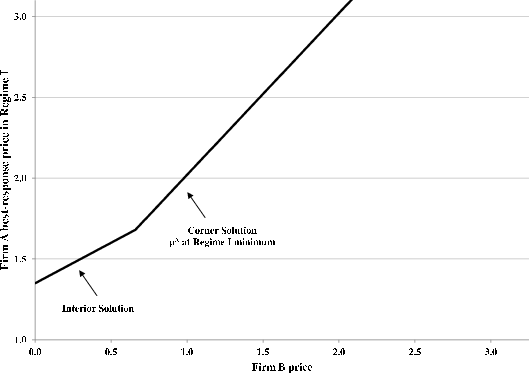
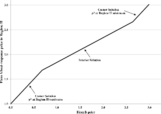
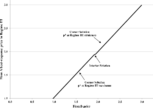
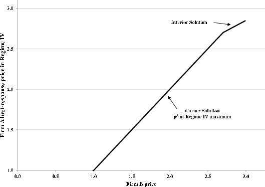
Footnotes
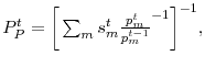 where
where