
FEDS Notes
 Print
PrintAugust 5, 2015
Mapping Heat in the U.S. Financial System: A Summary1
David Aikman, Michael Kiley, Seung Jung Lee, Michael Palumbo, and Missaka Warusawitharana
This Note reports a selection of results from research intended to quantitatively measure the buildup and reduction of vulnerabilities in the U.S. financial system over time. Building on the framework proposed by Adrian, Covitz, and Liang (2014), our effort focuses on measuring vulnerabilities in the financial system stemming from maturity transformation, leverage, and interconnectedness in the financial sector; valuation pressures or elevated risk appetite among investors in certain asset markets; and financial imbalances in the nonfinancial sectors of the economy. In this framework, elevated vulnerability suggests a financial system more likely to amplify or facilitate contagion of shocks than to absorb or contain them. Our method applies fixed criteria (that is, a static algorithm) to a medium-sized set of indicators covering a fairly wide range of financial activities. To facilitate the interpretation of a considerable amount of information, we take advantage of data-visualization tools which place the levels and changes in the sources of vulnerability we measure in the context of activity and positions in the past two and a half decades.
Our analysis reveals that many sources of vulnerability in the U.S. financial system had built to unusual levels several years prior to the onset of the financial crisis. In itself this may not be surprising, but our visualization tools and aggregation method(s) allow a broader perspective than has been brought to bear in existing work on the U.S. financial system. Our heat maps are colored red by the mid-2000s, identifying as key factors not only elevated real estate prices and the rapid pace and risky composition of mortgage lending, but also substantial use of leverage, short-term funding, and excessive maturity transformation in the financial sector. This reading suggests the potential for the quantitative measure of vulnerabilities we develop to provide the kind of early signal policymakers may need to apply countercyclical macroprudential tools. In this vein, our measures tend to lead the credit-to-GDP ratio gap--a commonly referenced indicator for countercyclical, macroprudential purposes--by a year or more, potentially providing important advance information on the state of the credit cycle.
Most recently (the end of 2014), our quantitative measures indicate a subdued level of overall vulnerability in the U.S. financial system. Although they point to valuation pressures and elevated risk appetite in certain asset markets--including commercial real estate and, to a lesser extent, those associated with credit risk and price volatility--by our metrics, nonfinancial sector imbalances, financial sector leverage, and maturity transformation were low, overall. The low levels of financial sector leverage and maturity transformation--which, in part, reflect the effects of financial regulatory reforms and industry responses to the crisis--can be traced to the fact that our statistical algorithm compares the current state of leverage and maturity transformation to norms over the past couple of decades. A more subjective notion of what levels might be considered to represent benign or elevated positions might convey a less sanguine view.
This observation brings to mind some important limitations of our approach. First, it focuses on cyclical conditions and is not well-suited for capturing ongoing structural vulnerabilities in the financial system that may be quantitatively important but not vary materially from quarter to quarter or even year to year. Second, our approach misses sources of vulnerability that cannot be readily quantified with available data--such as the degree of leverage associated with derivative positions or certain measures of the interconnectedness of systemically important firms--or that are associated with factors outside its pre-defined scope, including those that may be associated with the ongoing evolution of the financial system. Finally, somewhat counterintuitively, our measures can show markedly reduced vulnerabilities in the midst of crises, as in late 2008 and early 2009, despite the fragility of the financial system at such times. The sharp drops in asset prices and curtailment of credit during crises reduce measures of overvaluation and signal low nonfinancial imalances. While a macroprudential policymaker may well decide in a crisis to "dial down" a tool that had been employed during the boom phase of the credit cycle, "low systemic vulnerability" is probably not the best phrase to use to explain such a policy response.
An Algorithmic Approach to Measuring Vulnerabilities
In principle, there is an extremely wide range of activities and markets that one might want to consider when gauging the full extent of vulnerabilities in a system as complex as the U.S. financial system. Our approach to developing a quantitative, algorithmic approach involves several steps: Selecting a specific set of indicators on which to focus our analysis; obtaining a set of signals from this data, including defining reference values (e.g., mean or trend) for the assessment of the current signal; combining disparate information into an overall assessment; and, finally, developing visualization tools that permit interpretation without presenting overwhelming detail.
Selection of specific indicators
In selecting a specific set of indicators, we include information that spans the range of vulnerabilities emphasized, for example, by Adrian, Covitz, and Liang (2014). We also draw upon the academic literature and rely exclusively on publicly available information (as opposed to confidential information collected in the supervisory process). We assemble series that are available in a timely fashion and over a long-enough time period to provide appropriate context--that is, to allow a quantitative distinction between "normal" and "unusual" levels or changes in activity. In addition, we choose a large enough set of indicators so that a broad range of underlying financial market activities are covered and so that no one indicator would necessarily receive much weight in an aggregate measure.
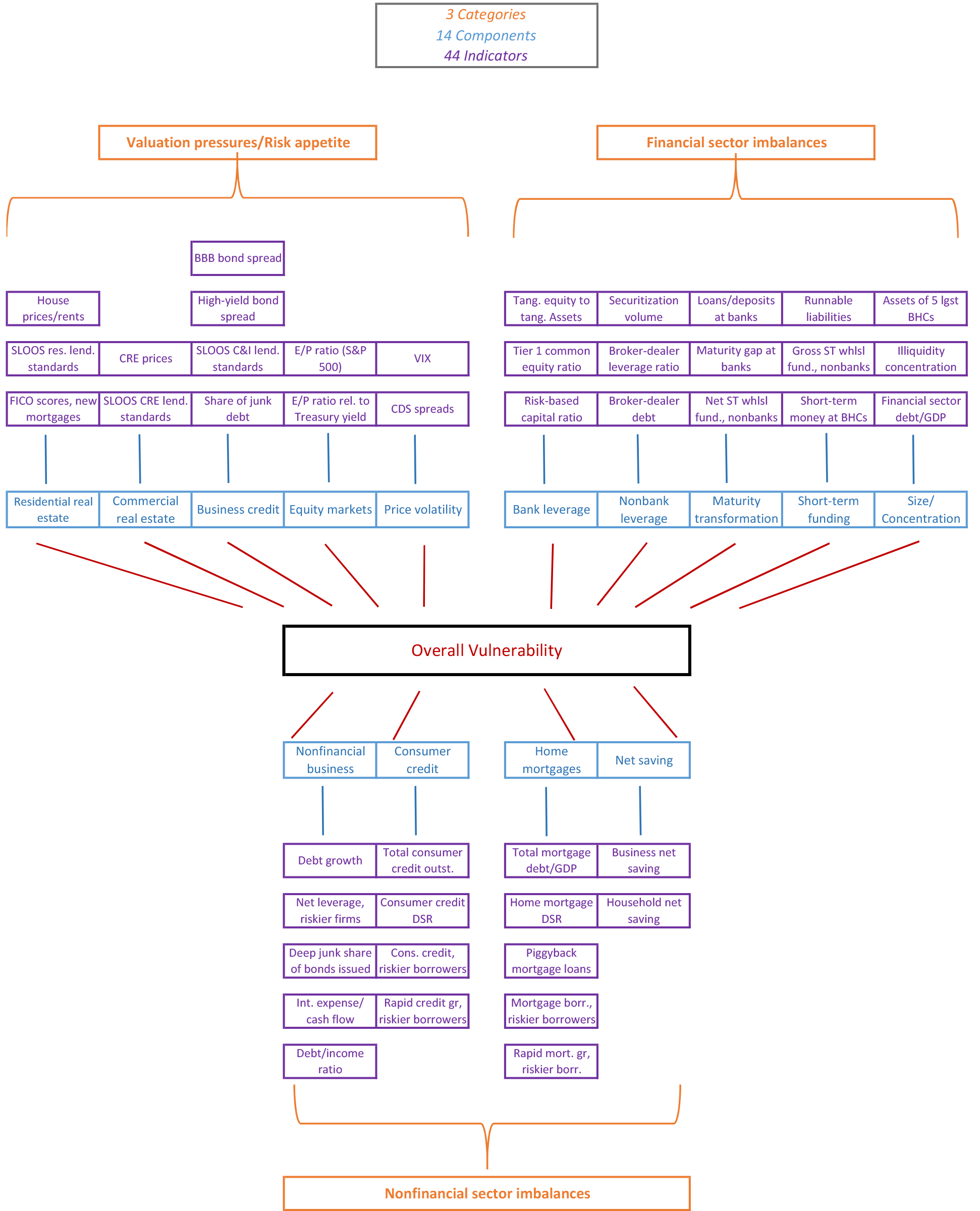
Figure 1 provides a schematic diagram of the range of indicators we use and how we organize them. In total, we assemble a set of 44 indicators (the purple boxes), which we group into 14 component sources of vulnerability (light blue), reflecting three broad categories (orange): asset valuation pressures and investor risk appetite; nonfinancial sector imbalances; and financial sector vulnerabilities.
- Valuation pressures and risk appetite (13 indicators, organized as 5 components): We consider indicators of valuations and/or lending standards for housing (3 indicators), commercial real estate (2 indicators), business debt and loans (4 indicators), equity markets (2 indicators), and price volatility (2 indicators).
- Nonfinancial imbalances (16 indicators, 4 components): We examine indicators of the volume, quality, and repayment burden on debt for 3 sectors: nonfinancial business (5 indicators), consumer credit (4 indicators), and home mortgages (5 indicators). We also include data on the net saving (2 indicators) positions of households and businesses.
- Financial sector imbalances (15 indicators, 5 components): We consider indicators of bank leverage (3 indicators) and nonbank leverage (3 indicators), the degree of maturity transformation (3 indicators), reliance on short-term funding (3 indicators), and size and concentration within the financial sector (3 indicators).
| Figure 1: Data Schematic for a Quantitative Assessment of Vulnerabilities in the U.S. Financial System |
|---|
 |
Processing the indicators and aggregating their information
With a dataset in hand, the next question is how to extract signals from the data--that is, combine the information from such a wide range of (only partially correlated) indicators in a flexible yet digestible form. Our approach involves 3 steps:
- We first standardize the raw data by subtracting from each series its average value or its trend (10-year moving average) then dividing by its time-series standard deviation. Our analysis focuses on the period from 1990 onward.
- We then average the standardized indicators within each of the 14 components listed above and rescale the average to take values on the (0,1) interval so that, for example, values near 1 represent observations near a component's maximum historical value. Our rescaling is accomplished by estimating a kernel density function over each component's historical distribution of standardized values then assigning each quarterly observation the quantile value from its estimated kernel.
- Finally, we average across the component indexes to create category indexes and a single overall index. We rescale this aggregate using its kernel density as described above, so that it also takes values on the (0,1) interval.
We chose this particular 3-step procedure largely because it is relatively simple to understand, allows levels and changes in the overall index (or any category indexes we chose to create using the same approach) to be traced to the 14 components, and appears to capture key regularities in the data. Note, however, that our method for rescaling components to the (0,1) interval means that the arrival of additional data can change the standardized and rescaled values for the entire time series. This implies that the current measures of the vulnerabilities over history can differ from their "real time" counterparts constructed using only the data available as of a given date in the past. This kind of "real time" measurement problem has been shown to affect the credit-to-GDP ratio gap, as well.2
Visualizing the data
Allowing flexible interpretation of the full range of the components of vulnerability that we process is another challenge. A line chart of the aggregated series makes apparent the substantial buildup of vulnerabilities in the 2000s, but line charts of the 14 components are insufficiently correlated to convey the key factors contributing to the time series of overall vulnerability--they merely produce a tangled mess. Thus, we take advantage of two data visualization tools--radar charts and heat maps. Generally speaking, radar charts (also known as spider or web charts) are convenient for gauging the level and source of vulnerabilities across many dimensions at a few points in time, while heat maps can effectively summarize information along those dimensions over a long time span. In addition, when the underlying data are stacked, heat maps readily identify time periods of unusual co-movements in the buildup and reduction of vulnerabilities. The heat maps use differences in color to highlight levels and changes in vulnerabilities, while the radar charts convey levels and changes through the vertices of the embedded polygons. Outside agencies have used both of these tools in financial stability monitoring (e.g., Office of Financial Research (2013) and International Monetary Fund (2014)). However, our use of a time-series heat map, in the manner of a ribbon chart, to convey a lot of information at once is not commonplace.
Results from Our Quantitative Approach
Figure 2 presents a radar chart highlighting the state of each component of vulnerability we consider in the fourth quarter of last year and in the fourth quarter of 2006. The upper left third of the radar chart plots the levels for each of the five components of risk appetite/valuation pressure we consider; the bottom third of the chart presents information from the four nonfinancial imbalance components; and the upper right third of the chart shows levels for the five components of financial sector vulnerabilities. In each case, the inner polygon (colored gray) corresponds to the minimum level of the estimated cumulative distribution function (CDF; below the 1st percentile) of the index measured for each component category since 1990; these minimum levels represent periods of very low contributions to systemic risk, and often occur after the 2008 financial crisis as asset prices reached their lows and deleveraging was rapid and widespread. Conversely, the outer polygon, along the edge of the figure (colored black), correspond to the maximum values of the estimated CDFs (above the 99th percentile), representing periods of very elevated contributions to systemic risk, and often occur in the years prior to the 2008 financial crisis.
| Figure 2: Radar Chart of the Component Sources of Systemic Vulnerability |
|---|
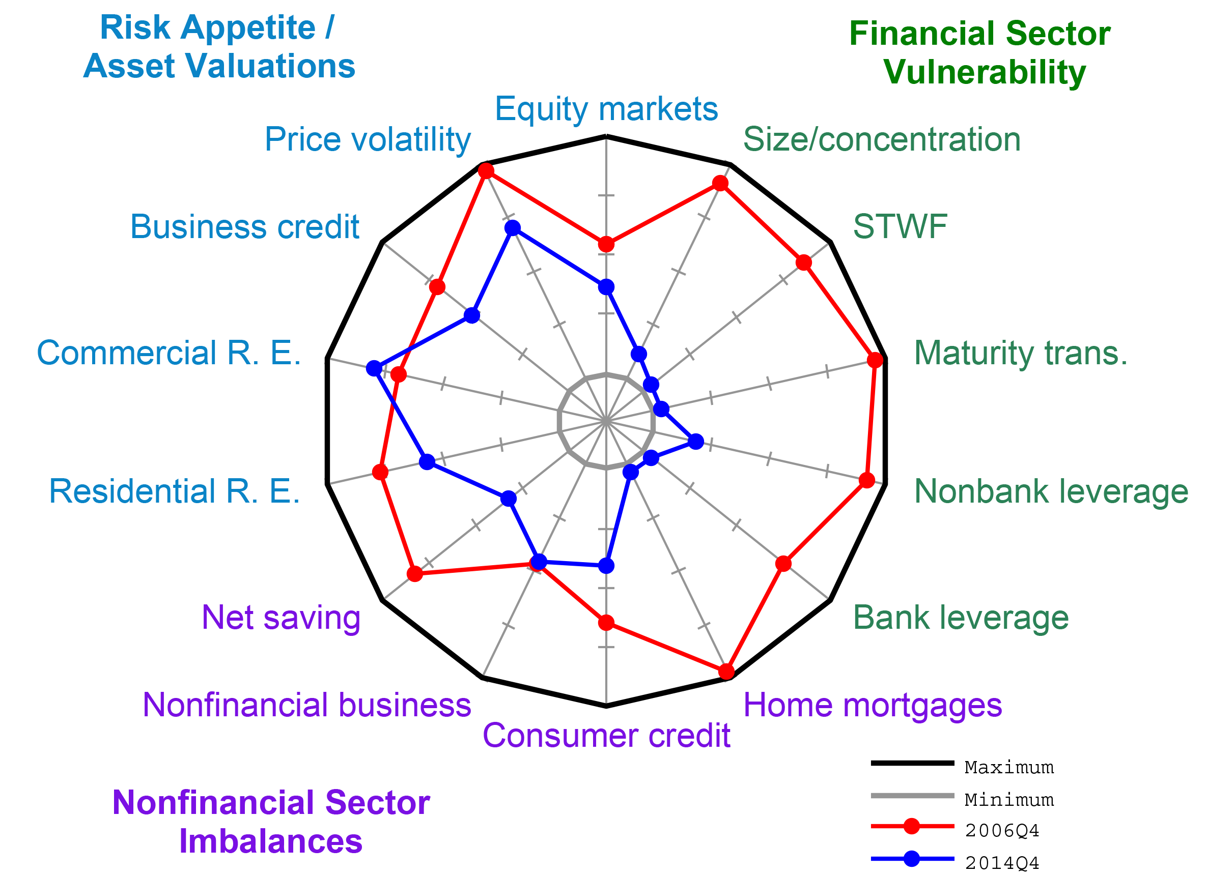 |
Source. Authors' calculations.
The radar chart clearly conveys that as of late 2006 our quantitative measures indicate at least somewhat elevated contributions to vulnerability from nearly every component (or "spoke" on the radar chart). The most pronounced contributions shown in the late 2006 polygon come from substantially elevated valuations in housing, commercial real estate, and corporate debt markets. Sizable contributions are also made by household borrowing, as captured along the mortgage and consumer credit spokes, and elevated leverage and maturity transformation in the financial sector. However, not every potential source of vulnerability appeared elevated: Imbalances associated with borrowing by nonfinancial businesses and valuations in equity markets were relatively moderate through 2006. In addition, bank leverage was not very high by historical standards, though it had been rising for several years.
The radar chart presents a markedly different picture in the fourth quarter of 2014. In particular, only one-third of the components of vulnerability appear elevated--specifically, those associated with risk appetite and valuation pressures in certain asset markets, most notably in corporate credit and commercial real estate. In addition, asset price volatility appears low in historical perspective, which in our frameword can be a precondition for building vulnerabilities. In contrast, valuations in the housing market and in equity markets were near the middle of their historical range through the end of last year.
Looking at the other two-thirds of the chart, our quantitative measures indicate much smaller imbalances in the nonfinancial and financial sectors than in late 2006. Within the nonfinancial sector, vulnerability arising from savings, business debt, and consumer credit positions are in the middle of their historical range, while that from mortgage borrowing remains near its historic low. Moreover, leverage and short-term funding within the financial sector at least relative to trends remain near the low points seen over the last two decades and a half, which, by the nature of our algorithm, is the benchmark for gauging these components' contributions to vulnerability in the financial system.
Radar plots are most effective at presenting a comparison of levels at two or perhaps three points in time, but a more complete picture of the time series can be seen with a "heat map." To generate our heat maps, we assign a color for each quarterly observation of our components or overall index (which both lie on the (0,1) interval) using the following scale:
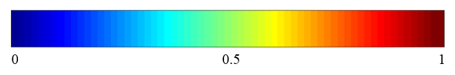
At values near zero, when vulnerabilies appear quite subdued, components of vulnerabilities or the aggregate index will appear "cool," (represented by deep blue); conversely, values near 1 will appear very "hot" (dark red), indicating acute vulnerabilities.
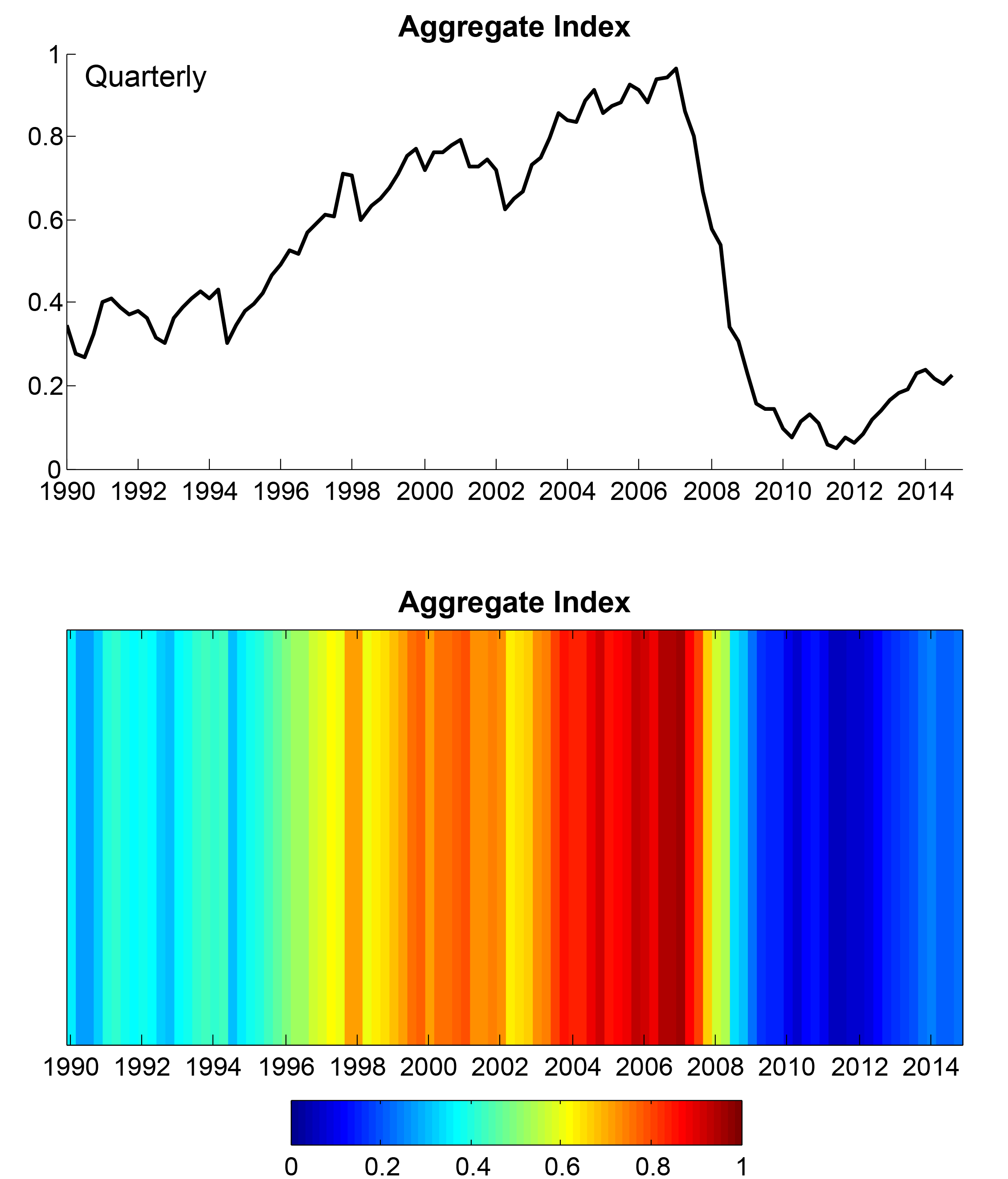
Figure 3 illustrates the correspondence between a line chart and a heat map: The upper panel shows the full time series for the overall index of vulnerability in the U.S. financial system, while the bottom panel presents the same information as a heat map. The information in the line chart and in the heat map is the same, but the heat map uses the blue-green-red color scale rather than low-to-high values on the y-axis values to convey the overall stance of vulnerabilities in the financial system. For example, the heat map shows the darkest shades of red in 2006 and 2007, when our indicators aggregate to values close to 1.
| Figure 3: Translating Numbers to Colors: Our Overall Index of Systemic Vulnerability |
|---|
 |
Source. Authors' calculations.
The heat map adds particular value when used to present the historical evolution and co-movement in the full range of components of vulnerability. Figure 4 presents the evolution of the overall index of vulnerability (the top heat map) and all 14 of its components, grouped into the categories of risk appetite/valuation pressure (the top large block), nonfinancial imbalances (the middle large block), and financial sector imbalances (the bottom large block). For example, the equity market bubble of the late 1990s flashes hot red at a time when other categories ranged from cool blue to bright orange, pointing to moderate overall vulnerabilities in the financial system.3
In contrast, nearly all categories except equity valuations and nonfinancial business credit were (at least clearly headed) up to orange-to-red levels by mid-2004--with clear signs of overheating in real estate valuations, consumer and mortgage credit, nonbank leverage and maturity transformation, and the size of the largest financial intermediaries relative to the economy. Valuation pressures and especially vulnerabilities related to mortgage credit peaked by 2006 while leverage and maturity transformation in the financial sector continued to deteriorate through much of 2007. In late 2008 and early 2009, the contraction in credit, leverage, and maturity transformation is apparent in our measures--and illustrates how our approach is not targeted at identifying crisis periods but rather at gauging the buildup of vulnerabilities in the system. Finally, a pickup in risk appetite over the past two years, especially in business credit, commercial real estate, and low volatility, is also clear in the top block.
| Figure 4: Heat Map of the Overall Vulnerability Index and Its Components |
|---|
 |
Source. Authors' calculations.
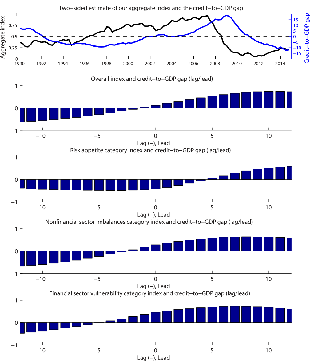
Comparison with the Credit-to-GDP Ratio Gap
A growing literature has highlighted the importance of sustained credit booms as potential precursors for generating vulnerability to financial crises, and the credit-to-GDP gap has emerged as a central indicator of financial vulnerabilities. Partly as a result, the credit-to-GDP gap has played an important role as a guide variable in the Basel III process for setting countercyclical capital buffers (see Drehmann and Tsatsaronis (2014) and, for a differing view, Edge and Meisenzahl (2011)). We find that the credit-to-GDP gap is somewhat correlated with our measures of vulnerability over the past 25 years, but our aggregate measure and two of the broad underlying categories tend to lead the credit-to-GDP gap significantly. The top panel of Figure 5 plots our overall index (in blue) and the credit-to-GDP gap (in green), showing the tendency of the index to lead this gap (the bars to the right--representing 5- to 10-quarter leads--are well above 0.5) . The bottom panels confirm this visual impression using the cross-correlation functions of the credit-to-GDP gap with our aggregate index (the top set of orange bars) and with indexes for the three categories of vulnerability--risk appetite, nonfinancial imbalances, and financial sector imbalances. Risk appetite (the second set of bars) tends to lead credit-to-GDP by about two to three years, while our measure of nonfinancial imbalances (the third set) leads by more than a year.
| Figure 5: Lead/Lag Relationship between the Credit-to-GDP Gap and Our Overall Vulnerability Index and Its Major Categories |
|---|
 |
Source. Authors' calculations.
We also considered a more formal regression analysis. We examined a number of vector autoregressions (VARS) containing our overall index and the credit-to-GDP gap (with controls for other factors, including the rate of change in real GDP, house prices, and corporate bond spreads). In general, our overall index "Granger-caused" the credit-to-GDP gap--that is, provided significant incremental forecasting power, suggesting that, by considering a broader set of financial and credit conditions, our measure of vulnerability could provide earlier signals than the credit-to-GDP gap.
References
Adrian, Tobias, Daniel Covitz, and Nellie Liang (2014), "Financial Stability Monitoring  ," Federal Reserve Bank of New York Staff Report no. 601 (June revision).
Aikman, David, Michael Kiley, Seung Jung Lee, Michael Palumbo, and Missaka Warusawitharana (2015), "Mapping Heat in the U.S. Financial System," Finance and Economics Discussion Series 2015-059. Washington: Board of Governors of the Federal Reserve System, http://dx.doi.org/10.17016/FEDS.2015.059.
Cecchetti, Stephen G. (2008), "Measuring the macroeconomic risks posed by asset price booms," in Asset Prices and Monetary Policy, edited by John Y. Campbell, Chicago: University of Chicago Press, pp. 9-43.
Drehmann, Mathias, and Kostas Tsatsaronis (2014), "The Credit-to-GDP Gap and Countercyclical Capital Buffers: Questions and Answers," BIS Quarterly Review. (http://ssrn.com/abstract=2457108)
Edge, Rochelle M., and Ralf P. Meisenzahl (2011), "The Unreliability of Credit-to-GDP Ratio Gaps in Real Time: Implications for Countercyclical Capital Buffers," International Journal of Central Banking 7, no. 4, December, pp. 261-298.
International Monetary Fund (IMF; 2014), Global Financial Stability Report .
Office of Financial Research (2013), 2013 Annual Report.
Schularick, Moritz, and Alan M. Taylor (2012), "Credit Booms Gone Bust: Monetary Policy, Leverage Cycles, and Financial Crises, 1870-2008," American Economic Review 102, no. 2, April, pp. 1029-61.
1. This Note is drawn from a longer research paper that contains additional details, analysis, and discussion; see Aikman, et al (2015) at http://www.federalreserve.gov/econresdata/feds/2015/files/2015059pap.pdf. Justin Shugarman provided excellent assistance with this research. Return to text
2. Our working paper includes a section devoted to analyzing the real-time properties of our quantitative measures of financial system vulnerability. It also includes a discussion of alternative approaches we investigated to aggregate the 14 component measures of sources of financial system vulnerability to form an overall index. Return to text
3. Notably, studies of the role of valuation pressures as signals of future financial instability, such as Cecchetti (2008) and Schularick and Taylor (2012), do not ascribe an important role to equity market valuations per se. Return to text
Please cite as:
Aikman, David, Michael T. Kiley, Seung Jung Lee, Michael G. Palumbo, and Missaka N. Warusawitharana (2015). "Mapping Heat in the U.S. Financial System: A Summary," FEDS Notes. Washington: Board of Governors of the Federal Reserve System, August 05, 2015. https://doi.org/10.17016/2380-7172.1574
Disclaimer: FEDS Notes are articles in which Board economists offer their own views and present analysis on a range of topics in economics and finance. These articles are shorter and less technically oriented than FEDS Working Papers.