EFA: Household Debt
Household Debt Overview
A growing body of research documents the importance of household debt to the Great Recession and subsequent sluggish recovery. Notably, counties in which households were heavily indebted relative to their income at the beginning of the downturn experienced sharper declines in consumption expenditure and employment. The tables and interactive maps below allow users to explore the ratio of debt to income by state, metropolitan statistical area, and county for each year since 1999. Household debt is calculated from FRBNY Consumer Credit Panel/Equifax Data, and household income is reported by the Bureau of Labor Statistics. For more information see the associated FEDS Note. Please note that the precise data values are not available for download and that the value ranges in the data files correspond to the color-coded scales used in the interactive map.
Interactive Data Visualizations
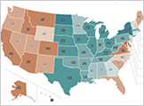
These interactive maps show the debt-to-income ratio for each state and each year since 1999.
Accessible Version | CSV
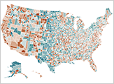
These interactive maps show the debt-to-income ratio for each county and each year since 1999.
Accessible Version | CSV

These interactive maps show the debt-to-income ratio for each MSA and each year since 1999.
Accessible Version | CSV
Note: missing data for CT. Prior to 2024, substate data for Connecticut was reported for the state’s eight historic counties. Going forward, substate data for Connecticut will instead cover the state’s nine planning regions. Differences in the timing of this conversion between our two source data sets results in some missing debt-to-income ratios.