FEDS Notes
May 24, 2021
Spatial Variation in the 2020 Housing Market Decline and Recovery
Brigitte Roth Tran and Nathan Ausubel
After plunging in the spring due to the COVID-19 pandemic, residential investment had a strong recovery in the second half of 2020. The initial decline resulted from both a disruption in activity due to social distancing, a broad-based drop in demand from economic uncertainty, and reduced access to credit (DeSanctis 2020). The ensuing recovery was driven by a reversal in these factors to various degrees, as well as significant support from low mortgage interest rates and a shift in preferences towards more housing services as people spent increased time at home.
A deeper look reveals that there is interesting regional variation in housing market activity underlying the national trends. For example, the COVID-19 pandemic has caused a well-documented migration away from crowded urban areas. Liu and Su (2020) find that "the pandemic has led to a reduced demand for housing in neighborhoods with high population density," due in part to telework and reduction in access to local amenities. Similarly, Whitaker (2021) notes that there has been both an urban exodus and a significant decline in people moving into urban neighborhoods. Analysts at Redfin, a national real estate brokerage, and Realtor.com, a real estate listings website, have also documented the phenomenon of homebuyers leaving crowded cities in favor of smaller cities and suburbia (Anderson 2021; Hale et al. 2020; Lily 2020).
Our analysis here adds to this research by analyzing additional dimensions of the pandemic-induced shifts in homebuying behavior. We use county-level housing market data from Redfin to uncover two key findings:
- Although in the spring of 2020 there were significant differences between housing markets in counties with larger versus smaller homes, these differences generally evaporated by the end of the year as home sales and prices surged similarly regardless of a county's baseline home sizes. The initial differences were consistent with people spending more time at home and desiring larger houses and have led to persistently greater year-over-year declines in inventory in counties with larger homes.
- Counties with smaller average mobility reductions for work over 2020 experienced a greater increase in home sales and a larger decrease in inventory by the end of 2020, likely reflecting both supply and demand differences. The mobility measure implies that these counties were less disrupted by social distancing, which could simultaneously make the areas more attractive to live in and make transactions easier to manage.
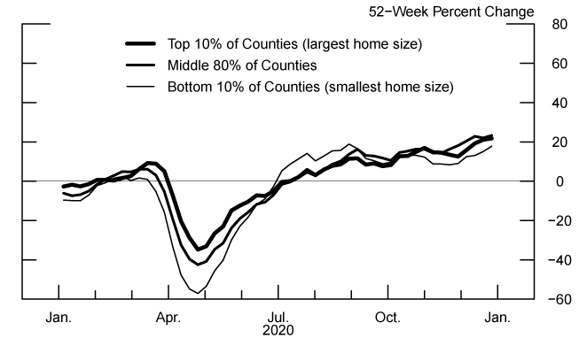
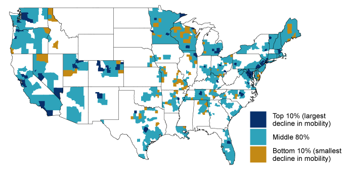
To uncover the regional variation in demand for larger homes, we first group counties by their average 2019 median square feet per pending sale, a baseline measure of typical home size.1 Counties in the "top 10%" category (indicated by the thickest lines in the next set of figures) tend to have large homes, while counties in the "bottom 10%" category (indicated by the thinnest line in the next set of figures) tend to have small homes. The map below shows which counties are in each category. The counties with the 10% smallest median home sale size in 2019 (yellow shading) include cities such as Chicago, Miami, New York City, San Francisco, and Washington, DC.2 However, not all of the "bottom 10%" counties are urban; in fact 61% of these counties are classified as non-metro counties based on the USDA's 2013 Rural-Urban Continuum Codes. Thus we are not showing a simple urban-rural divide in our county classifications.
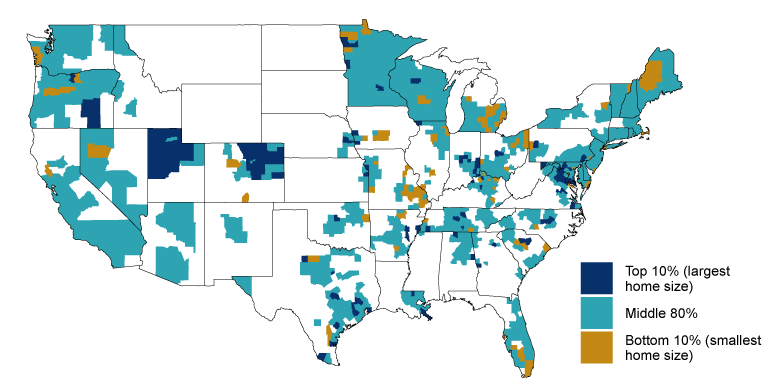
[including Alaska and Hawaii, which are not shown on the map]
Source: Redfin, a national real estate brokerage.
The figures below show how home sales, median price per square foot, inventory, and new listings evolved in the counties in each of these categories.
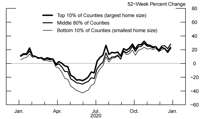
Note: Counties are split in three groups based on their average median square feet of pending sales in 2019. The 52-week percent change is calculated for an overall group. 1,124 counties are included, and Redfin data are based on 4-week rolling sums.
Source: Redfin, a national real estate brokerage.
Figure 3. Median Sale Price per Square Foot, With Counties Grouped by Median Square Feet of Pending Sales in 2019
Note: Counties are split in three groups based on their average median square feet of pending sales in 2019. The 52-week percent change is calculated for an overall group. 1,124 counties are included, and Redfin data are based on 4-week rolling sums.
Source: Redfin, a national real estate brokerage.
We find that although the national trend of decline and recovery was not simply driven by counties with large homes, there are some interesting differences based on county home size. For example, early in the pandemic, counties with the smallest homes (thin line) experienced the largest drop in sales and the largest decline in price per square foot.3,4 These results are consistent with a relative increase in demand for larger homes as people spent more time at home. We also find that the differences in quantity and price appreciation between counties with smaller and larger baseline homes were temporary, as the series returned to pre-pandemic differences by the end of 2020. Interestingly, while differences in the flows of homes being listed and sold in counties with small and large homes were temporary, this variation left a lasting impact on inventories. By the end of the year, counties with the largest homes had experienced greater year-over-year declines in inventory, signaling greater tightening of housing markets. This difference appears to be driven by the third quarter, when growth in new listings grew more slowly even as sales rose faster in the counties with the largest homes than in the counties with the smallest homes.
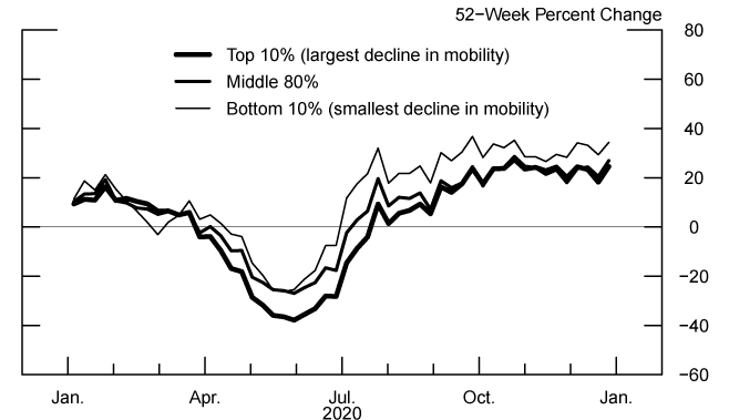
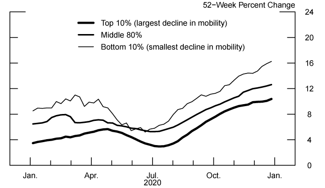
Next, we group counties based on the 2020 average of their daily year-over-year changes in the Google mobility index for the work category.5 This measure serves as a rough proxy for both the level of disruption caused by the pandemic in a county due to mandated or voluntary social distancing and of the extent of the transition to telework. Counties with limited social distancing and telework, where normal activities have been less disrupted, will generally show smaller declines in mobility in the work category. Counties in the "top 10%" are those with the largest declines in mobility over 2020 (reflecting the most disruption from social distancing and telework), while counties in the "bottom 10%" are those with the smallest declines in mobility (showing the least disruption from distancing). The map below shows that the most disrupted counties include much of the Chicago, New York City, San Francisco, and Seattle metro areas. While this grouping has some overlap with our first grouping by 2019 median home size, coastal states such as Washington and California contain many counties that did not have especially large home sizes but experienced sharp declines in mobility. Meanwhile, states such as Utah and Colorado contain many counties with large homes that had only moderate declines in mobility.
[including Alaska and Hawaii, which are not shown on the map]
Note: The top 10% of counties have the largest reduction in mobility relative to 2019. Counties in Hawaii and Alaska are not shown.
Source: Google.
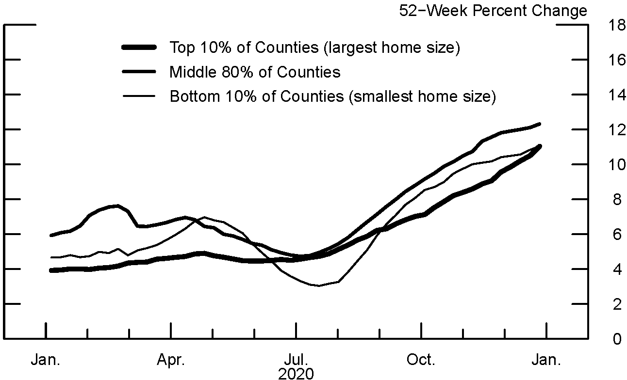
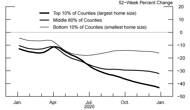
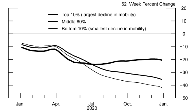
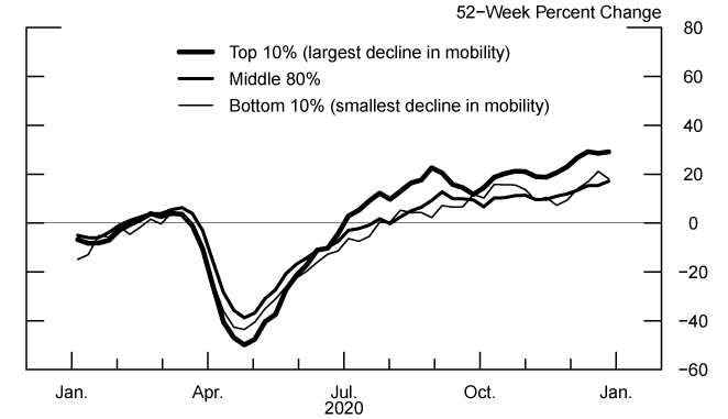
Social distancing and telework have the potential to both strengthen and dampen the housing market. On the one hand, greater social distancing could boost demand for housing services if households are spending more time at home. On the other hand, pandemic disruptions could lower demand if workers have less income to pay for housing services or if they migrate out to counties with smaller changes in mobility. Finally, relatively strict social distancing could make transactions more difficult, if buyers and sellers are more uncomfortable with the transaction process.6 The figures below again show how home sales, median price per square foot, inventory, and new listings evolved in the counties grouped based on Google mobility data for the work category.
Note: Counties are split in three groups based on their average median square feet of pending sales in 2019. The 52-week percent change is calculated for an overall group. 1,124 counties are included, and Redfin data are based on 4-week rolling sums.
Source: Redfin, a national real estate brokerage.
As with the analysis looking at home size, we find that the initial declines and subsequent increases in sales, listings, and price growth were evident in all groups of counties with some interesting differences. Notably, the counties with the smallest work-based mobility declines (thin line) experienced the largest temporary slowdown in the growth of price per square foot during the second quarter of 2020. This temporary reduction in price growth may reflect that these counties experienced the negative effects of heightened economic uncertainty that held down demand in the spring without as much of an offsetting increase in housing demand services from social distancing. By the middle of the third quarter, the relationship in year-over-year price growth between the counties grouped by mobility had reverted to that at the start of the year.
Much like the counties with the largest homes, counties with the smallest declines in mobility for the year experienced disproportionately large declines in inventory. This sharp decline in inventory again resulted from a large increase in sales that coincided with relatively modest increases in new listings. In contrast, the counties with the largest declines in mobility saw greater increases in year-over-year listings, while year-over-year changes in inventory were flat in the second half of the year. These differences could be consistent with a shift in demand toward areas that were more relaxed in terms of social distancing.
To conclude, we find that the national trend of decline and recovery in the housing market was broad-based and not simply driven by areas with larger homes or more disruptive social distancing. However, we also observe some interesting regional differences in the magnitudes of year-over-year changes in sales, listings, and prices, particularly during the middle of 2020. Though these differences were largely temporary, the counties with large homes and those with small changes to mobility experienced disproportionately large declines in inventory that persisted through the end of 2020. This decline in inventory is a sign of robust demand for homes in these counties, but it also poses a challenge for home buyers who increasingly grapple with tight housing markets. Only time will tell whether recent shifts in housing market dynamics are a temporary feature of the pandemic or whether they will persist as part of a new post-pandemic way of life.
References
Anderson, D. (2021). Sacramento, Austin and Phoenix Are the Most Popular Destinations for People Searching For Homes Outside Their Metro Area. Redfin. Retrieved from https://www.redfin.com/news/july-august-2020-housing-migration-trends/
https://www.realtor.com/research/2021-national-housing-forecast/
DeSanctis, A. (2020). Mortgage Credit Availability Decreased in April. Mortgage Bankers Association. Retrieved from https://www.mba.org/2020-press-releases/may/mortgage-credit-availability-decreased-in-april
Hale, D. et al. (2020). 2021 Housing Market Forecast and Predictions. Realtor.com. Retrieved from https://www.realtor.com/research/2021-national-housing-forecast/
Lily, K. (2020). Affordable Areas Outside Big Cities Are Heating Up the Fastest As the Pandemic Changes Homebuyers' Priorities. Redfin. Retrieved from https://www.redfin.com/news/hot-housing-markets-affordable-pandemic/
Liu, S., and Y. Su (2020). The Impact of the COVID-19 Pandemic on the Demand for Density: Evidence from the U.S. Housing Market. Federal Reserve Bank of Dallas Working Paper, No. 2024. Retrieved from https://www.dallasfed.org/-/media/documents/research/papers/2020/wp2024r1.pdf
Whitaker, S (2021). Did the COVID-19 Pandemic Cause an Urban Exodus? Federal Reserve Bank of Cleveland District Data Brief. Retrieved from https://www.clevelandfed.org/~/media/content/newsroom%20and%20events/publications/cfed%20district%20data%20briefs/cfddb%2020210205/cfddb_20210205_did_the_covid_19_pandemic_cause_an_urban_exodus.pdf?la=en
1. Redfin data include single-family homes, multi-family homes, condos and co-ops, and townhouses. Return to text
2. The suburbs of some of these cities (notably Washington, DC) are neighboring counties that have much larger median home sizes, even in the top 10% category. Return to text
3. We present year-over-year growth rates for series to deal with seasonality in these weekly data. Although they are positive throughout 2020, decreases in the year-over-year changes in prices often reflect declines in the price levels. Return to text
4. It might seem counterintuitive that the largest decline in year-over-year price growth did not occur until May in the bottom 10% of counties given that sales started falling months earlier. However, this finding can be explained by the tendency of prices to be sticky and thus respond with a bit of a lag. Return to text
5. We take the mean of the available Google mobility data in 2020, which starts on February 15, 2020. The Google Community Mobility Reports data report the number of people going to their work locations relative to the baseline level from January 3, 2020 to February 6, 2020. The baseline level is specific to the day of the week and the median from the baseline period is used. More details are available at https://support.google.com/covid19-mobility#topic=9822927. Return to text
6. This reluctance to engage in home transactions due to social distancing concerns likely decreased over time as the real estate market adapted its processes to conduct sales in a relatively low-contact manner. Return to text
Ausubel, Nathan, and Brigitte Roth Tran (2021). "Spatial Variation in the 2020 Housing Market Decline and Recovery," FEDS Notes. Washington: Board of Governors of the Federal Reserve System, May 24, 2021, https://doi.org/10.17016/2380-7172.2905.
Disclaimer: FEDS Notes are articles in which Board staff offer their own views and present analysis on a range of topics in economics and finance. These articles are shorter and less technically oriented than FEDS Working Papers and IFDP papers.