FEDS Notes
September 27, 2019
Housing Affordability in the U.S.: Trends by Geography, Tenure, and Household Income
Andrew Dumont1
In recent years, researchers and policymakers have expressed concerns about housing affordability challenges nationwide. Much of the focus has been on the increasing housing affordability challenges facing renter households, which the analyses below confirms is the group facing the greatest challenges in securing housing that they can afford. This FEDS Note explores where, and for whom, housing affordability is getting worse, better, or staying the same in order to shed new light on the differential experiences of various groups.
National Trends in Housing Affordability by Household Tenure
Between 2009--the peak of the housing crisis--and 2017, the most recent data available, the total number of households classified as housing cost burdened has declined by 1.7 million.2 This decline in the number of cost burdened households occurred over a period where the total number of households increased by 6.2 million. Of the 6.2 million new households formed over this period, 5.7 million were new renter households.
The percent of all households experiencing housing cost burdens, also called the rate of housing cost burden, has gone down by 3.3 percentage points over that period (see Table 1). As shown in Table 1, this overall decrease reflects two opposing trends: a significant increase in the rate of housing cost burden among renter households, offset by an even more significant decrease in the rate of housing cost burden among homeowner households.
Table 1: Number of households experiencing housing cost burden
| 2009 | 2017 | Change* | ||||
|---|---|---|---|---|---|---|
| Household tenure | # of HHs | % of HHs | # of HHs | % of HHs | # of HHs | % of HHs |
| Renter households | 17,241,359 | 46.20% | 20,138,321 | 46.80% | 2,896,962 | 0.60% |
| Homeowner households | 22,545,257 | 29.90% | 17,939,089 | 23.70% | (4,606,168) | -6.30% |
| All households | 39,786,616 | 35.30% | 38,077,410 | 32.00% | (1,709,206) | -3.30% |
Source: 2005-2009 American Community Survey (ACS) 5-year estimates, and 2013-2017 ACS 5-year estimates.
* All changes are statistically significant at the 99% confidence level
Geographic Differences in Housing Affordability by Household Tenure
Map 1 displays the 2017 estimates of renter housing cost burden rates for all Metropolitan Statistical Areas (MSAs) in the 50 states plus the District of Columbia.3 The map shows that rates of renter housing cost burden are highest in parts of California, Florida, and the Northeast corridor, with pockets of high renter housing cost burden elsewhere in the country.
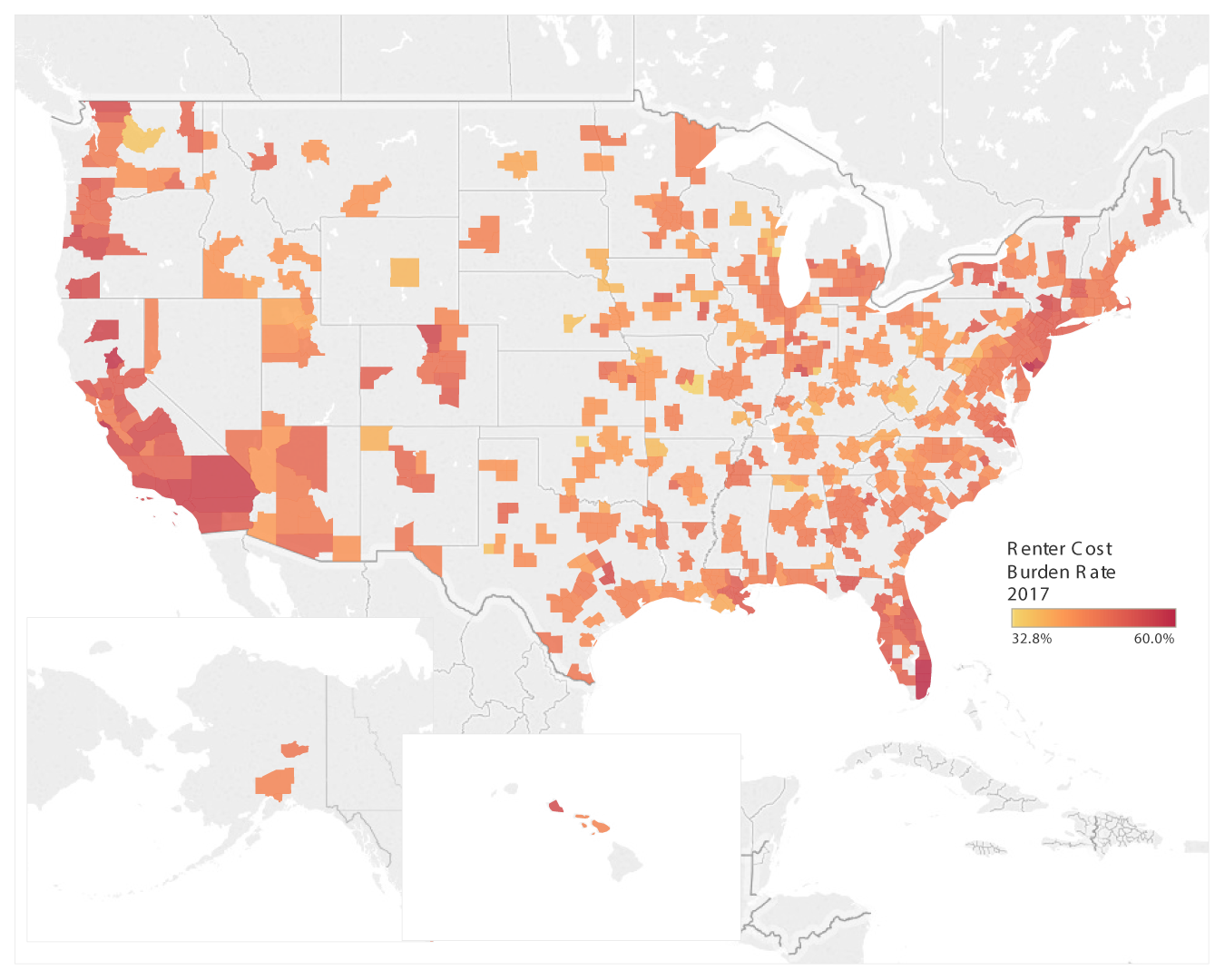
Source: 2013-2017 ACS 5-year estimates.
Map 2, which shows the change in the rate of renter housing cost burden across all MSAs between 2009 and 2017, tells a different story. A review of Map 2 and the data underlying it show that the largest increases in rates of renter housing cost burden have occurred in urban areas that do not often make national headlines for their rental housing challenges: cities like Hammond, Louisiana, Cheyenne, Wyoming, Sumter, South Carolina, or Great Falls, Montana. The populations of these urban areas hover right around 100,000, well below the population of the median MSA (around 246,000). The driving force behind these increases are not consistent across different areas and sometimes appear elusive. For example, some areas have experienced above-median growth in their populations relative to other MSAs (10.4 percent over the period in Hammond, Louisiana, versus median population growth of 5.0 percent for all MSAs). Other areas have had below-median growth in the median household incomes of their renter population (negative 8.5 percent for Sumter, South Carolina, versus a median growth rate for median renter household income of positive 2.1 percent for all MSAs). However, some areas do not appear to exhibit either of these trends: for example, Lynchburg, Virginia had both below-median population growth (3.9 percent) and above-median growth in median household income among renters (5.0 percent), a combination of trends that would generally be thought to put downward pressure on rates of renter housing cost burden.
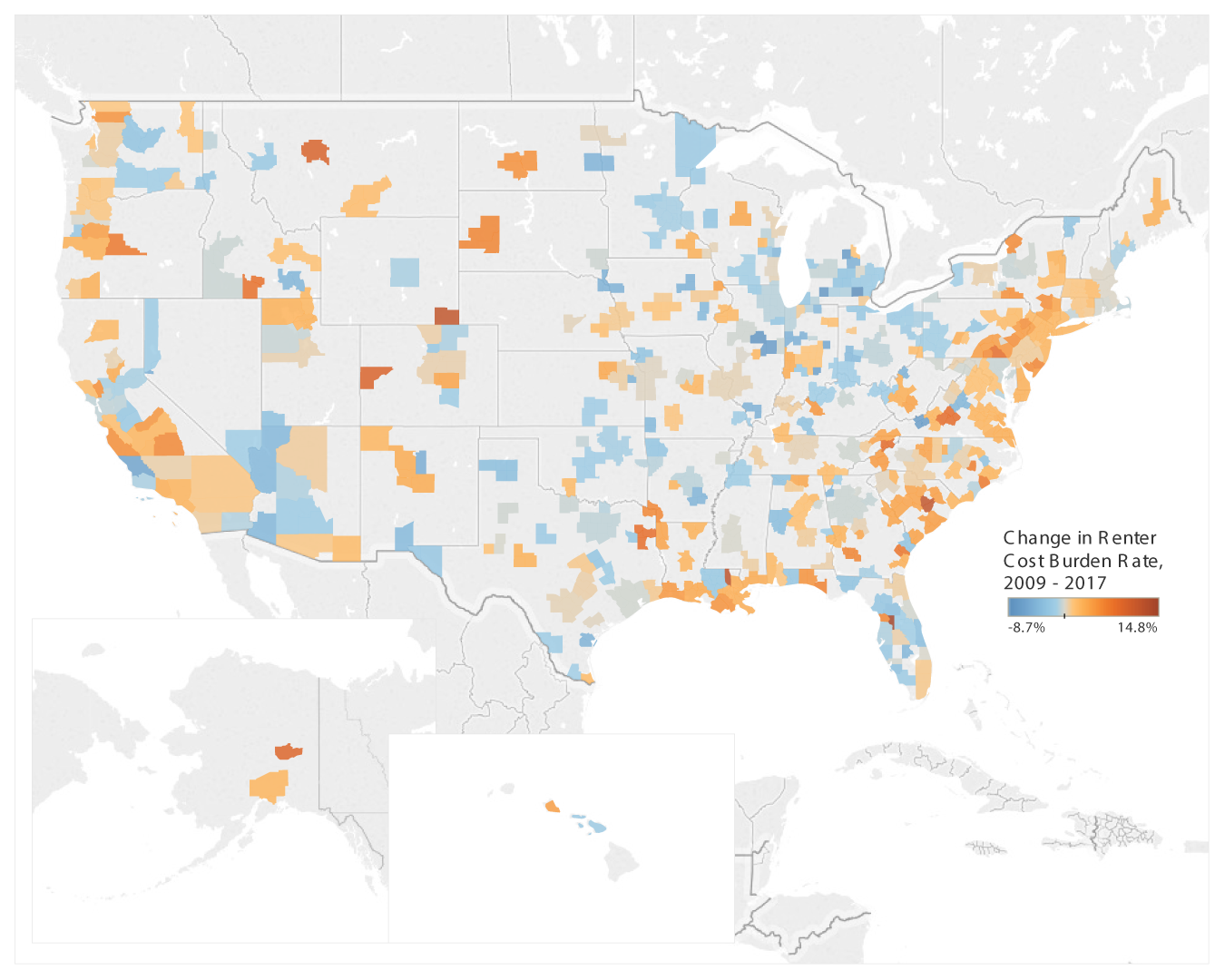
Source: 2005-2009 ACS 5-year estimates, and 2013-2017 ACS 5-year estimates.
Turning to homeowners, Map 3 highlights much the same geographic variation in housing affordability as Map 1, with cities in California, Florida, and the Northeast corridor experiencing the highest rates of cost-burdened homeowners, as was the case with renters. One key difference between the experiences of homeowners and renters is the sheer level of affordability challenges. Specifically, in 2017 rates of housing cost burden among renters were higher than those for homeowners in all 384 MSAs, ranging from 11 to 37 percentage points higher.
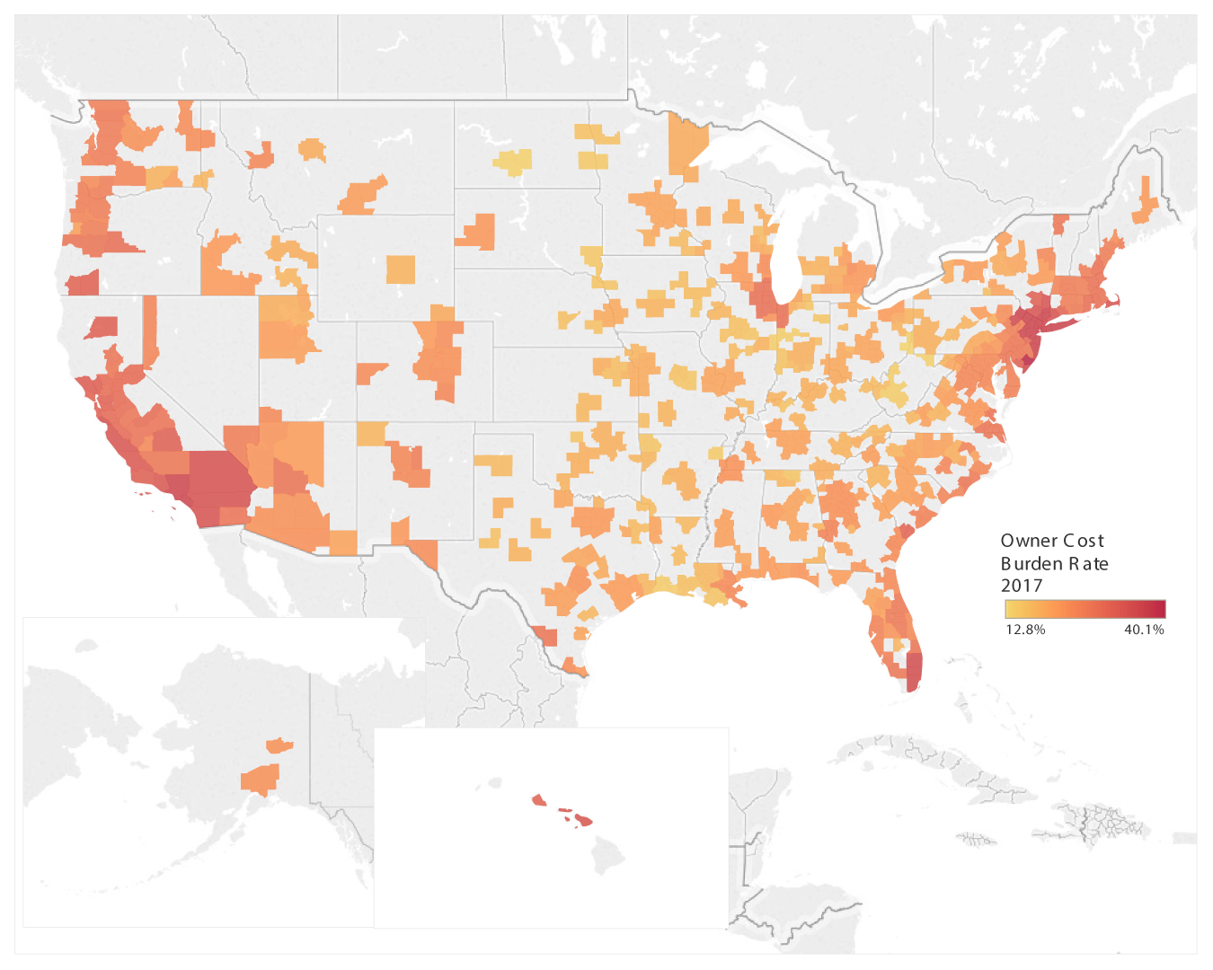
Source: 2013-2017 ACS 5-year estimates.
This contrast between homeowners and renters is even starker when looking at the change in rates of housing cost burden between 2009 and 2017. Map 4 below shows that virtually all MSAs experienced significant declines in their rate of housing cost burden among homeowners over this period. Interestingly, some of the most substantial declines in housing cost burdens among homeowners have come in cities whose names have become nearly synonymous with unaffordable housing in the national dialogue: cities like Miami, Florida, and San Francisco, Santa Rosa, and San Jose in California. Indeed, while cities in California are significantly over-represented with respect to having the highest share of renters and homeowners being housing cost burdened, they are also over-represented when it comes to the cities with the greatest decline in rates of housing cost burden among homeowners between 2009 and 2017. Indeed, fourteen cities in California are among the 25 MSAs with the greatest declines in homeowner housing cost burdens over this period.
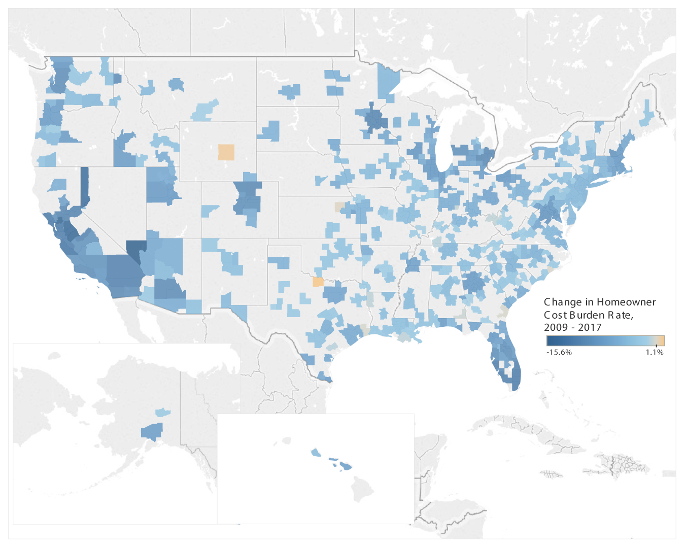
Source: 2005-2009 ACS 5-year estimates, and 2013-2017 ACS 5-year estimates.
Table 2 below summarizes the changes in housing cost burdens among renters, homeowners, and all households across all MSAs. A review of Table 2 shows there are only a few urban areas that have experienced statistically significant increases in their rate of housing cost burden among renters between 2009 and 2017. It also shows that the majority of urban areas have experienced statistically significant decreases in their rate of housing cost burden among homeowners over that period, and that on a net basis most urban areas had lower levels of housing cost burden in 2017 than they did in 2009, consistent with the national trends described above.
Table 2: Summary of changes in housing cost burden rates among MSAs between 2009 and 2017
| Increase/No Change in Burdens | Decrease in Burdens | |||||
|---|---|---|---|---|---|---|
| # of MSAs | % of MSAs | # for which change is Statistically Significant | # of MSAs | % of MSAs | # for which change is Statistically Significant | |
| Renter Households (HHs) | 209 | 54% | 32 | 175 | 46% | 11 |
| Owner-occupant HHs | 3 | 1% | - | 381 | 99% | 265 |
| All Households | 41 | 11% | - | 343 | 89% | 132 |
Source: 2005-2009 ACS 5-year estimates, and 2013-2017 ACS 5-year estimates.
Differences in Housing Affordability by Household Income
The data explored above show that renters and homeowners in different parts of the country have significantly different experiences related to cost burden. They also show that rates of housing cost burden have increased significantly for renters in the years following the Great Recession, while rate for owners have declined significantly. However, the aggregate experiences of renters and homeowners within an urban area often masks significant differences in the experiences of households based on their household income.
Table 3 shows that there was a significant increase in housing cost burdens among renter households earning between $20,000 and $49,999 a year. Households earning between $50,000 and $74,999 a year also saw a significant increase over this period.
Table 3: Rate of renter housing cost burden by household income, 2009 and 2017
| Household income | 2009 | 2017 | Percentage Point Change | Percent Change | Stat. Sign. |
|---|---|---|---|---|---|
| Less than $20,000 | 76.30% | 75.50% | -0.8 | -1% | *** |
| $20,000 to $49,999 | 48.50% | 59.70% | 11.2 | 23% | *** |
| $50,000 to $74,999 | 14.10% | 21.60% | 7.6 | 54% | *** |
| $75,000 to $99,999 | 6.10% | 9.50% | 3.4 | 56% | *** |
| $100,000 or more | 2.10% | 3.20% | 1.1 | 51% | *** |
| All Renter Households | 46.20% | 46.80% | 0.6 | 1% | *** |
Source: 2005-2009 ACS 5-year estimates, and 2013-2017 ACS 5-year estimates.
The Census Bureau did not begin reporting consistent 5-year ACS estimates on housing cost burden by household income for homeowners until 2014, limiting the ability to draw conclusions over a longer time horizon. However, Table 4 below shows a 3.8 percentage point drop in the rate of housing cost burden among homeowners between 2014 and 2017. This compares to the 6.3 percentage point decline between 2009 and 2017 identified in Table 1 above. As such, more than half of the decline in the rate of housing cost burden among homeowner took place over the more recent period for which we have data by household income. Therefore, a review of the trends over this period shown in Table 4 is likely still instructive as to the distribution of the overall decline across household income levels. The figures in Table 4 show that households earning between $50,000 and $99,999 had larger percentage point decreases in housing cost burdens than those at the lower and higher end of the income spectrum.
Table 4: Rate of homeowner housing cost burden by household income, 2014 and 2017
| Household income | 2014 | 2017 | Percentage Point Change | Percent Change | Stat. Sign. |
|---|---|---|---|---|---|
| Less than $20,000 | 68.00% | 67.50% | -0.5 | 0% | |
| $20,000 to $49,999 | 43.10% | 40.60% | -2.5 | -6% | *** |
| $50,000 to $74,999 | 25.60% | 22.10% | -3.5 | -14% | *** |
| $75,000 to $99,999 | 16.10% | 12.80% | -3.2 | -20% | *** |
| $100,000 or more | 7.20% | 5.20% | -2 | -28% | *** |
| All Homeowner Households | 27.40% | 23.70% | -3.8 | -14% | *** |
Source: 2005-2009 ACS 5-year estimates, and 2013-2017 ACS 5-year estimates.
Differences in Affordability by Income, Tenure, and Geography
The section above highlighted how a disproportionate share of the increase in renter housing cost burdens have been borne by those in the middle of the income spectrum, especially those households earning between $20,000 and $75,000. However, we also know from our analysis above that housing cost burdens vary widely by geographic area. Therefore, I next explore differences in rates of housing cost burden for renter and homeowner households at various income levels across MSAs.
Figure 1 displays the dispersion of renter housing cost burden rates across all MSAs in the 50 states plus the District of Columbia, by household income. This figure indicates that the rates of housing cost burden for those at the top and bottom of the income spectrum are somewhat consistent across urban areas. Renter households with the lowest incomes have very high rates of housing cost burden regardless of where they live, while renter households with the highest incomes have very low rates of housing cost burden regardless of where they live.4 The figure also shows that the experiences of those in the middle two categories of household income vary dramatically depending on where they live. This is especially true of renters earning between $20,000 and $49,999 a year, a group whose rate of housing cost burden ranges from a low of 23.4 percent in Jefferson City, Missouri, to a high of 86.9 percent in San Jose, California. While the rates of housing cost burden for those earning between $50,000 and $74,999 and those earning between $75,000 and $99,999 are more similar across the country, there are a considerable number of outliers for those groups, indicating that some MSAs are particularly challenging for households with these income levels.
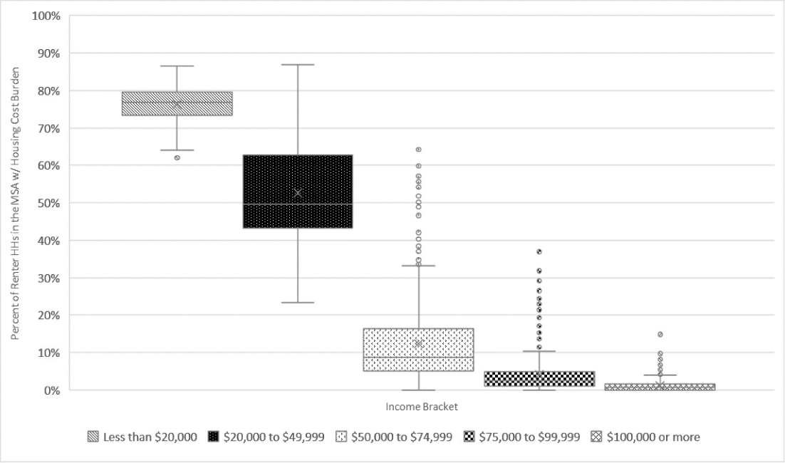
Source: 2013-2017 ACS 5-year estimates.
Table 5 below shows how rates of housing cost burden among renters in different income bands have changed between 2009 and 2017. The table shows that there has been an increase in rates of housing cost burden among renter households earning between $20,000 and $74,999 a year across virtually all urban areas. It also shows that the majority of urban areas have seen increases even among higher income households, though much fewer of those increases have been statistically significant. Readers might justifiably ask, "If the majority of MSAs are showing increases in rates of housing cost burden for renters across virtually all levels of household income (Table 5), then how come only 54 percent are registering an increase overall in Table 2 above, only a small fraction of which are statistically significant increases?" As we will see in Table 7 below, this disconnect is related to the overall change in the composition of renters by household income, whereby a much larger share of renter households in urban areas in recent years have been higher earners. These higher earning households have lower rates of housing cost burden as a group, even though the rates for that group have increased above what they were in earlier years. As such, this composition change tends to mute the aggregate picture.
Table 5: Summary of changes in renter housing cost burden rates among MSAs between 2009 and 2017, by household income
| Increase/No Change in Burdens | Decrease in Burdens | |||||
|---|---|---|---|---|---|---|
| Household income | # of MSAs | % of MSAs | # for which Chg is SS | # of MSAs | % of MSAs | # for which Chg is SS |
| Less than $20,000 | 165 | 43% | 1 | 219 | 57% | 13 |
| $20,000 to $49,999 | 381 | 99% | 201 | 3 | 1% | - |
| $50,000 to $74,999 | 344 | 90% | 120 | 40 | 10% | - |
| $75,000 to $99,999 | 295 | 77% | 33 | 89 | 23% | - |
| $100,000 or more | 290 | 76% | 14 | 94 | 24% | 3 |
Source: 2005-2009 ACS 5-year Estimates, and 2013-2017 ACS 5-year Estimates.
Turning our attention to homeowners, we see a very similar story to that of renters, with one major exception: there is a much larger range of burden rates for those earning less than $20,000 than is the case for renters.
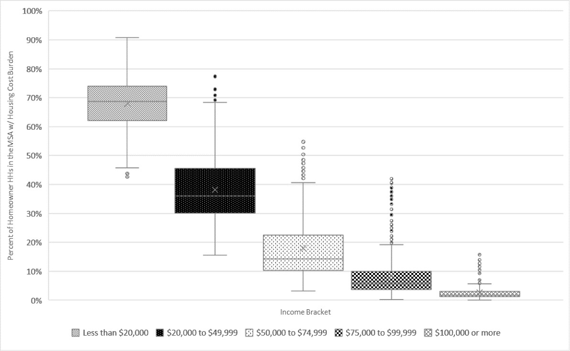
Source: 2013-2017 ACS 5-year estimates.
Again turning to changes in housing cost burden rates but this time for homeowners, Table 6 shows us that the vast majority of cities in the U.S. have experienced decreases in cost burden rates between 2014 and 2017 for all but the lowest income households.
Table 6: Summary of changes in homeowner housing cost burden rates among MSAs between 2014 and 2017, by household income
| Increase/No Change in Burdens | Decrease in Burdens | |||||
|---|---|---|---|---|---|---|
| Household income | # of MSAs | % of MSAs | # for which Chg is SS | # of MSAs | % of MSAs | # for which Chg is SS |
| Less than $20,000 | 189 | 49% | - | 195 | 51% | - |
| $20,000 to $49,999 | 64 | 17% | - | 320 | 83% | 10 |
| $50,000 to $74,999 | 38 | 10% | - | 346 | 90% | 62 |
| $75,000 to $99,999 | 57 | 15% | - | 327 | 85% | 64 |
| $100,000 or more | 47 | 12% | - | 337 | 88% | 58 |
Source: 2005-2009 ACS 5-year Estimates, and 2013-2017 ACS 5-year Estimates.
Some of this divergence in housing cost burden rates between homeowners and renters at different income levels is likely a result of shifts in tenure at different levels of household income. As shown in Table 7 below, between 2009 and 2017 there was a significant shift in the share of households earning between $20,000 and $75,000 a year who were renters versus homeowners, as well as a smaller but still substantial change among households earning between $75,000 and $99,999 a year.
Table 7: Change in the number of households in all MSAs between 2009 and 2017, by tenure and household income
| Homeowners | Renters | All Households | ||||
|---|---|---|---|---|---|---|
| # of HHs: 2017 | Chg in HHs: 2009 to 2017 | # of HHs: 2017 | Chg in HHs: 2009 to 2017 | # of HHs: 2017 | Chg in HHs: 2009 to 2017 | |
| Less than $20,000 | 5,559,860 | -616,733 | 10,162,057 | -48,978 | 15,721,917 | -665,711 |
| $20,000 to $49,999 | 13,738,646 | -1,837,850 | 13,119,829 | 736,640 | 26,858,475 | -1,101,210 |
| $50,000 to $74,999 | 11,274,044 | -1,296,402 | 6,441,284 | 1,261,142 | 17,715,328 | -35,260 |
| $75,000 to $99,999 | 9,126,133 | -534,812 | 3,468,283 | 1,082,506 | 12,594,416 | 547,694 |
| $100,000 or more | 23,590,242 | 5,017,151 | 4,732,076 | 2,308,323 | 28,322,318 | 7,325,474 |
| All Households | 63,288,925 | 731,354 | 37,923,529 | 5,339,633 | 101,212,454 | 6,070,987 |
Source: 2005-2009 ACS 5-year Estimates, and 2013-2017 ACS 5-year Estimates
Conclusion
The analyses conducted above show that the rate of housing cost burden among homeowners is significantly lower than the rate for renters, and that the burden rate for homeowners is down substantially since the housing crisis, while the rate for renters is up. The analyses also show that while the share of households enduring housing cost burdens are quite different in different areas of the country, the overall trends in affordability post-crisis seem to be similar across the country, with middle-income renters increasingly burdened while middle- to higher-income homeowners are experiencing fewer housing affordability challenges. While low interest rates in recent years have likely played a role in reducing the housing cost burdens of homeowners, these trends also likely reflect sorting of households between renters and homeowners. Potential homeowners and struggling previous homeowners foreclosed on during the crisis have likely been self-selected out of the calculation for homeowner cost burden and into the calculation of renter cost burden. Further research would be helpful in determining the relative importance of interest rates and other policy choices versus tenure sorting, and the interplay between different factors, in driving these diverging trends between homeowners and renters.
1. The analysis and conclusions set forth are those of the author and do not indicate concurrence by other members of the staff or the Board of Governors of the Federal Reserve System. Return to text
2. This paper classifies a household as housing cost burdened if it spends more than 30 percent of its income on housing costs. Much of the analysis in this paper uses American Community Survey (ACS) five-year estimates. As such, "2009" actually refers to the values for the five years between 2005 and 2009, and "2017" refers to the values for the five years between 2013 and 2017. I use "2009" and "2017" for ease of display, but readers should be aware of this important distinction. Return to text
3. The Office of Management and Budget (OMB) delineates MSAs, which include counties and clusters of counties containing a Census Bureau delineated urbanized area of at least 50,000 population. The analyses contained in this report used the 2018 OMB delineations to identify MSAs. In 2018, the OMB delineated 384 MSAs in the 50 states and District of Columbia. This paper focuses on MSAs since they have higher cost burden rates than nonmetro counties. For a recent assessment of housing cost burdens in nonmetro areas, see Dumont, A. (2018). "Rural Affordable Rental Housing: Quantifying Need, Reviewing Recent Federal Support, and Assessing the Use of Low Income Housing Tax Credits in Rural Areas," Finance and Economics Discussion Series 2018-077. Washington: Board of Governors of the Federal Reserve System, https://doi.org/10.17016/FEDS.2018.077 Return to text
4. These findings are consistent with those in Larrimore, J., & Schuetz, J. (2017). "Assessing the Severity of Rent Burden on Low-Income Families," FEDS Notes. Washington: Board of Governors of the Federal Reserve System, December 22, 2017, https://doi.org/10.17016/2380-7172.2111. Return to text
Dumont, Andrew M. (2019). "Housing Affordability in the U.S.: Trends by Geography, Tenure, and Household Income," FEDS Notes. Washington: Board of Governors of the Federal Reserve System, September 27, 2019, https://doi.org/10.17016/2380-7172.2430.
Disclaimer: FEDS Notes are articles in which Board staff offer their own views and present analysis on a range of topics in economics and finance. These articles are shorter and less technically oriented than FEDS Working Papers and IFDP papers.