FEDS Notes
January 11, 2018
Household Debt-to-Income Ratios in the Enhanced Financial Accounts
Michael Ahn, Mike Batty, and Ralf R. Meisenzahl1
This note describes new data on household debt-to-income ratios (DTI) that is being provided in interactive maps as part of the Enhanced Financial Accounts (EFA).2 A growing literature, starting with Mian and Sufi (2010 and 2011), emphasizes the importance of household leverage--for example, household debt relative to household income--for understanding the Great Recession and subsequent sluggish recovery. Notably, Mian and Sufi show that counties in which households were more heavily indebted relative to their income at the beginning of the Great Recession experienced sharper declines in consumption expenditure and employment. While the Financial Accounts of the United States have long reported aggregate household debt and income, this EFA project presents county-level, core-based statistical area (CBSA)-level, and state-level household debt-to-income ratios from 1999 to present. The granularity of this data, which will be updated annually, allows users to further explore the nature and implications of heterogeneity in household debt.
Aggregate Debt-to-Income Ratio
Figure 1 panel 1 shows aggregate nationwide DTI for the United States, as reported in the Financial Accounts, and figure 1 panel 2 shows the growth rates of personal consumption expenditures (PCE). Together, these panels suggest a connection between household leverage and economic growth during the Great Recession. While aggregate DTI had been increasing since the early 1980s at a moderate pace, it increased sharply during the housing boom of the early 2000s, then began to fall at the height of the recent financial crisis in 2008. At the same time, PCE fell sharply. In the aftermath of the financial crisis, U.S. households significantly reduced their indebtedness relative to their income. Such a reduction in household leverage during a time of low income growth implies that households either defaulted on their loans or reduced consumption expenditures in order to slow the accrual of new debt or to pay down existing debt.3 In fact, quarterly personal consumption expenditures since the financial crisis have been consistently below the pre-crisis long-run average (the red line in figure 1, panel 2). This slower growth in private consumption then translates to lower economic growth. However, these aggregate trends mask important regional variation in the evolution of DTI that may explain differences in regional economic performance. As Mian and Sufi showed, such regional variations can help researchers to establish the causal link between household leverage, consumption, and economic growth.

Source: Financial Accounts of the United States.
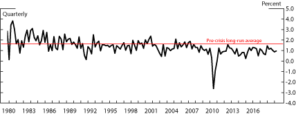
Source: Financial Accounts of the United States, Bureau of Economic Analysis.
Data Sources and Ratio Construction
We compute DTI at different geographical levels using data on household debt from the Equifax/Federal Reserve Bank of New York Consumer Credit Panel (CCP), and the data on household income from the Bureau of Labor Statistics (BLS).
Household Debt
The CCP is an anonymized 5 percent random sample of Americans with credit files at the credit reporting bureau Equifax. It also contains the credit records of the household members of the individuals in this primary sample, allowing the construction of representative, household-level debt statistics. The data include the zip code of the household, allowing us to produce aggregate estimates at various levels of geography. The data begin in 1999 and are available quarterly.
The credit files contain a detailed snapshot of each person's debts, including the account balance, payment history, delinquency status, etc. Below we show that estimates produced by the CCP are consistent with other sources of information on household debt in the US. The CCP aggregates individual loans by loan-type.4 This project incorporates all types of debt reported in the credit file excluding student loans.5 We calculate household debt by summing all individual balances and 50 percent of joint balances for each member of the household.
Household Income
The Equifax data do not include income. We use data from the BLS, which reports income earned by workers covered by unemployment insurance programs overseen by the Department of Labor. Income is reported quarterly and aggregated to annual amounts for each geographic region, including counties, CBSAs, and states.
Debt-to-Income Ratio
We report DTI at the county, CBSA, and state-levels. The interactive maps contain annual data as of Q4 each year, and quarterly data is available for download. For each geographic area and time period, we calculate DTI as the ratio of aggregate household debt from Equifax (excluding student loans) to aggregate income (from BLS). We calculate aggregate household debt by summing individual household debt in the CCP within each geographical area and multiplying by the sampling ratio.6
Debt-to-Income Key Facts
Using the more granular data, two characteristics of DTI across the United States stand out: 1) there is widespread geographic variation in DTI levels at a given point in time, and 2) the DTI increase and decrease over time at significantly different rates in different areas.
Cross-sectional Variation
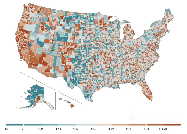
Figure 2 presents county-level debt-to-income ratios during the fourth quarter of 2006. It is clear that county-level DTI ratios can deviate widely from the national DTI statistic. Counties with the highest DTI ratios (in the top 25 percent of the distribution) had an average DTI ratio of 3.35 while those with the lowest ratios (in the bottom 25 percent) had an average DTI ratio of 0.93. Further, as documented in the work of Mian and Sufi, the variation depicted in this map helps to explain which areas were ultimately hit hardest by the Great Recession.
While most of the research has focused on county-level variation, other levels of aggregation can be useful depending on the policy or research question. This EFA project therefore also provides the DTI at the CBSA and state level. At the CBSA level, DTI ratios tend to be lower and exhibit less variation. One reason is that large counties within CBSAs have lower leverage. Still, even at the state-level there still is considerable variation in DTI. In sum, the variation in DTI is large irrespective of the level of aggregation, suggesting that macroeconomic developments or policy initiatives could have substantially different effects throughout the United States depending on the health of household balance sheets in each area.
Time series – Evolution
The Financial Accounts capture the large increase in US household debt that occurred in the early and mid-2000s, but the national figures also miss variation in where the changes were most pronounced. With the animation feature available on the EFA project website, users can see that debt growth (relative to income) was much stronger in some areas than others.
Comparison to the Financial Accounts
The household debt statistics reported in the Financial Accounts are largely compiled from aggregate data on loans made by other sectors, whereas the CCP is built upon direct micro data on borrowing of a sample of households. Despite the very different approaches, both methods generate similar results, and thus can be used in tandem. For example, in their introduction to the CCP, Lee and van der Klaauw (2010) show that as of the second quarter of 2010, national estimates of mortgage debt and consumer credit were $9.4 and $2.3 trillion from the CCP, and $10.2 and $2.4 trillion in the Financial Accounts. Likely sources of the discrepancy include mortgage debt owed by foreigners without credit history and non-profits (such as churches and universities) which cannot be broken out separately from households in the Financial Accounts.7
Conclusion
This EFA project presents data on household debt relative to household income that is consistent with the national statistics in the Financial Accounts, but can be used to study cross-sectional and time series variation by county, CBSA, and state. Research shows this data contains relevant information about the economic performance of different areas throughout the business cycle. We believe it will be of interest to those studying past developments in household leverage, as well as those monitoring the current state of the economy.
Reference
Bricker, Jesse, Meta Brown, Simona Hannon, and Karen Pence (2015). "How Much Student Debt is Out There?" FEDS Notes 2015-08-07. Board of Governors of the Federal Reserve System (U.S.).
Gallin, Joshua, and Paul A. Smith (2014). "Enhanced Financial Accounts," FEDS Notes 2014-08-01. Washington: Board of Governors of the Federal Reserve System.
Kennedy, James E., Maria Perozek, Paul A. Smith (2014). "Accounting for Mortgage Charge-Offs in the Financial Accounts of the United States," FEDS Notes 2014-10-31. Board of Governors of the Federal Reserve System (U.S.).
Lee, Donghoon and Wilbert van der Klaauw (2010). "An Introduction to the FRBNY Consumer Credit Panel", Federal Reserve Bank of New York Staff Report #479.
Mian, Atif, and Amir Sufi (2010). "Household Leverage and the Recession of 2007-09." IMF Economic Review, Vol. 58 (1), pp. 74-117.
Mian, Atif and Amir Sufi (2011). "House Prices, Home Equity--Based Borrowing, and the US Household Leverage Crisis." American Economic Review, 101(5), pp. 2132-2156.
1. We thank Marco Cagetti, Mario Perozek, and Paul Smith for helpful comments. Return to text
2. For a description of the Enhanced Financial Accounts project, see Gallin and Smith (2014). Return to text
3. Mortgage defaults and the resulting charge-offs on the lenders' balance sheets were sizable (Kennedy, Perozek and Smith, 2014) and account for a reduction in the aggregate DTI ratio level of 0.1 in the aftermath of the financial crisis. These defaults may also indirectly affect consumption as defaults lower credit scores and reduce the ability to take out new loans, for instance for durable purchases. Return to text
4. The categories are auto finance, auto bank, bankcard, consumer finance, first mortgage, home equity installment, home equity revolving, retail trades, and other trades. Return to text
5. We exclude student loans since they are not consistently reported before 2006. Student loans accounted for 6 percent of total household debt in 2016. Return to text
6. For computational purposes we use a 15% sample of the CCP, making the sampling ratio 133. Return to text
7. In a more recent and targeted analysis from 2006 through 2015, student debt in the CCP tracked very closely with that reported in the Federal Reserve Board's G.19 report on Consumer Credit (which is a source for the Financial Accounts). See Bricker, Brown, Hannon, and Pence (2015). Return to text
Ahn, Michael, Michael Batty, and Ralf Meisenzahl (2018). "Household Debt-to-Income Ratios in the Enhanced Financial Accounts," FEDS Notes. Washington: Board of Governors of the Federal Reserve System, January 11, 2018, https://doi.org/10.17016/2380-7172.2138.
Disclaimer: FEDS Notes are articles in which Board staff offer their own views and present analysis on a range of topics in economics and finance. These articles are shorter and less technically oriented than FEDS Working Papers and IFDP papers.